

Question about scale bar font plus exporting issue
 OwlishlyTaboo
Traveler
OwlishlyTaboo
Traveler
Good morning,
I have been having problems with resizing the font for the default scale bar in CC3+ overland style.
How can I make it bigger without making the scale bar bigger?
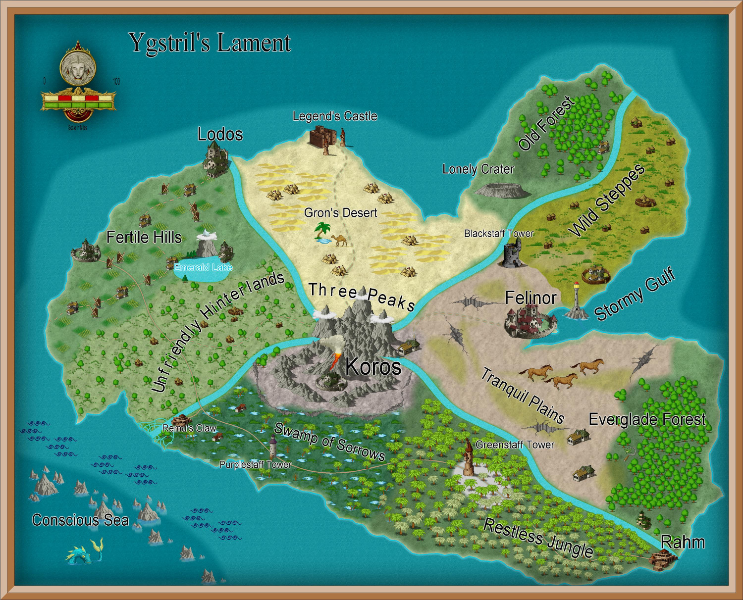
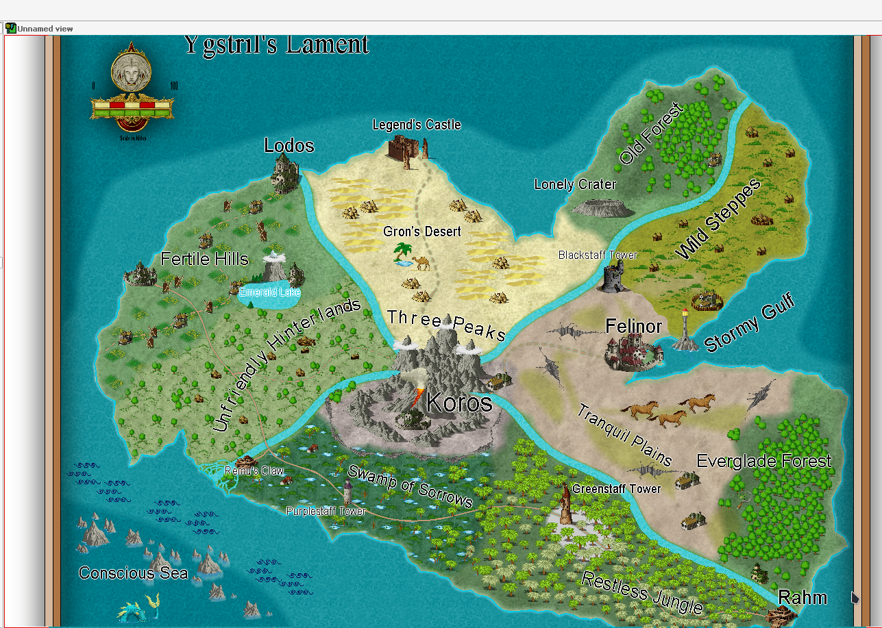
Also, it seems I have lost some detail while exporting the map. The picture above is the exported map and the screenshot below is how the map looks in cc3+. There seems to be less glow and the roads are a bit different. I tried different export settings but the effect stays the same (I asked this question in the past and got recommended some export settings before, tried those and they did not work). On cc3+ it looks a bit more "grainy" and the outer glow effect seems more visible. Why does that happen?
Kind regards,
Sam
Comments
Hi Sam :)
If you use the eyedropper tool to set your properties to be the same as the symbol and then Explode the symbol you should then be able to edit the text separately to the symbol.
When you Save as... there is an Options button in the Save as... dialog. Click that and adjust the settings to suit. These are the ones I commonly use for a reasonably good bitmap export.
Some effects like glows can be highly resolution-dependent in how they look. For glows, the closest pixel to the entity will get the full effect of the glow and pixels farther away will get progressively less. On the screen, a glow that's only two pixels or so wide will go from full to not-full very quickly. During a higher-resolution export, there will be more pixels for the glow and each pixel will be smaller. Onscreen images are never anti-aliased, which may be at play here.
The anti-aliasing technique that CC3+ can use during export uses a technique called multi-sampling, which means that it computes more pixels then will be present in the final output and averages together pixels to get a final output. What that can do for certain resolutions is to give the appearance of dimming bright pixels right next to dark pixels (for example, a bright glow around a black object). The onscreen image gets a rim of full-brightness pixels, while the export gets those full-brightness pixels dimmed just a little bit by the neighbors.
The short version of all that is that, yes, the final output of saving an image may look slightly different than the onscreen version due to decisions made about the different needs of the results (the onscreen image needs to be generated quickly and the exported image needs to be generated at higher resolution and likely anti-aliased).
To make sure that I answered your questions:
The onscreen version is about 1000 pixels wide. The roads are only a pixel or two wide at that resolution, meaning that the system rasterizer (the part that converts from the internal vector representation to the raster representation that can be shown on the screen) has to pick which pixels are inside the road and which pixels are outside of the road. The rasterizer in CC3+ doesn't have any way to specify "this pixel is X% on the road and Y% outside of the road", so thin item like the roads will have some parts that are thicker than others.
The exported version is 1500 pixels wide and it looks like the raw rasterized image was at roughly twice that resolution (maybe 50% to 67% antialiasing in CC3+). That means that there were a lot more pixels to start with in the exported image, meaning that the results will be better. I took the two images and cropped out a little bit, then zoomed in so that it would be easier to see what happened:
In the onscreen image side, it's easy to tell that the roads and glows were only a couple of pixels wide, meaning that the inside/outside test had some tough decisions to make and the overall quality is a little lower than ideal. You can also see this in the symbols, where thin things like the windmill blades and rows in the cropland are spotty blobs because some pixels that are important to understand the meaning of the image are missing. By contrast, the Exported Image has enough pixels so that those features are all present. Due to the final downsampling to get the image to a reasonable size, though, some items like glows are a little bit less intense because the energy of the pixels is spread out a little differently.
There is one other minor difference between the two, in that one is saved as a PNG (the onscreen image) and one is saved as a jpeg (the exported image). JPEG compression is lossy, meaning that the saved pixels don't perfectly represent the input pixels. With PNG compression, on the other hand, the saved pixels exactly represent the input pixels. What that means in this case is that there is a little bit of junk around sharp edges and high-contrast edges like the roads and text. It's easiest to see it in the lake in the top-right part of this image. However, JPEG compression is only a very small part of the visual differences between the two images, but it does account for maybe a quarter or tenth of the perceptual energy loss in the glows around the text (that is, a tiny amount compared to the systematic losses from the antialiasing).