WIP - My New World - Myrrhina
 hsv216
Surveyor
Hi all,
I am working through trying to build a world with CC3+ (I am a newbie), and coming up with a lot of questions, so figure it might be easier to keep it all in one thread. :)
Please be patient with me. :)
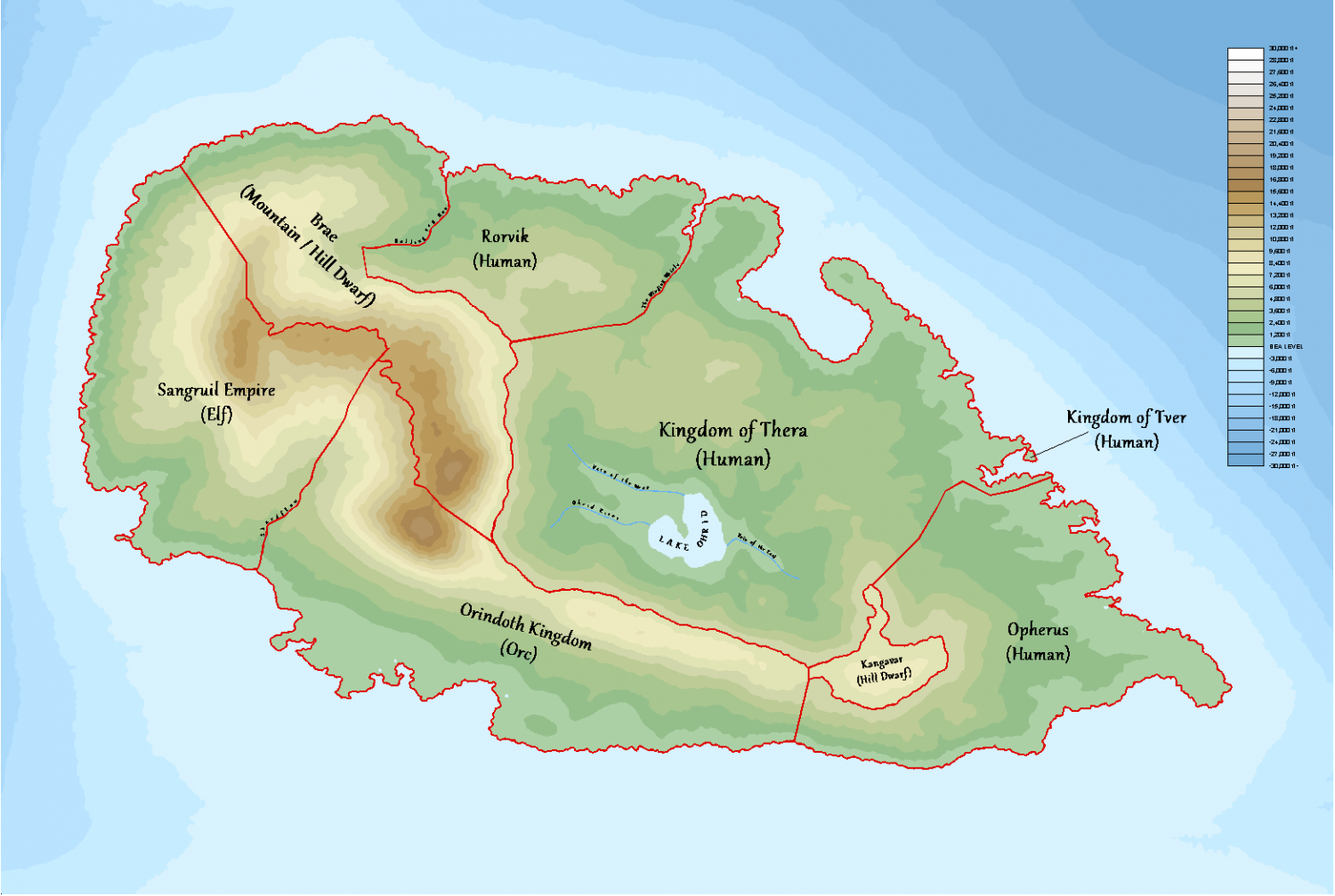
Attached is the continent I am working on at the moment. I am happy with what i have thus far (and still a gazillion more things to do). I already have the world (built using the world builder annual) and am now working on continents. I will then work on countries, cities, places of interest, etc, so taking a top down approach. Yes it will take a long time, but helps me learn. :)
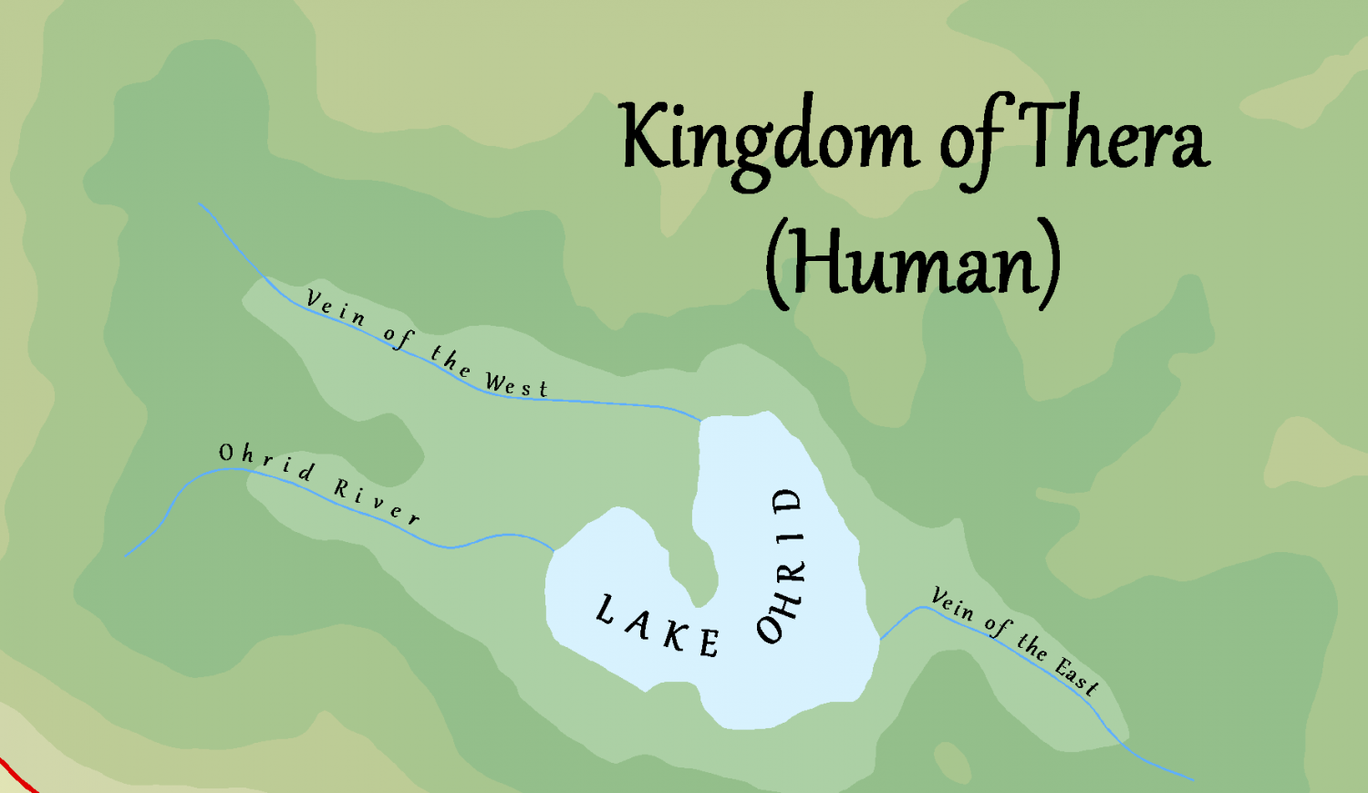
The issue I have at the moment is trying to get the text to be nice and clear. What I am trying (hoping) to do is to be able to read the text while zoomed out at continent level (including river names). I will add mountain range names, major cities and that might be about as far as it goes for this size map. I have tried to do what Ralf did in the last live mapping video, but it still looks out of focus. If I zoom in on the text, it is nice and clear, just seems to lose clarity the further out I zoom. Below is the continent zoomed out and then a zoomed in selection showing it clearly. It doesnt seem to matter if I have sheet effects on or off.
Attaching the fcw file as well if that helps as it stands right now.
And if you do open the file, yes I am still trying to get my head around sheets and layers and what should be on what sheet, so that will likely be confusing to any that do open it! You have been warned! :)


Comments
Hi hsv :)
I thought at first that it was just a lack of sheet effects, but some of the sheet effects were a bit too large so I reduced them to a more sensible size for you and made sure the map will open in future with the effects turned on.
When you open the Sheets and Effects dialog in a map there is a check box at the top called Activate Sheet Effects. That needs to be checked for effects like glows, shadows and blurs to be visible.
Of course, now you can see them you may decide to edit them, or others might offer better options, so I've called it repair - sue version. I also moved a few things onto the right sheet.
Thanks Sue, I did warn that it was likely a little bit of a mess. 😊 Unfortunately having the effects on or off did not seem to help clear up the text.
Does anyone think it is possible in CC for the scale and if so any suggestions please? Happy to try out stuff as it also helps me learn more and more of what this beast is capable of. The "beast" being the application not me. 😋
As a reference I am using this map from worldatlas.com to help me understand the level of detail that you could expect on a continental map. The text is obviously very clear, albeit it small but still legible. Admittedly it is very likely a high quality picture of a printed map and was just trying to emulate the same or similar in CC. 😊
You can edit the size of effects by picking the effect in the effects panel and hitting the Edit button on the right there. So if the glow isn't big enough you can make it bigger, or more intense.
Not sure what you mean by the scale.
Thanks Sue, I will give that a go! What I meant is scale of the map is very large, i.e. about 4000 x 2000 miles so was wondering if that might be the reason why the text is not as clear as I am hoping, i.e. the text is not scaling appropriately. I may play around with the text properties as well some more. :)
Yes, sometimes the default for the text doesn't work on all of my maps. So I make the text much larger in the 'Text Specs' on the right side. Then place one bit of text on the map. If it isn't the correct size so it is readable, I type 'edit' and edit the text, click on properties, and in there adjust the text size. Click on Okay, click on the next okay. And compare the text to the map size.
Continue until it works.
Thanks Jim, I will play around with those settings a bit today and see how I go! :)
It also depends on what look you want. I’m working on a large map (3500 x 2400 miles) and I’m using smaller fonts as I want them visible in a high res version when zoomed in but in standard res version don’t really care if the text is readable. As the text is a distraction from the map it self if the text size is readable.
personnel choice as to what your looking for and what you want to bring attention to. The text or map it self.
With that said it is possible to find a happy medium for text size depending on the size of the map.
choice of font and color makes a big difference also. Don’t be afraid to use a more readable font for small text like on your borders. It doesn’t have to match the more fancy text your using for the other areas.
Hi all,
So stepped away for a little while and come back to start working on my map. I have decided to try and use the MS style for the continent as well. I may still revert to doing the country size map instead in his style and leave my continet map as I currently have it. What I am looking for an opinion on please, is the density of the hills and mountains.
Does it look about right to you? If not, what looks wrong?
I am also not sure if I should add more hills to the edges of the terrain fill. First image is the whole continent and then a zoomed in version. The continent itself is about 4,000 x 3,000 miles and located within the tundra belt so quite close to the south pole.
Thanks everyone.
Wow! That's an awful lot of work.
The result is mostly great, but the edge of the extent does look a bit sharp. I can't really see at this scale if that edge is pure symbols or mountain/hill background. If it's symbols you might want to consider thinning them out a bit as you get towards the edge and using the mountain/hill backgrounds with wider than normal 'Edge Fade, Inner' sheet effects to gradually blend into the surrounding lowlands.
Do you have sheet effects turned on?
lol thanks Sue,
I felt like I cheated a bit with using the draw symbols in area feature and then adjusting the scale at the edges so not nearly as tough as placing them all individually. it still added a few thousand symbols though, so will have to see if that is a problem. Thankfully I have a very powerful PC. The symbols themselves are the Snow Mountains and Snow hills. The terrain fill is the Terrain Default, Tundra one. I felt it blended nicely with the look and feel rather than the moutnain or hill default terrain symbol things. I used the symbols along to then try and "hide" the sharp edge of the terrain tool.
BUT, I did not realise and thanks to you have realised I have made an error with this. The screenshots did not have sheet effects on but with them turned on it looks a heck of a lot better! I can probably ditch the symbols along, as the sheet effects does it a heck of a lot better and now makes it more obvious that I did use the symbols along, lol.
I was just struggling to try and find a nice balance between having too many symbols and then the edges looking too obvious, but the sheet effects have solved the problem. :)
Thank you again. :)
This is without removing the symbols along (sheet efects on)
This is without the symbols along. (Sheet effects on) :) Much happier with the result now too.
Hi Everyone, I am seeking some critical feedback please. I have pretty much finished with the continental map. Next steps will be to add some labelling, decoration and then starting to go into a regional style map for each of the countries.
Please see below two screenshots:
One shows the political boundaries and fortresses. The fortresses will just be used for refernce in the country maps, i.e. I will hide them and probably delete eventually.
The other shows with the fortresses and political borders hidden, but everything else is the same.
Like I said am after some feedback as I am by no means an expert in this, so am sure there are plenty of things I have not even considered! Or if something does not look right, or if there are some things I could do better please point it out no matter how small it may be.
Thank you in advance.
The center lake looks a little "off" - at least at low zoom levels. Maybe an edge-effect similar to the Shoreline, or a different texture could help.
Apart from that, the map looks really good and well thought out.
I would try changing your political boundaries to different colors for each area. You can have two or more areas with the same color boundary but just not next to each other. That would separate the boundaries better and make it easier to see where the boundaries are. I would also use polygons for the area with a filled color and a sheet effect to just show the boundary edges. after you use the smooth poly tool to make the boundary. then use the smooth to straight command to turn the area into a straight poly then you can use the trace command to trace the border of the neighboring region. Once your all done you can leave them as straight or change them back to smooth polys by using the straight to smooth command.
Just an idea for you to think about.
sample below - not all done but this is what I'm currently working on
Thanks guys, keep em coming.
Really love that look Jeff (will look to do that!).
Thank you for that. I had the lake edge on the wrong sheet, so was being overshadowed by the fill. :) Thanks for pointing it out.
@EukalyptusNow and @Jeff B
Thanks for the feedback guys. Please see amended below. :) Definitely like the inland lake / sea looking more defined and the political borders also look a lot nicer this way too. :) I may still play around with the borders a little as they go a little haywire on the coastline, but am still very happy with the result now.
Much better than a single color for all the regions.
Did you use the trace function on the shorelines for the border?
Also I put the region names in the same color as the outline. I also put the text and region outlines on the Border/Political Layer (not Sheet) this way I can turn them on and off using just by toggling the hide layer checkbox for the borders/political layer.
Hi Jeff, I did not. YThe regional borders were already 2D paths so I changed them to the 2D poly and then used the edge fade effect (the MS style already has this effect on the political borders sheet. I think the biggest issue is the coastline is very jagged (by design) so the edge fade struggles to keep a nice flow as it has some sharp corners to contend with. The areas that are smooth and flowing like between the countries is fine.
I have changed the opacity to about 20% so that you also have the colour over the landscape which then hides a lot of the anomolies. :)
These are the worst of them. There are about 8 or so around the map:
Think I am ready to lay this continent map to bed now. :) Any final comments are more than welcome! Only difference between the two screenshots is the country text colour. Let me know if you think one looks better than the other to you. I am leaning towards the first one (black text) personally, but wanted to see what it would look like following Jeff's suggestions.
I think the black looks better :)
I can read both, but the black looks a bit better.
The black looks better because you have the political colors covering the entire area instead of just outlined.
Have you considered trying an "Edge Fade, Inner" effect rather than "Edge fade"? "Edge fade" is really only intended for rectangular areas and gives odd glitches at 45 degree boundaries, including the bowtie anomalies that you noted above. "Edge Fade, Inner" doesn't have those anomalies.
This is exactly the same difference that you'll run across in the "Bevel" effect (intended for rectangular areas) as compared to the "Bevel, Lighted"effect (intended for any shape of areas).
Hi Joe,
I am trying to use the edge fade, inner, but when I do that, the borders between countries seem to cancel each other out i.e. no fade between the countries, only along the coastline. Screenshots below with the settings. First screenshot is the default (with my settings for width), and then a few oithers that I tried to play with the settings to see what they did, but still not quite what I am after. :( The help topic does not exist for this dialog box. Do you know what settings I should use as that sounds like what I want, but just not doing what I want? :) Thanks!
Default Settings:
Reverse Opacity:
50 / 100 Opacity:
Full size map:
This is the Info - List for one of the countries (the blue one in this instance)
Yea, this is one of the cases where you have to use Edge Fade and not Edge Fade, Inner. One of the differences between these effects is that edge processes each differently solid colored polygon individually, while edge fade, inner processes the entire combined shape on the sheet.
To use Edge Fade, Inner here, the borders would have to be on individual sheets where the number of sheets equal the N-color problem for your layout.
I apologize, I misunderstood how your drawing was structured (I had guessed that each country was on its own sheet). As @Monsen points out, "Edge Fade, Inner" is a structural element that goes on everything on a sheet and it looks like "Edge fade" works on each solid color within a sheet. A mode for "Edge Fade, Inner" to operate on color blocks would be a nice feature to have, then.
Thanks guys, I probably will create extra sheets for each country then as it will look nicer. 🙂
Would be nice if the fading part worked the same on both, since edge fade inner obviously does a better job of it than just edge fade, ie the "bow-tie" effect.
Yup definitely looks a lot better, although a little more effort. Will be annoying if making changes to then have to make changes to 8 instances / sheets. Still would be great if the edge fade used the same method's or whatever it is that it does to do the fade. :)
And now the final for this continent. Next is each country. 😊 Stay tuned!
I am rather happy with my first attempt. 😊