WIP: birth of the firedemon battlemap
 Fersus
🖼️ 11 images Surveyor
thanks to Sue's dark city assets I have the means now to attempt this map!
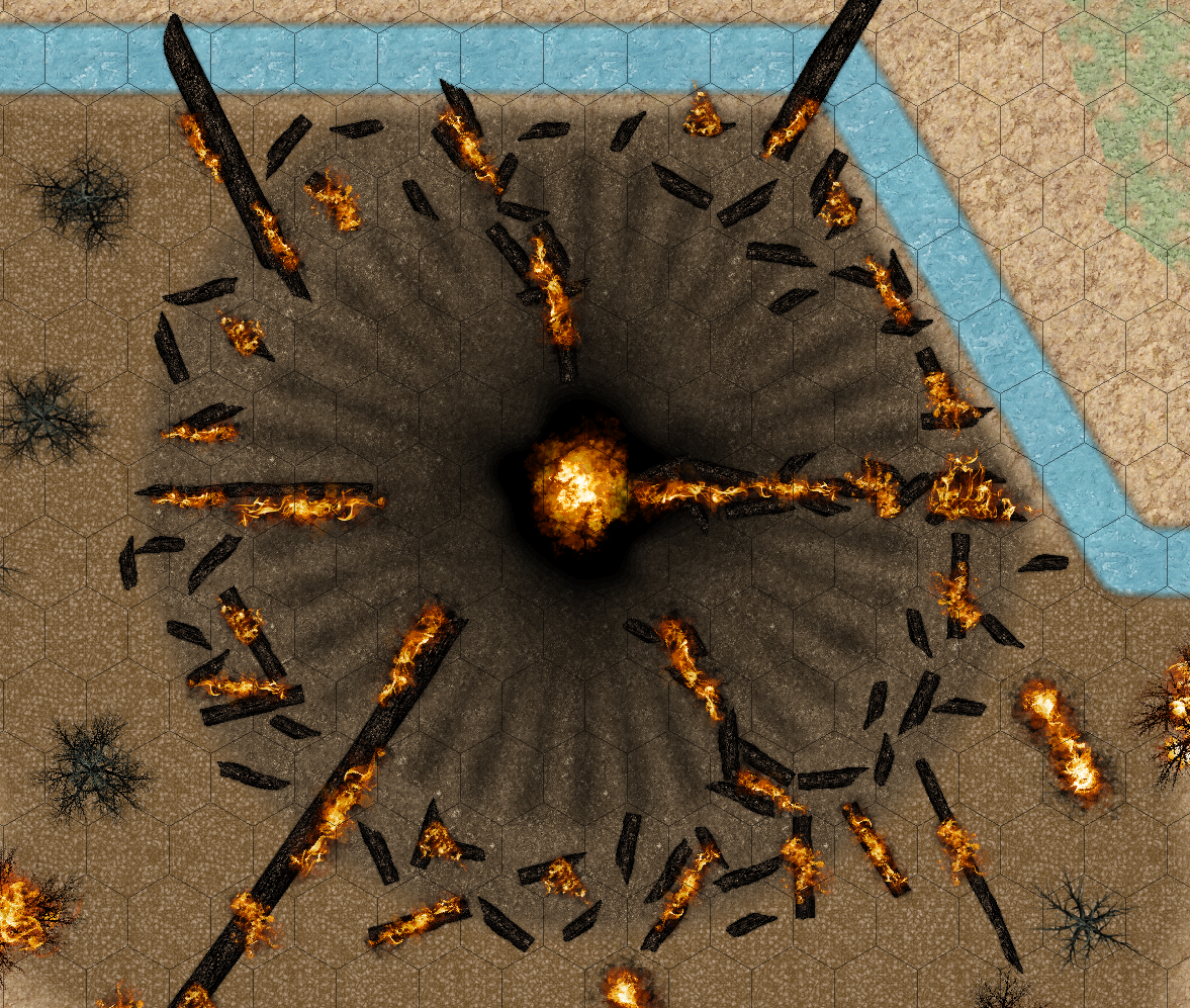
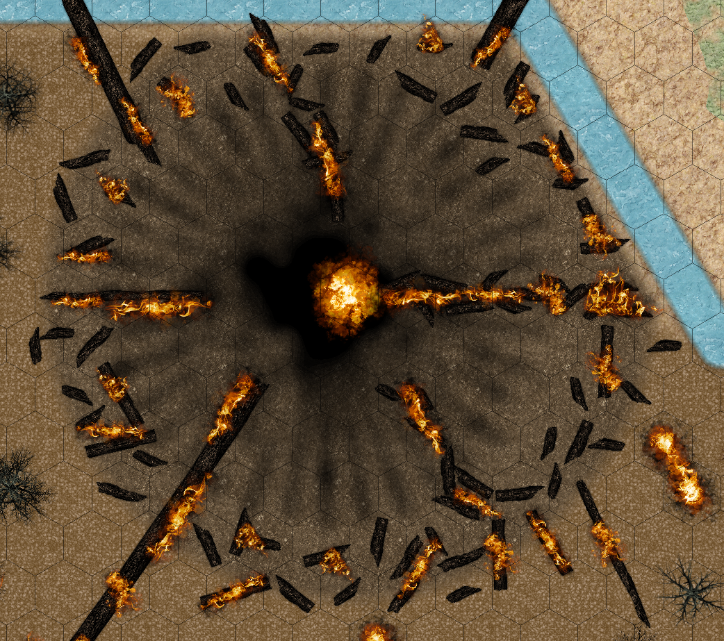
The heart of the map should be the place the demon escaped their former prison in a huge explosion:
I made the burned spokes just with lines a glow and a transparency effect. My attempts to make them less regular with displace failed however as this always moved the centre of the explosion to the side :/
The best results I got is with the Mixed_forest_Hi.png:
but it's still off centre by about half a hex.
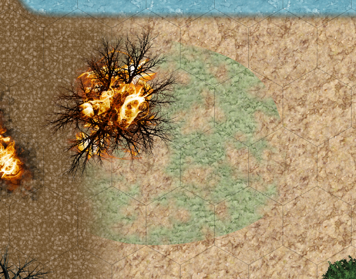
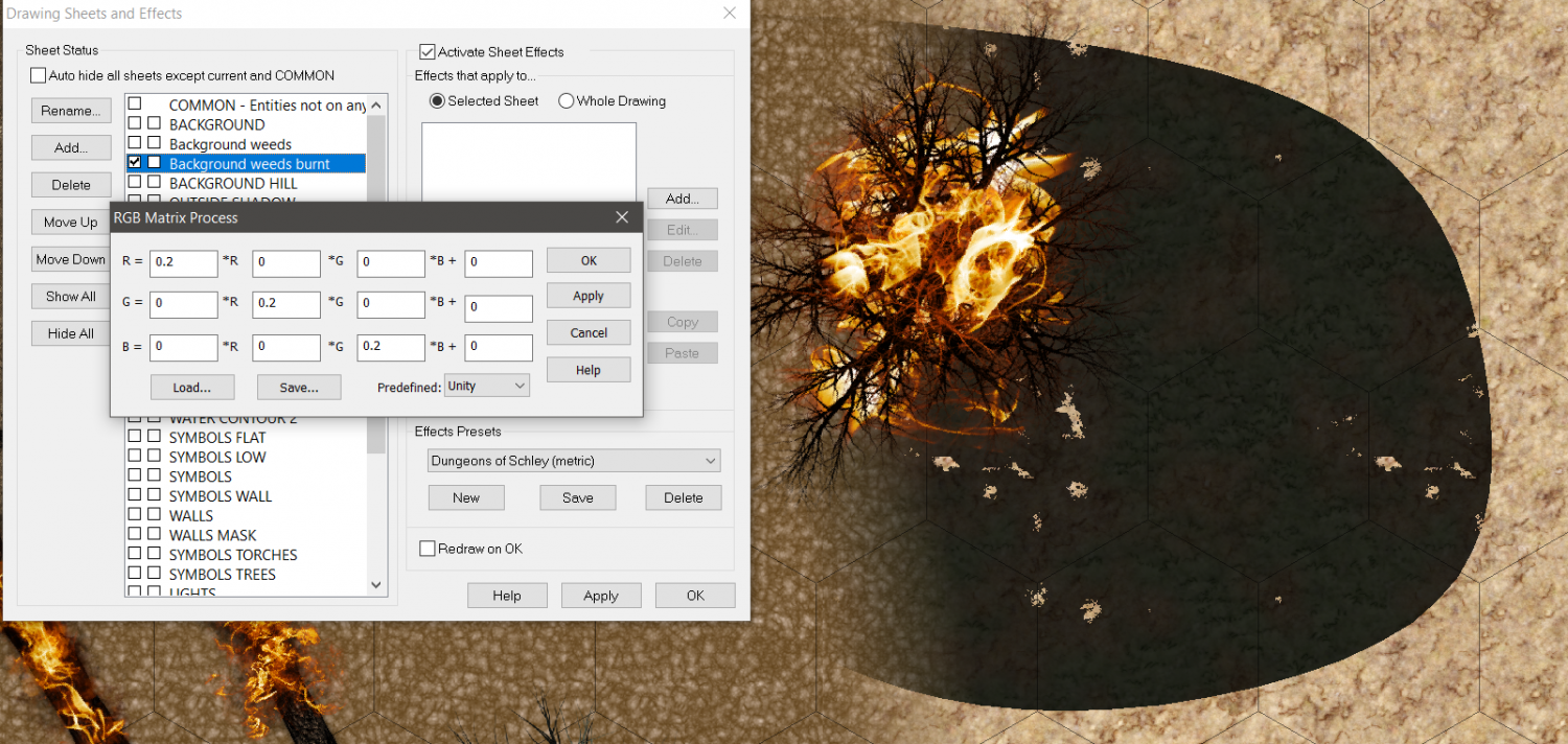
An other thing I still struggle with is the RGB matrix effect. I hoped I could use it in conjunction with the transparent grass bitmap fill to get burnt grass, but instead the transparency get's lost:
I'll play around with some other settings.
I'm grateful about any insights concerning these two effects...


Comments
There doesn't seem to be an EFI effect on that sheet. Maybe ok that RGB Matrix Process and then add one?
Nice use of the fire symbols :)
thanks, Sue!
I didn't think that the EFI effect would have an influence on that, as I tried to get green patches (the grass) to be near black, while the earth from below still can be seen trough the transparent parts off that fill. but instead everything turns black, including the transparent part :/
But for completeness' sake, I tried it with EFI and played around a little more with the RGB matrix:
here you can see, that the transparent parts get tinted as well.
But don't worry. I didn't get the grass to a burnt look anyways. If I go darker it just get's completely black and looses the grass feeling anyways. Guess I have to think about something else to make this work...
Oh I see! I didn't realise you were using a partially transparent texture.
How about a Colorize effect instead?
There is a burnt grass texture in Darklands City, if you don't mind drawing your own patches.
Thanks sue! I'll check out both suggestions!
Thanks to all your help I could make this awesome map:
unfortunately the export makes these two shadow bars on the top and on the bottom, and get's the shadows not quite right. so here is a screenshot:
Type EXPORTSETMPPP and hit enter. If the number returned in the command line is only 4 million (4000000), type 40 million (40000000) and hit enter, then try again.
It makes the scan wider, which may be enough to get rid of those horizontal bars.
Thanks for the hint! T
hat helped with the bars, but the scorched earth effect around the big bonfire in the middle still eludes the export, even though the file now has 16mb oO
Can you show a screen shot? I don't understand what you mean by the thing escaping.
in my post above I have the picture with the shadow bars and a screenshot. in the one with the bars there are these black shadow lines missing that should indicate the explosion that happend there. in the screenshot below it is visible:
You mean the radial lines?
How did you make them?
They are just black lines that have a glow and a transparency so they're not that apparent
Check if any of those effects scales are set to Percent of View Width. If they are, set them to map units instead and readjust them to look right.
If they aren't... I'm a bit stumped!
Decrease the transparency ?
Good idea, @JimP
My first idea was to increase the glow, but that's not satisfying
Sscreenshot:
jpeg:
I'll try the transparency next
What units are those effects using?
now the lines are visible:
but the glow still vanishes in the export:
the effects at the moment are
and transparency is at 50% at the moment (was 5% originally)
the glow is first in the list, as I only wanted to hide the lines carrying the glow with the transparency...
Curious. I was half expecting everything to be in Percent of View Width, but if all are in Map Units that is not the answer.
Transparency Acne?
Is all of that black? Black lines, black glow?
If all is black, try changing one or more to dark grey and dark brown.
Are those lines 0-width lines? Try making them a bit wider, thin lines can disappear when output to an image, which again would prevent them from having any effect.
I think Monsen is on to something. I increased the line width to something non 0 and it get's better. It's still not wysiwyg so I'll play around a bit more with line width and the effect strength.
Thanks for the hint!
Thanks everyone for all your help, the map turned out quite... ahem... "nicely" doesn't seam appropriate, but I still go with that :D
When you're working with very thin entities like lines, Outer Glow is better than Glow because Outer Glow will thicken things up before smoothing them out.