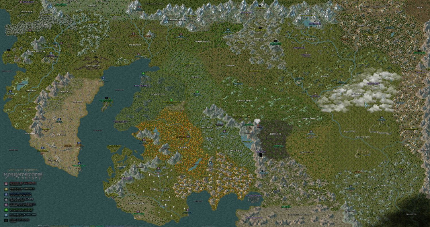
The World of Mahdran - MMORPG Concept World Map
I have been a member of the Profantasy community since 2008 and wanted to thank the Profantasy community for the inspiration, kind-hearted, always willingness to help and wanted to send my appreciation to Sue Daniel, Ralf and Monsen and any others who has helped trouble shoot along the way or give better tips/ideas. Thank you!
My mapping skills have progressed as time went on, and we were blessed to have CC3+ and some great annuals such as, Spectrum Overland, Herwin Wielink, DeRust, Jonathan Roberts and a few others. The way I approach mapping is super unconventional to most, as I mix and match symbols, terrain fills and effects to establish a vast array of unique areas in my map. In previous ones, my maps have been extremely patchy and didn't have fluidity. While any mmorpg map who has a vision of unique zones while attempting to maintain a somewhat realistic feel. I believe I have achieved that to the best of my ability "for now".
This world map is a 4x4 grid and photoshopped together. The Kingdom Flag and Zone Text legend are apart of the map. The map file is extremely massive (40mb). I take pride in having a hi-res map where wandering eyes can enjoy an explore. If you're interested in the adventure I'd recommend downloading the map from the hi-res link and using your photo viewer on your computer.
Hi-Res Map Link:
https://www1.picturepush.com/photo/a/16528015/img/4x4-World/Mahdran-Classic---4x4-World.jpg


Comments
One thing I notice is the texture backgrounds. They do not look good due to the size of the map. You may want to go in an increase the texture sizes.
One thing I find odd are the colored trees. This gives the idea of autumn. However, it seems surrounded by swamps and green trees. It just seems weird to me. I would expect the colored trees to be more north. Or, if you are in the southern hemisphere, south. But if that is the case, the further green trees below don't make sense.
I think the scale texture issue typically comes in play when you're zoomed out of the map. When you zoom in, it's not an issue. It would be helpful if you could list the areas that have the scale texture issue? I could see the Omenmare Steppe and Searingfront Plains that are most obvious. If I scale up some textures in other areas it would ruin the thematic nature of that zone. I intentionally used Herwin Wielinks land Fill and then layered that with Satellite Woods Fill texture because you can blend and bleed other terrains through it to give a different ground effect.
This map has the following biomes: Sub-Arctic Transition of Tiaga to Temperate, and Temperate. The Autumnvale is living in a temperate biome so I don't see why that would be an issue? The trees are in a perpetual autumn state for a specific reason in the lore.
The background fills are the entire map. It does not matter what area it is. Zooming in does make them go away, which is why I suggested larger fill textures if you want people to look at the entire map.
I am on the opinion that even fictional worlds designed for video games should be somewhat realistic in design. Not that all games do that. Elder Scrolls seems to have done a decent job at that. However, to be fair, all of their maps are political maps with much terrain detail.
Several zones in MMOs I have played have strange color trees. WoW being one of them.