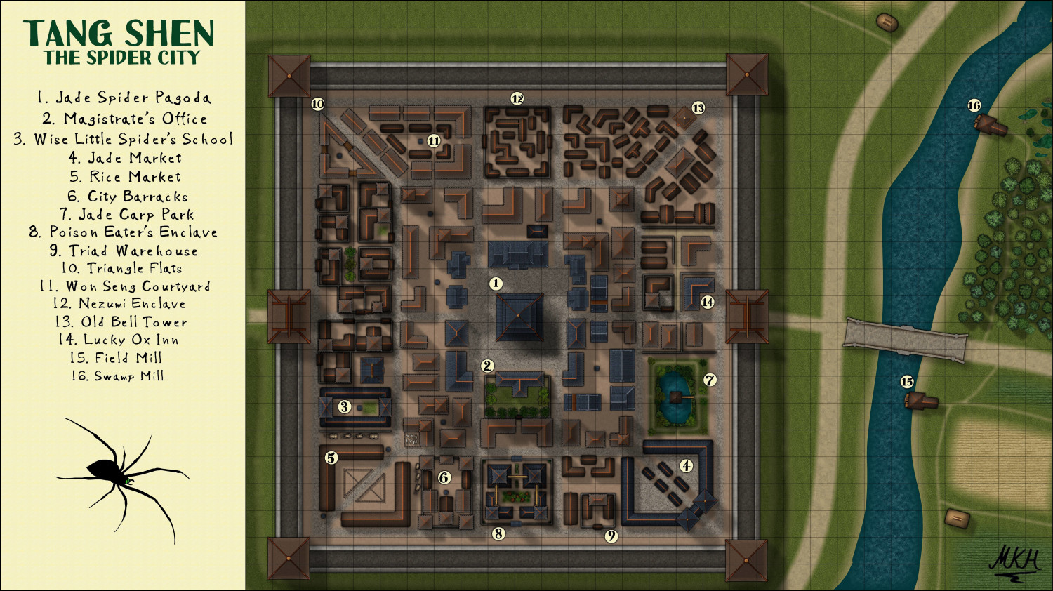
Tang Shen - The Spider City
 EukalyptusNow
🖼️ 62 images Surveyor
My first attempt at using the CA143 Asian Town-Style
Had this map lying around for a while, until I managed to sort our the gras texture's "Transparency-Acne"-Issues in another map (Thanks again Loopysue).
I drew the spider in CD3, using a free to use photo as source and then adding the mandibles and eyes.
Think that the town is a bit "special-heavy" (too many special buildings and not enough normal residences) - but I still like it and my players seem to prefer "a bit unrealistic but fun" to "totally acurate but more dull".
What do you think about the map?


Comments
With those location names, it definately isn't a normal location.
Really great. It would be great in the Atlas, somewhere on Kumarikandam
I have yet to play around with this style. I like what you have done. Maybe I will play around with this next.
Thank you all for your kind feedback.
@Quenten : Thanks for the offer to include them in the Atlas, but I'd like to keep them out for now - I might want to publish them elsewhere and avoid conflicts.
OK
Think that the town is a bit "special-heavy" (too many special buildings and not enough normal residences)
Well, if we assume the Triangle Flats are residences too, along with those properties surrounding Won Seng Courtyard, that looks to be only about 10% "special" areas/places/properties within the walled city, which seems perfectly reasonable overall (and also treating the walls, gates and wall-towers as separate from this minor exercise).
Thanks @Wyvern
Come to think of it, there's more resindences in town than I initially initially realized.
The Triangle flats and the outer ring of Won Seng Courtyard are high density housing for poorer but not destitute citizens, with a bit of rivalry between the inhabitants of the two blocks.
Also most of the inner ring buildings are dual use, with businesses on the ground floor and the flats of the owners and maybe a rented out room or two above.
The two enclaves are mainly residential too, if not exactly regular.
I really like the map.
My only critique is the seemingly random numbering of the named locations. I prefer them to be more sequential. For example #5 in this map I would've numbered as 4 and then continued counter-clockwise inside the city finishing at 14 which is currently #10. To me it just makes things easier to find. In a small map it's not so bad but on a larger one...
I do that to. It is in case my players accidentally saw or heard me refer to a room number. Or saw my notes. They couldn't find out what was what.
Very good point, @jmabbott
Labelling things according to categories/ importance instead of map placement might seem like a good idea... until you search the Inn labelled No. 17 on a huge map and eventually find it - right between numbers 4 and 32. ;-)
I remember grumbling about this myself as a user, so thanks a lot and here's the updated version.
Well, the beauty of CC3+ is it's very easy to hide GM info on the map and show the players only what you want them to see...😉
@EukalyptusNow You're very welcome.
Yup, hide text, but if the DM just has the jpg/png, then nope.
edited for typo.