CA3+ Dragonlance headshots
 Daniel Pereda De Pablo
Surveyor
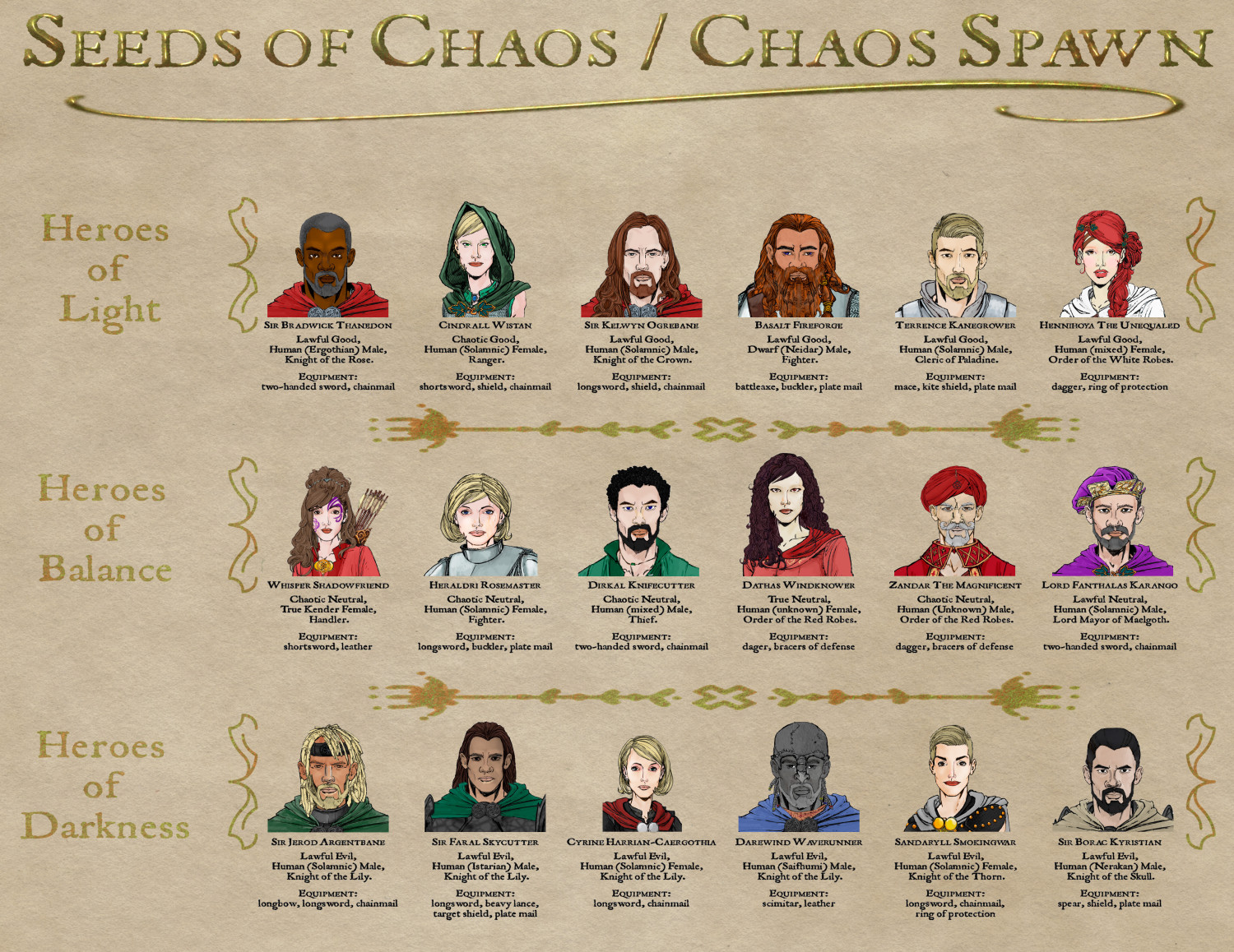
Hi. One of my favourite D&D modules is a Dragonlance two-part adventure from 1999, Seeds of Chaos / Chaos Spawn. If you are Dragonlance fans, you probably know it. Now, the Classic Dragonlance modules used to come with a set of pre-generated characters you could play, each one with D&D stats, a backstory and really good looking headshots by Diana Magnuson. In that spirit, I have created my own with CA3+ for those two adventures, based on the depiction of the characters in the modules.
It may also have contributed to me doing this the fact that I wanted to see if I could create a range of characters which were similar enough in appearance when needed (knights, wizards) and have a proper identity at the same time. I hope I made it.
Some technical details: all the faces and upper torsos were created in CA3+, slightly modified in PS, and laid out on an old paper texture with in-game details.
Enjoy!
Also, for future reference, which character do you like the most, aesthetically speaking, and why?





Comments
These are very beautiful. Great work in making all the characters distinct!
I can say that Darewind I like the least. This is because there is too much gray.
As for the most? That is hard. I keep changing my mind, but for now, I would say Heraldri. The reason being is that it seems the most 'realistic' in detail. There is natural skin tone with some colors on there giving her a more complex complication. She has a nice normal hair style that seems suitable for a fighter. Contrast her with say Hennihoya. Her hair color does not seem natural and does not go well with the complexion.
Thanks for the feedback. Funny story about Heraldri: the scar on her left side is made with a mountain from CA 179 Peter Fenlon Revisited, some Color Key and adjusting Blend Mode. I find overland symbols quite useful when adding marks to the skin of the characters. Also, many noses are two overlapping nose symbols, Zandar the Maginificent, for example. It helps giving a more different look to each character.
So, I made another one. The main cast of the DLS2: Tree Lords adventure for AD&D Dragonlance, back in the day. All the headshots were created in CA3+, with just a few minor touches in Photoshop (the freckles, for example). Enjoy!
And a few more, that I had promised the guys at Dragonlance Nexus to do: the unsung heroes of DLQ1 and DLQ2, AD&D Dragonlance adventures from quite some time ago. All the headshots and facial textures were created in CA3+, with just a few minor touches in Photoshop (some crooked smiles, for example). Enjoy!
And the last one in the series, the main cast from AD&D DLS4 - Wild Elves. Created and texturized in CA3+ with final touches in Photoshop. It's almost 10 MB, be wi-fi wise and enjoy!
Sir Boracius and Lady Halona Kyristian, children of Sir Borac Kyristian, hero of Maelgoth and paragon of the Knights of Neraka. CA3 + a background and a few details added in Photoshop. Enjoy!