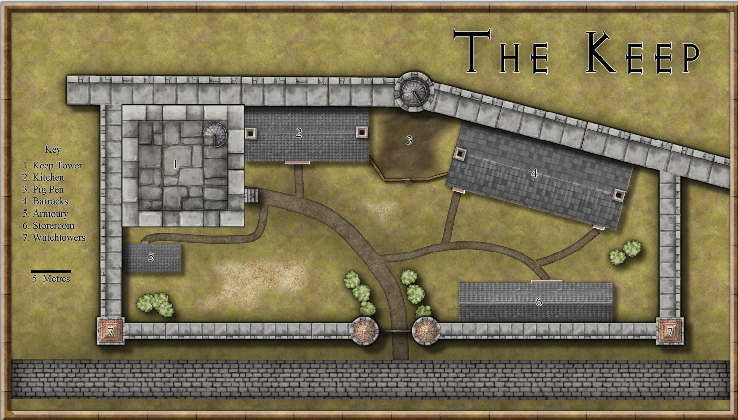
My First Attempt at Village Scale...
Here is a piece I'm working on for a publisher. This my first attempt at a map that is between City and Dungeon scale.
I know there are a couple of minor errors with the paths on the 'Eastern' side but other than that, thoughts?


Comments
Hello Jim,
you might try adding some shadow effects to the keep tower to make it more apparent that it's higher than the other buildings. Maybe similar to the shadows on the "normal buildings" but on a higher sheet.
The stone "main road" in the "South" looks a bit too "separate" from the ground to me. Maybe a very slight edge fade or mud from the "castle path" at the join might help.
The font used for the description might be slightly larger. My old eyes... ;-)
Apart from that, I really like the map, especially the the colour scheme and spacing.
What happened to the battlements at the east and west ends? And I agree about the tower needs a greater shadow
Beyond the Keep Tower shadow issues, I'd suggest adding some shadow effects to all the wall towers, as they also look very flat right now.
Appreciating you may be tied to whatever the publisher wants, but you might want to add further smaller towers where the two walls join, or add crenelations along both sides of that main north wall after where the two link (on the "outer" side from the enclosed part). The crenellated wall ending at the thicker north wall just looks odd right now, because it leaves the south side of that main wall undefended.
If the brown roads/paths are just dirt, I'd suggest making all their junctions less precise (so not just where that "castle path" meets the main paved road), as unless something blocks them, folks will always cut the corner at such places, which will wear away the grass very quickly. Indeed, you might even want to consider redrawing the dirt paths as smooth polygons, rather than lines (or just add a few polygons to break up the precise edges of the lines in places; as long as they're all on the same Sheet, the Effects will blend the two into one). Unless there are obstacles, dirt paths end up getting broader and (loosely) straighter over time with use.
Thanks for your comments and suggestions folks.
'The Keep' is the main headquarters for the town guard. The larger, north wall is the City outer wall, everything 'South of it is within the city, hence no need for 'internal' crenellations - it's designed to keep people out, not in. Well, that's my take on it at least. Additional battlements are not part of the brief and therefore won't be included.
Here is a modified version based on your feedback...thanks again.
Better.
Indeed, much improved.
Maybe increase the glow on the numbers to make them more legible.
The Tower top looks very flat though. The outer walls need some sort of shadow to show the floor is below them. If it's the exterior top, that may complicate matters, as you'll need different length shadows for the higher and lower stretches of the wall tops.
Further on the latter point, and if they are, the crenellations need a little adjustment too, as there are what seem to be large open gaps at the northeast and southwest corners currently, which is not realistic.
@Wyvern The 'tower' is the symbol from the Jonathon Roberts City style (as is everything else except the other buildings). I did think about emphasizing the crenellations and floor but that would require manually drawing the shadows. At the moment I don't have time to do that; I've got the temple to finish including its basement, the city map, a ruined keep and another floorplan with basement to get done by the end of the month. If I get the others done to a suitable standard before my 2nd deadline (missed the first) I'll re-visit it, otherwise this will have to do.
I like it! Everyone else pretty much covered most of the minor issues. The only thing that bothers my eye is the scale of the main wall. The walkway along the main wall appears to be around 5 meters wide which seems too large, especially next to the buildings. To me it makes the buildings look smaller for some reason. Maybe that's a style issue. I dunno.
Thanks @Rob_Wordsmith. The cartography brief called for the main wall to be 4m thick with the courtyard walls 2m thick (I'll have to adjust the Nth-Sth walls (thanks for making me re-read the brief!) as I misread the spec.
Ah right. Haven't used this style much myself, so didn't realise the Tower was a single symbol.
You could probably manage by simply drawing the crenellated wall separately on top of the symbol (probably as polygons, and using various of the copy & paste options to speed things up). Use two Sheets, one for the higher, one for the lower, wall segments, and add suitable shadow Effects to both. I am though assuming there'll be a suitable texture fill style available to fit the overall colour-scheme for the stonework...
@Wyvern If I were to do anything, I'd probably just use a polygon with a transparency fill on the lower parts to darken them somewhat on a sheet above and maybe draw some polygons on the higher bits on a sheet with the wall shadow effect on, then trace that with a suitable 'shadow' on a separate sheet and hide the original polygons. I'd like to do it but between RL, running a weekly game, playing in a weekly and fortnightly game as well as a PBP game, I may not have time...
Yeah; appreciate the problems!
Good luck with it all anyway.
The stone "main road" in the "South" looks a bit too "separate" from the ground to me. Maybe a very slight edge fade or mud from the "castle path" at the join might help.
What a great suggestion. I looked at the first picture then the second. That was a game changing element.