

Problems with Text
 Dak
🖼️ 37 images Surveyor
Dak
🖼️ 37 images Surveyor
HI Everybody
Can anyone help with this unbelievably frustrating problem?
I am just trying to put text on the simplest map imaginable, but some text just won't play ball.
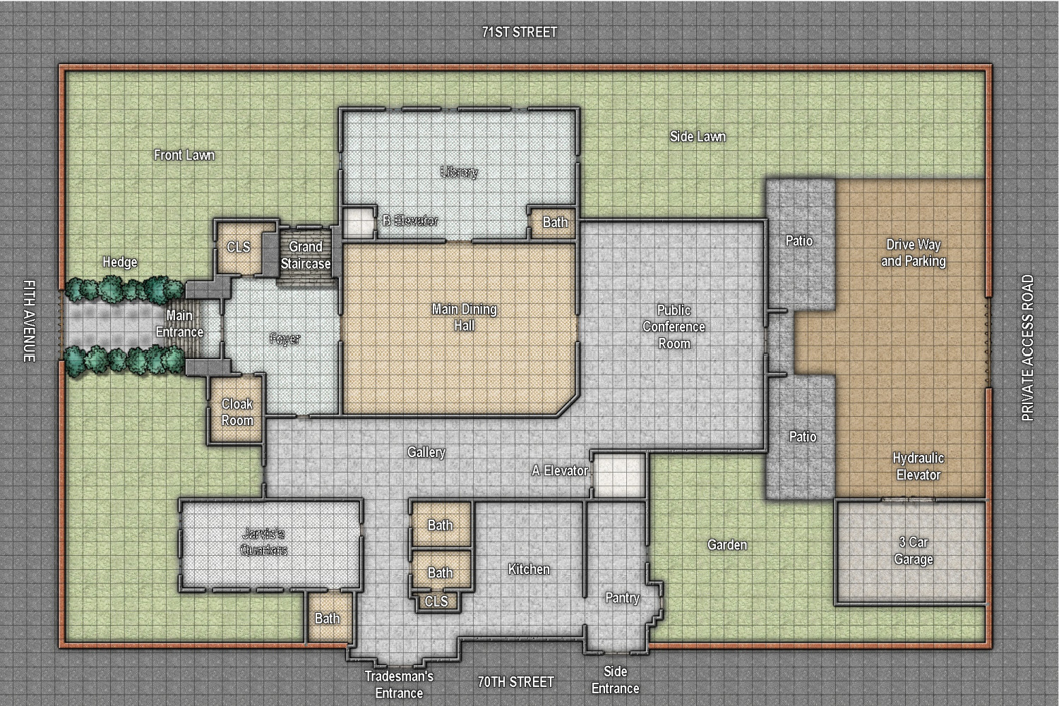
This is Avenger's Mansion for the upcoming Marvel RPG, and I can't the get text on 4 names to look perfect. Either "Jarvis's Quarter's" looks OK, but "Library", "Foyer" and "B Elevator" look weird, or vice versa.
I've tried putting the text on separate sheets, changing the floor pattern, but nothing works.
All the other text is fine no matter what I do, but these 4 texts seem to be linked somehow, and I don't understand why. All the text was done at the same time with the same font, size, and other parameters.
I printed off a low res version to show the problem and now all 4 names have gone weird.
Any help, once again, will be gratefully appreciated.
Dak
Comments
Looks like effect acne to me. Look for LoopySue's take on that here in the forums.
Try copying the text onto a new Sheet with no Effects on it in exactly the same place as it is now (so the two texts overlie one another). It may work better with the new text Sheet below the original (but still above the floor) or above the original text Sheet.
Alternatively, you might try changing all the text's colour to something slightly different to what it is currently (because the "acne" effect seems to happen when there's something of an identical - or nearly identical - colouring on two overlying Sheets which have certain kinds of Effect in operation). In this case, it may be simply the text Sheet's Effect interfering with the specific colour and shape of the floor fill's patterning.
Awesome. Thanks JimP and Wyvern. I changed the colour from 15 to 19 and it has worked a treat.
- Is this floorplan from a pre-existing canonical source?
- If so, is it open for some small modifications?
If the answer to question 2 is yes, here are my suggestions for improved realism. (If not, then never mind.- Sidewalks on Fifth Avenue and 70th/71st Streets would be nice since they are public thoroughfares.
- The "Private Access Road" should be gated at both ends so the parking lot doesn't need to be.
- Each patio should have an access door as should the garden and side lawn. (Some fire exits* wouldn't go amiss.)
- The "Grand Staircase" looks nice but where does it go? Are there any other staircases from the ground floor?
- The boundaries of the "Hydraulic Elevator" aren't clear. Does it go up, down or both?
* The Avengers' Mansion isn't just their home and headquarters; its "Public Conference Room" makes it a public building which means it has to conform to municipal, state and federal safety codes. Even if the building is privately owned it hosts a federally sponsored/chartered group so compliance to these regulations is politically advisable.It was only posted to demonstrate that the problem I had with text had been solved because of the kind advice from Wyvern.
No, it's not open to any modifications.
Also, if you look on the map of Manhattan the area between 70th and 71st street on 5th avenue is The Frick Collection.
There is no Avengers mansion, sorry for the huge spoiler here, but it's all make believe! I know it's a massive disappointment, but some people actually make stuff up for the sake of a good story that has no correlation to reality.
But then again, that happens when one uses the imagination.