WIP: Cepheus Engine / Traveller tactical battlemap
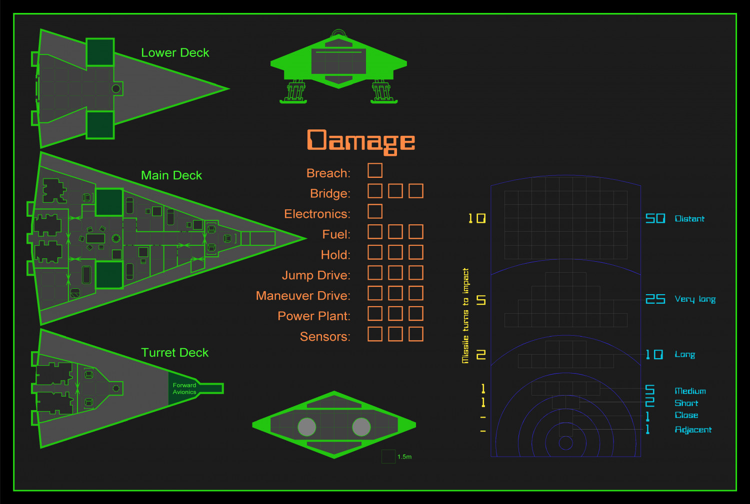
About a month ago I stumbled into a "tactical battlemap" for Traveller (can't remember where), and I liked the concept enough to give it a try myself.
I don't know if I'll use it since my I'm playing my Traveller/Cepheus game in person. But, we make maps because we like to make them, right?
Anyway, this is what I have so far:
I did try to upload it to my preferred VTT, but I edited the image to have a transparent background (in case I want to later add something else as a background or something else).
I wanted to see if I can get some feedback on things to change, tweak, improve, or just what to put in the upper-right corner. Or how to choose better colors. I'm not the best at choosing colors.
Thanks!
Tagged:







Comments
Thanks @DaltonSpence !
Can't take much credit here. I just used the... Traveller Ship style (?). Not at my mapping computer atm, and I can't remember the correct name, but it's the second image in this Cosmographer sampler:
https://www.profantasy.com/products/cos3_examples.asp
All I did (style-wise) was changing the colors.
EDIT: It's called Cosmographer Traveller Deckplan
I ended up making 3 versions (using the magic of layers).
Cepheus Engine:
Cepheus Deluxe (the range chart is not really needed in CD, but it looks cool):
Mongoose 2E:
I guess I'm almost done. I just want to double check I didn't mix rules between systems.
EDIT: BTW, the range chart is my take on the "ruler" mentioned in this video: https://youtu.be/u0rPlnZ2uJE?t=599
For those interested in copying my color palette for your "Cosmographer Traveller Deckplan" maps, I made a macro to change all the colors in the main template.
It works for the Beowulf template, but I still have to figure out a way to handle errors (specifically, when no entities are selected for a given command).
And for the two or three of you who don't read every single post (heh), one of the limitations of using macros is that you can't change the symbol references already placed in a map (at least not in one step). There are four options to accomplish this:
For option 1, you might want to modify my macro above.
For options 2 and 3, something like this may be handy (especially if you're trying to create a new catalog, since you can use "Symdefs to Sheets", run the macro below, and then "Sheets to Symdefs"):
And if you go for option 4: please share it! ;)
And, to wrap it up, I made a catalog with the few trackers I made. I included both the main neon-colored version and a varicolor one (the range trackers use 4 colors and I can only set one varicolor, so my recommendation would be to clone+edit the symbol instead).
This is the catalog thumbnail (I selected the neon green for printing the varicolored symbols):
And this is the FSC for you to enjoy:
For use in your own tactical map, I do recommend adding some sort of glow effect. Blur Alpha worked for me with these settings:
Cheers!