A Teleport Hub
 Fersus
🖼️ 11 images Surveyor
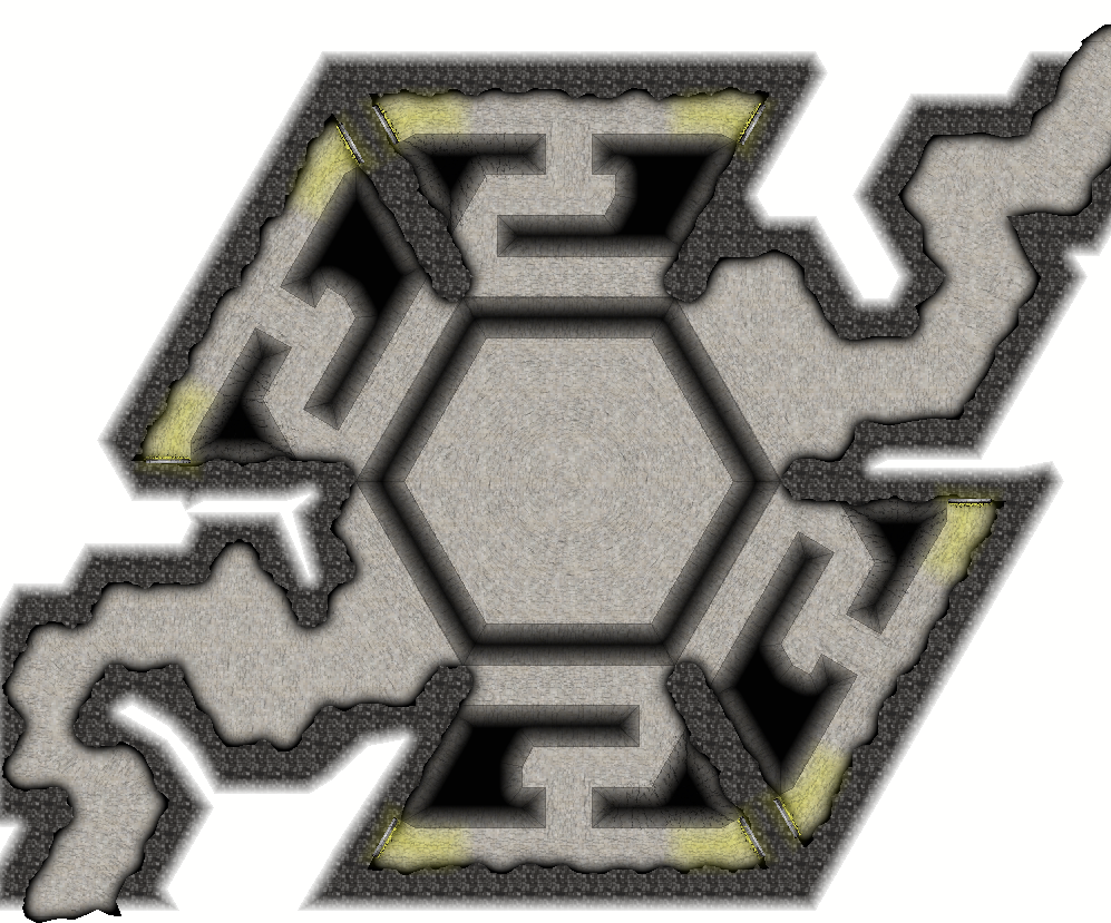
This is supposed to be a hidden cave that elves used to install 8 teleport portals for a guerilla war against the invading humans. But this was a very long time ago, the elves lost by now and some baddies stumbled upon this and used it for their nefarious purposes. Now our heroes found out about this, and it's time to take out the raiders camp behind the 8 teleporters one at a time.
One of the natural paths will be blocked by a cave in (there'll be a secret behind it, thats even older then the elven wars. Maybe that's why none of this looks like elven work? ^^).
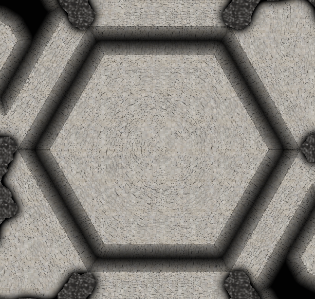
The hub is designed in a way, that if one elven warcamp should fall and enemies are using the teleporter to enter the hub, the defender on the central platform can shoot the intruders one at a time, while the enemy has to walk through the portal first to even get a glance at the defenders.
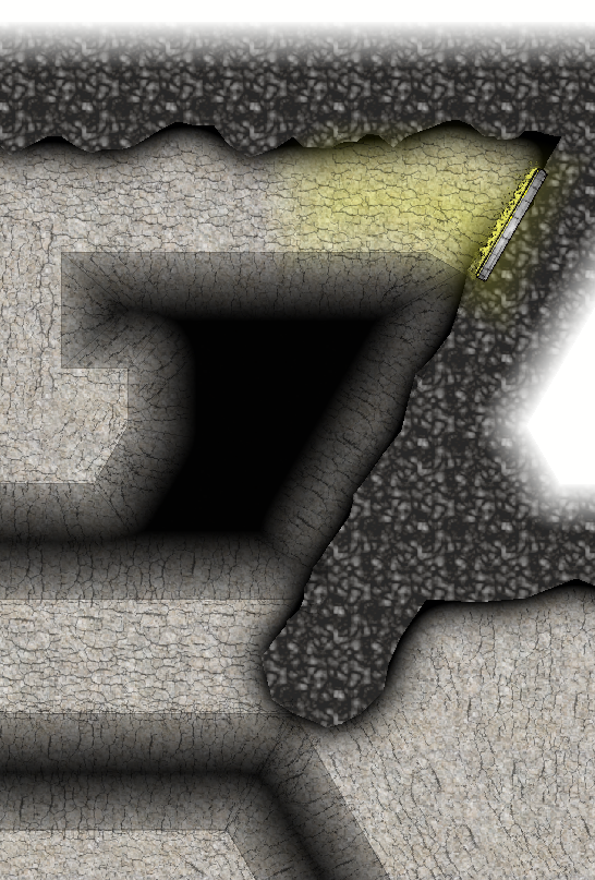
I'll add some drawbridges and decorations later, for now I wanted to showcase the bottomless pits. I really like how they turned out 🤩
The best thing about them is that this is just a black polygon with the edge fade effect and some lines added to emphasis the contours. The "cracks" symbols from the CSUAC Symbol set where used A LOT here, as they really made it easy to get the result that I was aiming for.
I ended up using them even for the floor that's not near a pit, just because they are a really nice touchup for the bitmap fill...
I'd like to get a similar 3D effect with the cave walls, but I don't really know how. Any suggestions are highly appreciated 😀





Comments
Cool stuff!
One way is adding more sheets for additional, superimposed, tiers of cave wall - say two or three - where you gradually alter the shading properties for each so as to create a sense of depth.
Granted, it's more of a paper theatre approach - but who doesn't love paper theatre?
Oh, that's a good Idea! I'll try that! Thanks Lillhans!
perfecto battlemap!
I played around with Lillhans' suggestion of layering different sheets that get darker and darker, but I was not happy with the result.
After hours of trying it hit me: why don't I try to superimpose a lighted bevel on my cave fill? The cave wall fill was to dark for that, but after choosing a brighter one, it looked quite nice:
But now for the boss level: The fade to wight... ahem... fade to white of course ^^
AS implied in my first version, I'd like to save ink by not printing the negative space behind the cave wall. So I added a layer to the bottom of the list with a strong edge fade effect. The Idea being, that the plateau where my view cuts into the cave walls will be white and the edge fade makes the cave walls brighter the "higher" the elevation is. Just as the traps indicate depth by getting darker, the edge fade should indicate height by getting brighter.
This looks okay-ish where it works, but unfortunately it leads to a lot of acne:
and it's even worse on printing:
"ok" I thought. "This is surely this $?§!%&! effect again where effects don't work properly when the color underneath is the same. I know how to handle this: just add a layer in a different color just beneath the fade-to-white Sheet (well: on top of it in the sheet list), then the effect should vanish. It feels like quite the roundabout way of solving it, but it should solve the problem, so let's go!"
Well, it didn't:
It did improve the situation quite a bit, as this is the printed version again. So when we are sufficient far away from any edge where the fade effect could be triggered, we indeed get a completely white area. But on the edges the acne still appears revealing even the black polygons that I hoped would fix this problem.
Does anyone know what's the proper way of handling this?
Looks good :)
I think you might have more luck (but I'm not guaranteeing it) if you use a sheet over the top of everything, place a slightly off-white rectangle on it to cover the whole map, add a Color Key effect to that sheet followed by the EFI, then copy the floors on top of the white rectangle and use change properties to convert those copied floors to magenta polygons (to cut them out of the rectangle).
You can enhance the depth of the floors by adding a dark glow effect to the FLOORS sheet, set to Inner.
So, I think I finally have got where I want to be! After a long battle against the Acne (TM), I tried different background fills and different order of the sheets until I got everything just right:
Of course, the version without the fade to white looks nicer, so I'll keep a version without the fade as well:
Thanks again everybody for your patience and help!