

WIP: Latest Commission Maps
 jmabbott
🖼️ 39 images Mapmaker
jmabbott
🖼️ 39 images Mapmaker
Hi Folks,
Here is a WIP of Map 3. The main temple for my latest commission. Usually, I just get sketches and a very brief art direction. This time, along with the sketches, the art direction is very detailed and I've also got the draft text - makes it both better and harder for me; I have some license to do what I want but I I'm expected to include more detail...
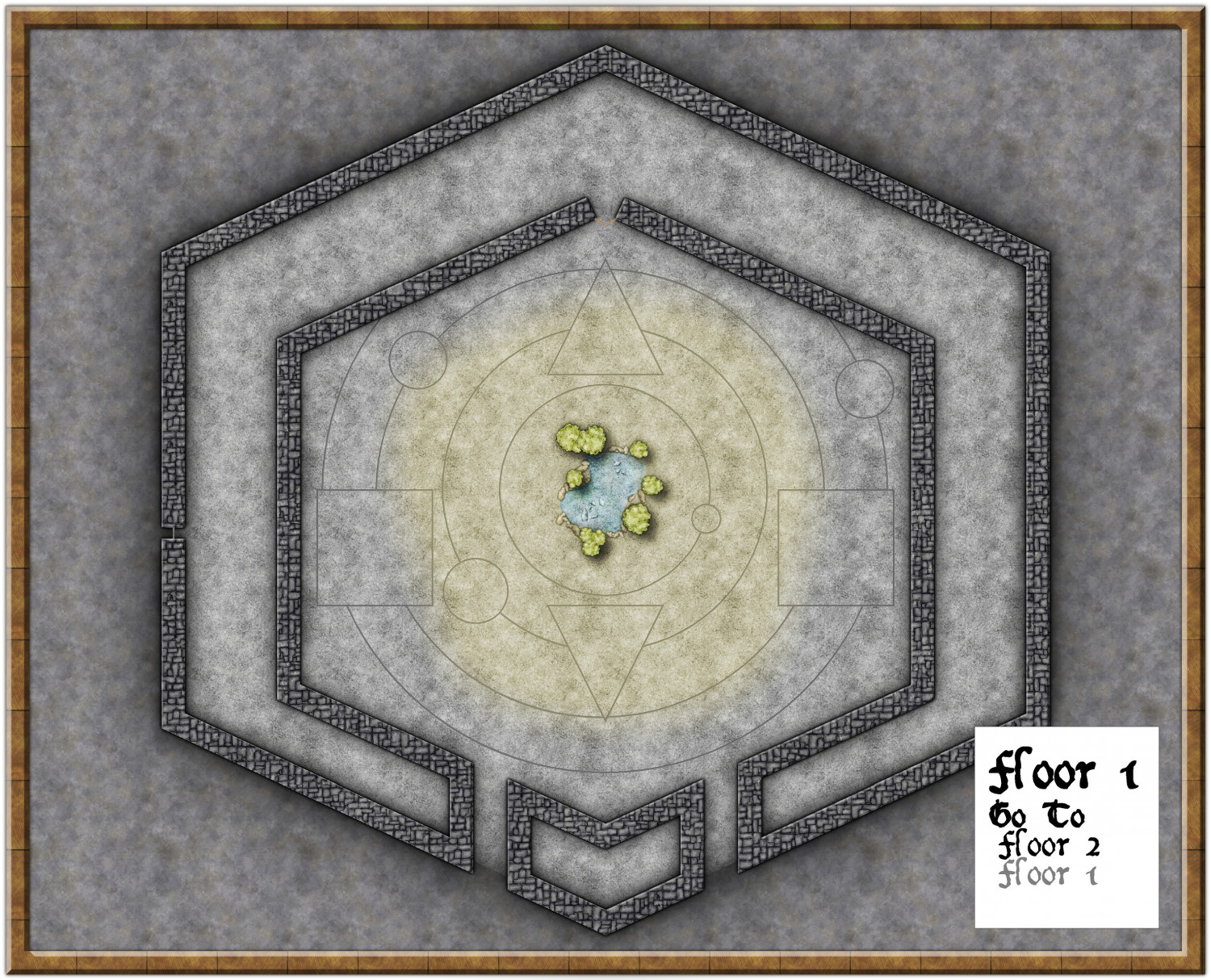
I'm thinking the circle on the outer ring would probably be better located bottom right... thoughts?
The yellow in the centre is meant to be the light coming in from the domed ceiling...
![[Deleted User]](https://secure.gravatar.com/avatar/c75d9a245b74d9c59be0999ea81ca541/?default=https%3A%2F%2Fvanillicon.com%2F92add7f8c954488718110edc4896ad39_200.png&rating=g&size=200)


Comments
The outer-ring circle seems fine where it is. Moving it might unbalance the look of the whole, assuming you have licence to move it at all, of course. I imagine that's why the whole central design is off-centred to the hexagonal walls.
Might be worth considering a different wall texture, as the rectilinear alignments in the current one make it look a little odd.
@Wyvern The central design is centered to the outside walls, the concentric rings may not be exactly the same distance apart (I may or may not have had SNAP on). Good idea re the wall texture.
Ah, right. Hadn't noticed the different wall separations - the interior walls on the southern sides seem to have fooled me!
Did you know there's a tiny gap in the middle of the western outer wall? There seems to be a very thin piece of wall (?) across it, as it looks different to where the entrances are on the south side, and the floor texture meets the outside floor texture. Hadn't noticed that sooner either. Unless it's some kind of window?