oh dear... Traveller Sub-Sector 3d mapping, I hope
 JimP
🖼️ 280 images Departed Legend - Rest in Peace
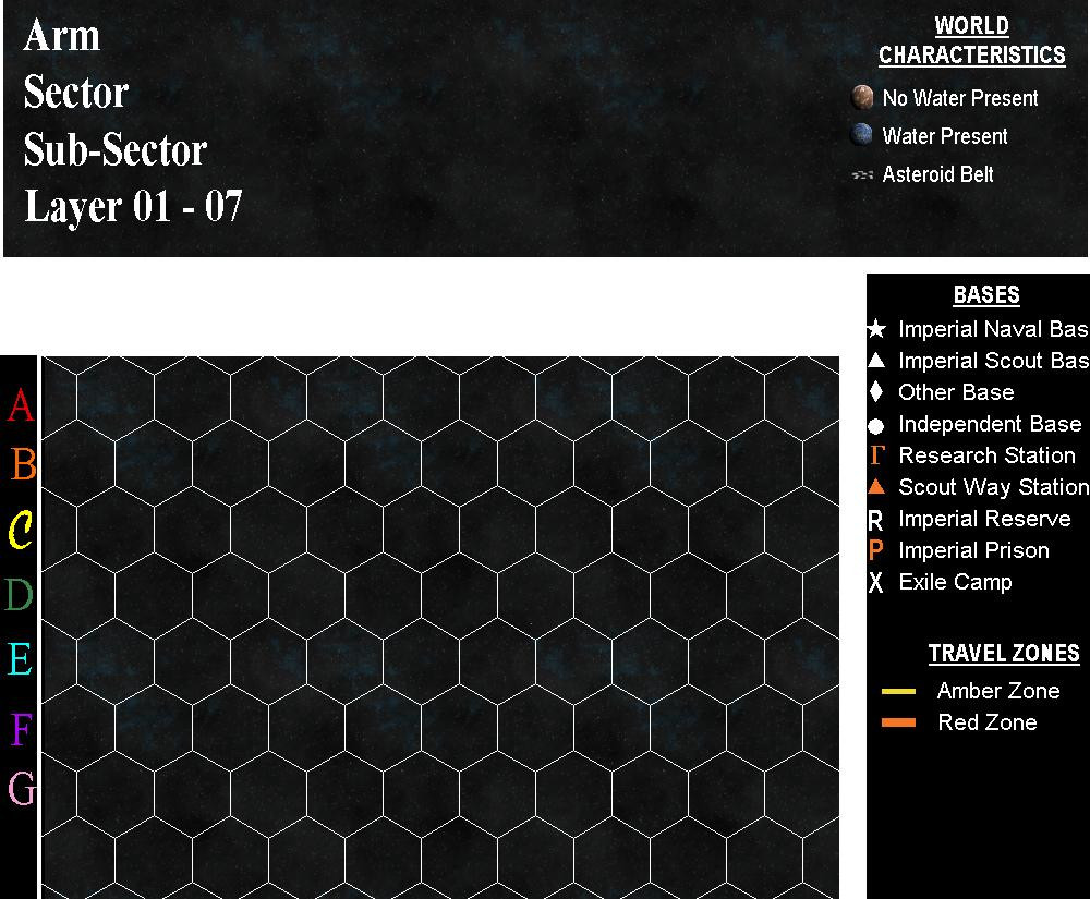
Side view of a sub-sector... one version. This is the one I came up with.
But there are 80 places to put planet maps in a sub-sector. This one column, or 10 places. So if I wanted to make layer D or E the 'center' of that sub-sector, then other planets could be mapped above and below that center area.
You in the back, no screaming ! Headaches are okay.
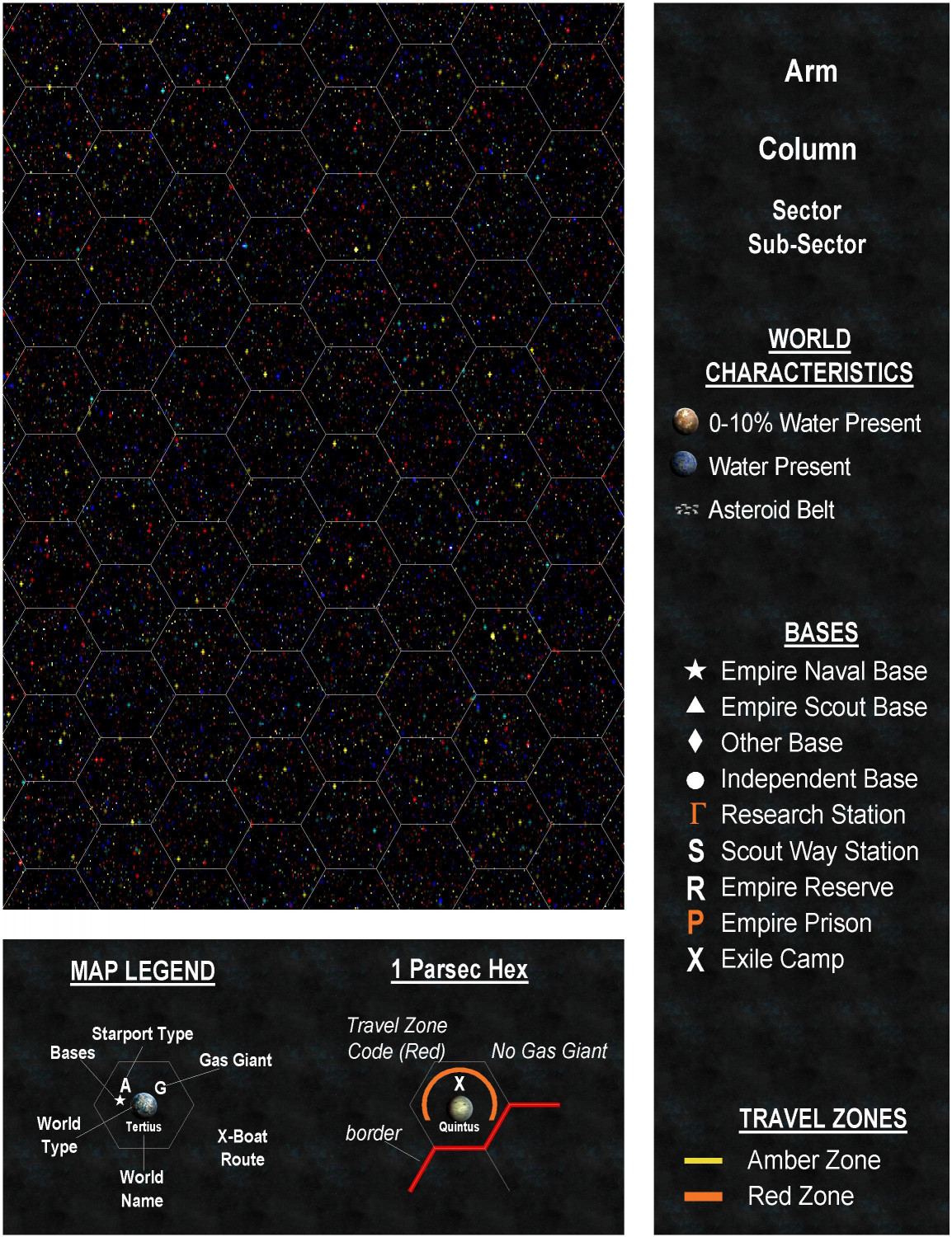
This is what the standard overhead view of a sub-sector looks like.
So, I would have to make 8 of the first map... or figure out a way to 'stack then sideways.
That means all but one would have a transparent, or no, background so all the planet maps in a sub-sector could be seen.
Of course, I could use star symbols, and have links to each planet map page.
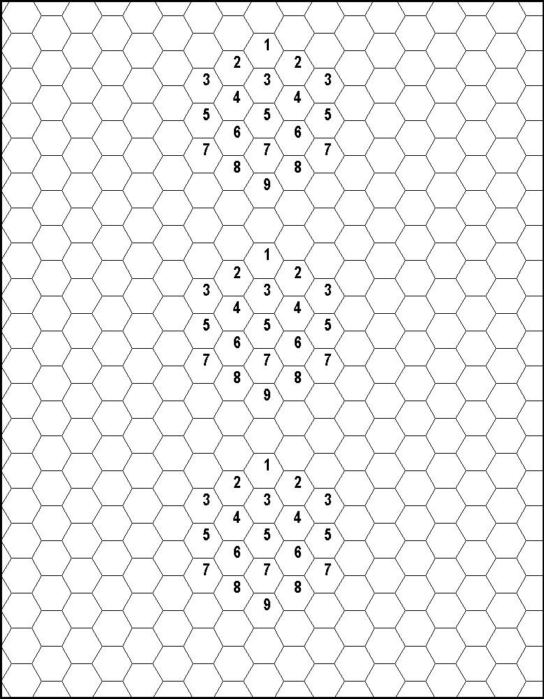
There is another 3d sub-sector template out there.
That one stacks them, but only above, on, and below the ecliptic.
If I wanted to do more layers... it would take multiple maps of the one just above this text.
I would love it if I could figure out an easier way to use the top one, but it looks like I'll be using the bottom one.
What do you think ?


Comments
Honestly, I would probably abandon the traveller symbols and use the cosmographer height symbols instead. The indicators on those were made to show positions above/below the plane.
Making multiple maps does not make sense to me, because then you are removing all ability to show things in relation to each other, which is a very important aspect.
I doubt I would do my entire site with this, because it would mean a big jump in the number of maps.
From discussions in Traveller threads elsewhere, people believe there should be a way to show that not all solar systems are on the ecliptic.
To map something in true 3D you would have to use a 3D model, such as a Blender model. I'm not suggesting that you should actually go and do that, but to consider that there is a real limit to how complicated a 2D map can become in its attempt to describe a 3D situation before it becomes unreadable.
Wouldn't it be better just to map the location of each solar system on a master map, and then to map each solar system as a separate map, with maybe some kind of 3D alignment symbol to show it's orientation relative to the plane of the master map?
One could also look at AstroSynthesis from NBOS (which is available on DriveThru). There's a plug-in to do Traveller system generation, but I can't vouch for how current or accurate it is. (Actually, I think there's two.) I believe there are some potentially interesting import and export functions, too, though I can't swear to it.
https://nbos.com/products/astrosynthesis/screen-shots
I have Astrosynthesis, but its too small text for me to read easily. I zoom in, and I lose track of my start point.
This will mostly be an experiment. So I don't think I'll do much beyond trying it out to see if I can come up with a 3D representation of a sub-sector. Of course, it it turns out to be easy, I could do more than one sub-sector.
Thanks for the feedback.
Tried an insert of a second map, it went on the grid sheet and layer... the fcw contained a sheet and layer for Worlds2. No idea why the fcw went to grid instead of the active sheet and layer worlds 2.
Anyway. I got them all fixed. I placed some planets on layer worlds and some on Worlds 2.
Here is the jpg with all of them.
Just worlds layer.
with just worlds 2 layer active.
I think this would be fairly easy to do, but I'm not doing my entire Traveler site.
I need to displace slightly each column so they look different.