

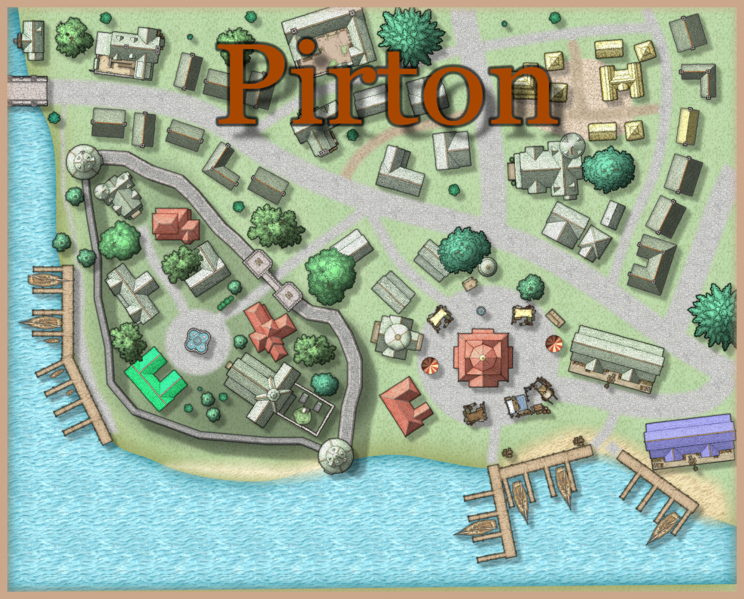
My first town map I'm happy with.
 Stephies
Newcomer
Stephies
Newcomer

Made this town in a few sessions and was quite pleased. Any tips or criticisms are greatly appreciated.
Tagged:


 and 2 others.
Comments
The map looks nice. I am not a fan of the text placement/color though. I would recommend you moving it to the bottom left into the water and making it smaller. Perhaps change the color to white and add a black glow to the text. That will give it an outline.
Drop shadows make the text look like it is hovering, especially with the X/Y values you have set. So it looks like the name of the town is flying over it creating shadows like it is trying to menace the villagers.
You may also look into a glow for the water/land where it meets up.
Good, but the title should be moved to bottom left. A few miscellaneous items and or fences wouldn't go astray, like you have done for the market place. And a scale bar is vital.
Well done though. I like it. Have you thought about adding it to the Community Atlas?
Thanks for the advice, here is attempt number 2. I moved the title and added the scale and compass rose and, a few more symbols. I tried messing with some sheet effects but couldn't get shoreline to look as good as I would want.
Hi! Very nice! I like it.
I could just suggest to add some datails: details really make things look better:
You could try to change a bit the grass colour, adding a second layer with darker grass here and there. Some small stones around the streets may also give a good touch. In general, all these kind of small things makes all look even nicer.
But as I said, I like it!
I like it, but what is happening to the shore on the bottom left hand side, where some of it appears to have a sharp line. Otherwise, I think the shore is fine, perhaps a few rocks might help.
I like the gravel.
You could try going to the land sheet and adding glow. Select outside and then use one of the blues that looks close to the water color. 12.5% and 5 blur.