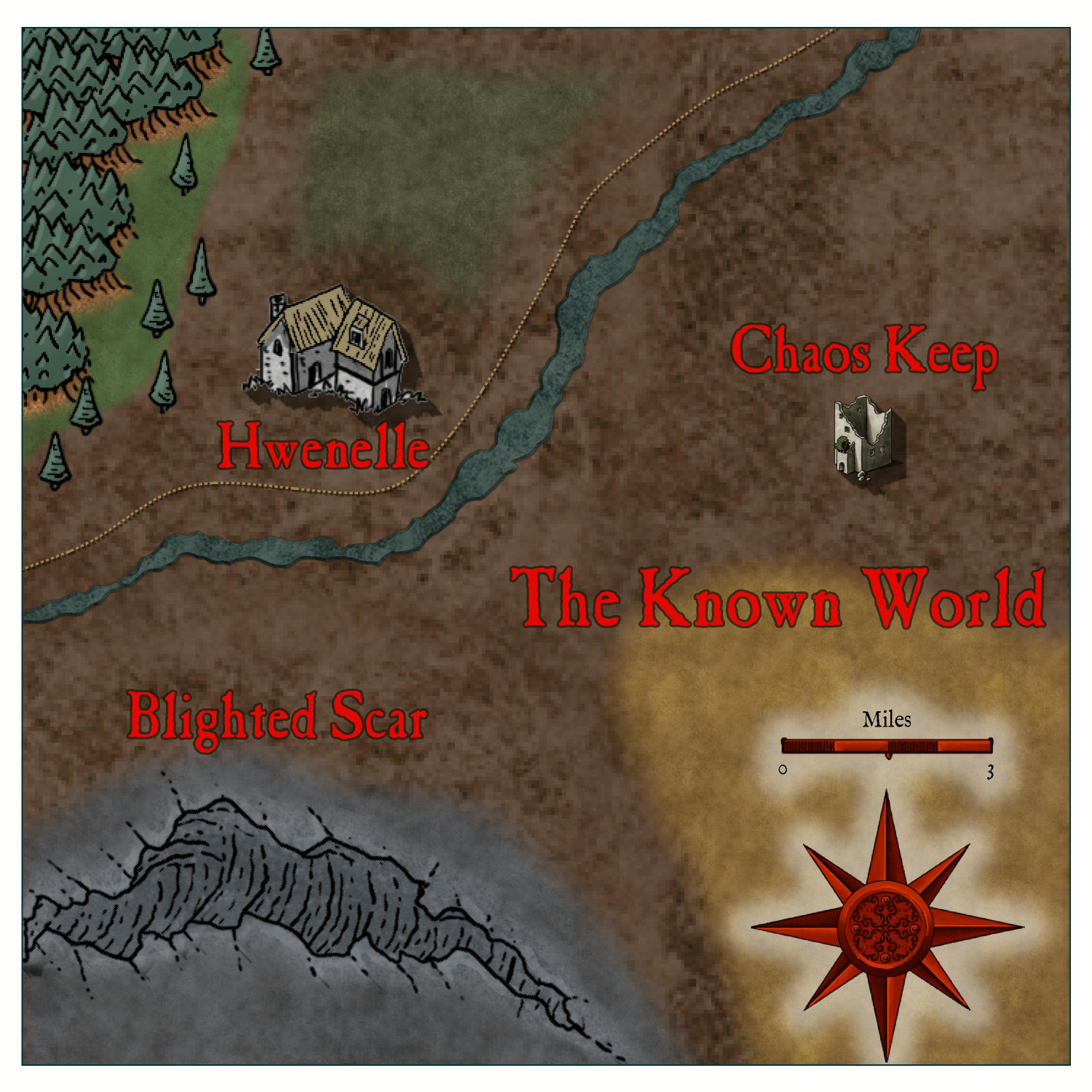
First Real Map! Questions plus feedback request. From Annual 2016 Dark Realms.

Here is the starting area for an upcoming Dungeon Crawl Classics game.

Question 1: Whenever I change from the overland Map Menu, to the Dungeon Menu, and back to the Map Menu. It forgets all the presets for whatever style the map was created with (Annual Dark Realms in this case). The only way I can fix it is to close the program and open it again. Is there a way to do this in program to get back to the original symbol style with their default options (default landmass, default sea, etc)?

Question 2: Is there a way to to have the edges of the map "torn"? Or would that be better done in an image editing program?

Let me know any thoughts or techniques I can use to improve on this map!


Tagged:

Comments

  • MonsenMonsen Administrator 🖼️ 81 images Cartographer
    edited February 2022
    1. When you hit the add-on buttons the program loads some defaults to ensure that things work sensibly. For example, if the overland filters were kept when you went to the DD3 add-on, all catalog buttons would just return empty results because the overland filters doesn't make sense in a dungeon setting. Unfortunately, this also means that the settings loaded with the map is lost. Generally, it is not adviceable to use these buttons in the middle of a map. If you wish to load symbols from a different add-on, use Open Symbol Catalog instead, this allows you to load any catalog, not just the one provided by the defaults for whatever add-on you switch to. The easiest way to reload the correct settings is to just reload the current map, you don't need to restart the program. Simply save the map (if you have changes you wish to keep), then simply pick the map from the top of the recent file list in the File menu. This will reload the map, and reload the settings from it.
    2. One way of making torn edges is to place a white polygon with some fractalized edges on top of everything. The white will cover up part of the map, appearing as a tear. Add some inside glow and perhaps some blur or similar to make it look more like a tear and not just a flat poly.
    LoopysueThirstyBard
  • Awesome thanks! I'll start using that button instead of switching wholesale.

Sign In or Register to comment.