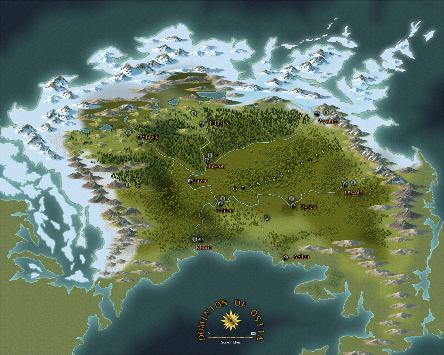
WIP: Dominion of Ostia
 Calibre
🖼️ 39 images Mapmaker
Greets, fellow artists
Well, working on another map from my game world, Estonisch. Trying to keep it in a similar style to others for continuity. This one is giving me many hassles 😁
Anyway, please critique. Can use all the help I can get...
Still a lot to do...
Cal






Comments
Well, continuing on. I have issues heh.
1: Hard edge to snow line
2: Can't decide whether edge striping is good or bad heh
3: I dislike the dashed 'track' line, but can't find the dotted line in styles
4: Not sure if vignettes are large enough
5: I can't find suitable structure style for inns, towns, etc.
Any advice on these and other issues would be very helpful, please.
thanks
Cal
OH, almost forgot:
1: If I raise the anti-aliasing above 30, my snow fill at top of map disappears.
2: Need to add islands out in the lower bay and off northwest coast
3: Move tree lines across those rivers! heh
thanks
Cal
It's a lovely shape and design, Calibre :)
Can you increase the width of the Edge Fade, Inner effect on the snow to give you more fade? 30% antialiasing should be enough for most maps, but I don't understand what you mean by it causing things to disappear.
I'm also not really understanding what you mean by vignette. To me it is a darkening of the corners of an image.
If you don't find the correct line style, it is easy enough to make your own. Just click the line style indicator, and make a new style. For a dotted style, you'll want very short line segments, and a distance between them that is still quite short, but at least twice as long as the line segments. And make sure you don't use paper scale.
Thank the Gods you answered! 😁
If I increase the edge fade, then the snow draws back from the coastline and really looks weird. I fought back by adding another texture over the snow further inland (tundra) and the faded that much more; but, I don't like it all over the place. This is one of those times I wish I could use my old analog brushes and do a manual blend heh.
The vignettes/symbols for castles and towns. Are they too small? Also, I'm not sure on type font and colors yet. I really do appreciate feedback/critique---I am used to it from my days in art/graphic design classes heh.
thanks
Cal
Oh, yeah, all the snow on the upper part of the central land vanished when I increased anti-aliasing above 30 for exporting. Weird, eh?
Thanks, Remy. Man, I will try. Seems like I tried before and it was a mess.
😁
You can use a Color Key on the coast side of the snow to stop it peeling back. This is a different setup where I've used other effects as well as the Edge Fade/Color Key combo, but if I turn those effects off, you can see what I've done here.
There are 2 polys on the same sheet. Light and dark pink (the light pink represents the snow). The dark pink will be removed by the Color Key, but before that the combined area is eroded by the edge fade. The end result is that where the light pink is the edge of the combined area that edge will be faded, but where it is protected by the dark pink it will remain.
An alternative to this is to use the same snow texture on your tundra sheet, but you can have transparency acne issues if you do it that way.
Thanks, Sue.
NEVER would've thought of that. I appreciate and will experiment.
Remy, I'm looking at the Edit line Style dialogue and shaking head. I'll search for a tutorial. I remember Ralf doing this in a video not awfully long ago.
thanks
Cal
Hey @Calibre !
That mape is very nice!
Thanks, indeed, sir.
Please let me know if you see errors I can correct. I'd appreciate it.
Cal
Cal, I wonder why there is so much ice reaching southward on the left rather than on the right. And tundra and boreal forest are 2 buffer zones between ice desert and temperate biomes
I forgot to say - Another way you can affect a smooth gradation but a sharp edge at the ocean is by placing the ocean on top of the land and its terrains, so that the terrain shapes vanish under the sea and only show a faded edge on the land.
Darklands WATER sheet already had the Color Key sheet effect. All you need to do is cut a hole in the ocean to expose the underlying paper - the land, once you add the terrain colours. You can convert a map to be water over land if you wish. It just takes a bit of thinking and careful reordering of the layers. You don't have to redraw your land shape because it can be turned into the magenta shape that cuts the whole in the ocean. Here the green is faded on the land, but has a sharp edge where it vanishes under the ocean.
Greets, Quenten
How goes?
At the risk of adverting to a meme or is it trope? I must advise that this continent was devasted by elemental forces 7000 years ago. Just off map to the top left is the Palace of Immros. Immros is one of the demi-urgic elemental entities still on the Continent. Think of him as Elemental God of Ice. His influence spreads outwards and forms the HoarFrost Maul (the area you had concerns about). So, I bend the rules of physics a bit heh.
thanks for the feedback, sir
Cal
Thanks, Sue
Brilliant!
Cal
Ok, my fellow artists, I am progressing!
Bear with me on Font and Text colours, please. Can't make up my mind. Need to study it a bit.
Quenten: the opposing elemental force is personified in the Fane of Terranos, Earth Elemental God who keeps the ice of Immros at bay, so to speak.
Cal
I really like it a lot!
But, if a have to say something, I would make the background mountains bigger. It will make the streams that goes south more natural... Also, the stream from Otlhon to Kotrhis may be a bit wider... And have a name 😉.
Thanks indeed, sir.
I'll take a look on mountain size. I've been thinking they are still too large for me heh.
River names are coming up!
really appreciate the feedback
Cal
Hey, guys
Going to call this a final forum version. I must admit I'm getting antsy to try a new style but as I said I wanted to keep the styles the same for all my game maps. Anyway, of course I still need feedback if you can. 😁
thanks