

WIP Everyone's making Inn's & Taverns - making floor look used / abused
 EdE
Betatester 🖼️ 23 images Surveyor
EdE
Betatester 🖼️ 23 images Surveyor

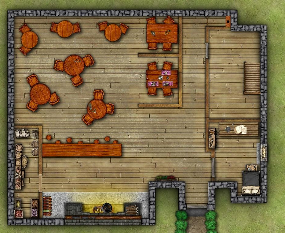
I was trying to come up with a way to make a wooden floor look aged / scuffed by heavy use. The effects are hidden in the upper image and turned on in the lower image. Any thoughts on whether I am getting the visual effect I want?
Happy New Year all
Comments
That's pretty good :)
The only problem I can see is that the furniture now looks too perfect compared to the floor.
Yes, it does. Thanks for the feedback Sue.
Ed
Looking good.
For my eyes, the chairs are a little too big. Esppecially in comparison with the loo and bed.
Yes, I have realized I still need to work on scaling. Good eye! Thank you for the feedback.
Looking fine.
Maybe add a few scorch marks in front of the fire as well? And worth looking through the "Debris" symbol catalogues for a few suitable stains, perhaps?
One or two of the symbols might need moving slightly - the bedroom table seems to be embedded in the wall, currently, for example.
And maybe add some more windows? (Or at least a ventilation hole for the toilet!)
Wyvern, thank you for the feedback, I took a closer look at the symbols and positioned them more appropriately...whilst making a few changes. I was focusing on Sue's feedback and aging the tables & chairs. Your suggestion of soot on the fireplace was something I overlooked. Windows are currently missing on purpose. This building was initially a frontier outpost built to withstand raids by warbands of orcs & ogres, so either no windows or arrow slits. Haven't decided yet. still playing with the common room furnishings too
Oh yes - the furniture looks much more like its been battered around.
Arrow slits would be an interesting change from the norm, but either way.
Have you thought of making the walls pop a bit more by playing with the sheet effects on the WALLS and FLOOR sheets?
Thanks for the feedback, Sue! I admit, I have not started playing with sheet effects on the walls or floors. I'm never really certain what you mean when you use the word "pop", but it come up frequently in your comments on my maps 😁. The walls do look rather mundane and very square, I'll play around with the effects and see what I can come up with.
DaltonS
No Roman architecture here. I did see a hypocaust in the Roman baths in Bath (UK). Your point about lighting is well taken. I was playing with a triangular fireplace in the upper left corner of the common room for heat. I intend to have a chandelier hanging above the common room accessible from a second-floor balcony (flamboyant swashbuckling anyone?). It makes sense to move the bar "up" a little more...and add a Barkeep's Rump Roast to the menu immediately😛.
To make something pop is to make it stand out, or up in the case of walls. Some people lengthen and deepen the shadows to make things look taller, though this can be a bit misleading because it makes the whole map look as if the building has no roof whatsoever. Some people play with the glows, especially a faint dark glow set to inner on the floors coming in from the edge, since it mimics the real world. Light never gets into the corners as intensely as it hits the floor in the middle of a room.
As a frontier post, it might be possible there'd be better defences around the doorway externally than there are currently. Indeed, it's possible there'd be no ground-level access at all, with the main doorway on the level above that, accessed by a narrow stairway externally. Certainly, reworking the building as an inn might alter the access options, but some of the defensive structures would likely still remain. That'd be a lot of extra work here though, I realise!
There is a problem with the fireplace walls defensively now though, in that these are both thinner than anywhere else, and heavily advertised on the outside by projecting beyond the main line of the walls. In reality, the fireplace flues would likely have been built into the walls to disguise this (and probably be smaller than are currently shown), or be reinforced externally to have the same thickness as the main walls. Orcs and ogres might be reckless, but they're also not necessarily as stupid as systems like D&D have sometimes portrayed them 😉
Thank you, Wyvern. I appreciate the insights into improving the design of the building. I will take a run at a 2.0 version of this at a later date but for now I have a D&D game to GM this week and I need the map done. I gave in and added windows to the ground floor and nixed the upper story. I'll take these learnings and use them for my next "frontier" Inn. For the moment, I give you the Shaggy Shep Inn and Tap Room. Center of life in the hamlet of Kilmeade.
Cheers.
You've worked hard on it, and it's a pretty good start :)
The locals all know that the roly-poly hobbit sheriff's native form is nine feet tall, smells a bit of sulfur, has a fifteen foot wingspan, and has an unsettling number of teeth visible in an oversized smile. Visitors bent on wrongdoing usually find out about this just a little too late to do them any good.
Nice map, @EdE! I like the attention to detail overall. A nice technical final touch might be to add a little antialiasing (maybe 25% to 50%) on the final export to smooth out the edges of everything.
Good luck running the game!
The Rogue (a.k.a. the Thief for us oldsters) was heartbroken since there was no chandelier to swing from but otherwise the map was well received. Thank you for all the advice.