

First Cosmographer Map
 JulianDracos
Mapmaker
JulianDracos
Mapmaker
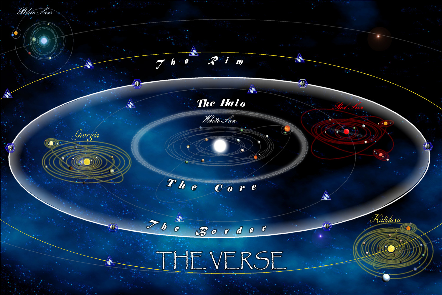
Here is my first attempt at using Cosmographer. It is a system(s) map. I am in the process of labeling things. I had so make a couple of symbols. I am thinking I may like the text effects better if I did them in GIMP. Hopefully the background image is OK. The first time I made a space background.
Before I continued labeling things, I thought I would see if there were any comments on what is completed so far.
Tagged:


 and 3 others.
Comments
Very cool.
This is the map of The Verse in Firefly, right?
You could maybe give the sun symbols glow effects in their respective colors. In the show, they worked with the scolors of the suns to show the difference between Planets in various systems.
I really like it. I did have a difficult time reading the cursive font at first but I think its something to do with the cursive and italic 'S' that I don't really care for. I also was just going off the in-browser image which is a bit smaller than the actual on my screen so that doesn't help.
I didn't really think about the background at all, just kinda took it for granted and it blended with everything great - which is perfect for a background.
Overall it's cool map and I like it a lot.
Yeah this is from Firefly. The cursive font closely matches the official map. I picked one a little different to improve the S. I may change it because I am not a fan of the capital S either.
I have a problem with the glow effects. For whatever reason, when I add the glow effect, it makes it a block around the suns. It looks unnatural and very fake. For the white and blue suns, I doubled the symbols. One is the normal sun. The other, I think might be a planet symbol. Anyway, it has an outer radiance similar to a glow that I put behind the sun to try and get a glow effect.
Was it the Glow Effect, or the Outer Glow one, you were using? Outer Glow does need more work to stop it looking like a solid mass outside the highlighted object sometimes, as there are more elements of it you can adjust. Glow usually works quite well without having to do this, particularly for circular objects (Glow doesn't work so well for the corners of angular objects however; Outer Glow is much better for those).
You might want to think of swapping the locations for the Red Sun and Georgia systems, as the red coloration isn't so easy to see against the darker sky background. The yellow for the Georgia system should still be fine against the darker area where Red Sun is currently.
I have tried both glow and outer glow. There is a bit of a difference, but largely the same in them being more of an octagon instead of a circle. However, there is a bigger problem. All glow effects leave a dark space between the sun on the glow.
I may be able to add a polygon background with an edge fade or something like that to get a glow. I will have to play around with it.
I will see about swaping the places of the Red Sun with Georgia to see how it looks. They are both in the same orbit, so that should be OK.
So what I ended up doing was adding a new sheet with a red background. I then added an glow effect and a blur. I only did this for the red star so far. Does this look better?
I have not moved the systems yet. I am assuming I am going to have to select everything and move them over manually, but I thought I would see if there was some sort of swamp command I did not know about.
Kind of hard to tell on my cell, but this does look a bit better to me.
The empty ring around the planets where the glow doesn't show is caused by the partially-transparent edge in the bitmap caused by the blur used by the original image's designer that makes the edges of the symbol image smooth. The effects system will treat those pixels as though they are solid and the effect starts only where the images are truly transparent (out from the perceived edge of the image).
One way to work around that problem is to add a sheet that has a simple circle where the symbol is located and about the same size, which this sounds like what you did later on. Apply the glow to the sheet with the circle and it will look as you were likely originally expecting (a big red glow around the symbol).
Having to keep a separate sheet for each glow color puts limits on using this technique. My extreme laziness limits me to a maximum of two or three sheets using this technique, but I've seen folks do many separate sheets and get nice effects.
I've not done much with Cartographer, so I hadn't realised there'd be such an issue with adding a glow to the symbols. There is a small glow built-in to the star symbols, but I agree a larger glow is really needed to show clearly what the object is when you're viewing the map at a distance.
The Red Sun system does look a little better.
If you still want to swap the two systems, I think you will be better moving the systems manually.
You could use rotate, providing you know the exact centre of the main orbit on which both systems lie, but this will also invert everything in the process.
Mirror copy would keep all the orbits and objects in their same relative positions once swapped to the opposite side of the orbit (don't do this on the labels though), but you would need to drawn the mirror line very precisely at an angle to accomplish this, AND mirror copy will force everything onto one Sheet if it wasn't to begin with. Plus you couldn't swap the two systems in one command, so one would overlap the other after the move (unless one set is on a different Layer, which you could hide before-hand).
Maybe mirroring or rotating the background star image would work instead? It would certainly be a simpler operation!