WIP: The Citadel
 Calibre
🖼️ 39 images Mapmaker
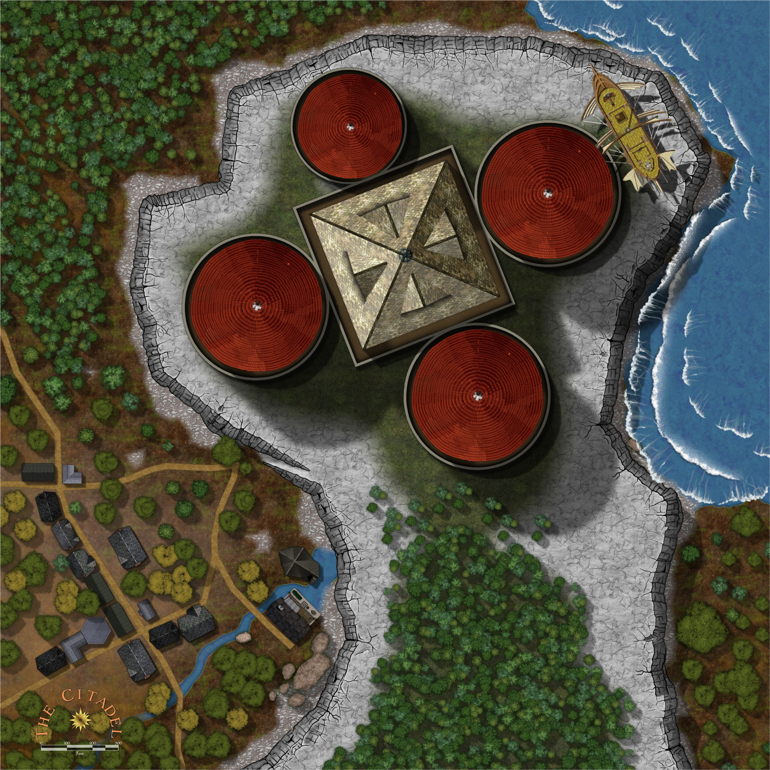
Well, in an effort to show the sheer scale and scope of 'The Citadel' on Mor Stonisch, I present this WIP.
There's a lot that needs tweaking and I'll accept any and all advice!
Not labels, yet but the logo and the scale are correct.
thanks
Cal


Comments
Looks great, Calibre :)
Only one slight adjustment suggestion from me. Where the shadows of the map are falling south-east, those towers and the central building seem to be shaded more on the north east. If you turn each of them by 90 degrees clockwise they will match the shadows in the rest of the map.
Ahah. For a moment, I didn't see what you meant. Yes, I see it now.
😁
Critique = good
Cal
Ok, did a little work on the conical tower tops. I've noticed trying to do non-visual rotate, that the rotation spins counter-clockwise. Might be my eyes, but I tested it vigorously heh. Correct me if I'm wrong, please.
I added light to the tower tops and used an edge fade. May need to tweak that a bit more...
Cal
Also, the drop shadow under the windship/skyship is there mainly for my players to clearly see it's floating; but I don't like that. I need to either displace it more and/or lighten. Not sure yet.
Cal
I tend to rotate things by eye, so I don't know.
The towers and roof look much better now that they are more in tune with the rest of the shadows.
With that ship I would probably blur the shadow quite a lot.
Will do. And, thanks!
Bah, wall shadow on tower seems to be muted somehow...will fix.
Cal
The shadows still seem confusing to me. The towers each seem to have two - a very long paler shadow, and a much shorter, darker one. That seems to suggest they're both very tall and much less tall simultaneously, with the longer shadow being cast by what's probably meant to be the much lower part of each tower.
The airship's what alerted me to this, as it's physical form clearly overlaps the part of the tower attached to the much longer, paler shadow, yet the ship isn't casting the same shadow; only the much shorter, darker one.
Yeah, shadows are hassling me.
Right now, I've removed the double shadows. I had a wall shadow on the top of the tower in an effort to remove the brighter area on the top. I'll fix that another way.
Ship shadow bugs the crap outta me. Thinking about how to fix that issue you point out. That's probably what's been bothering me subconsciously.
Thanks, Wyvern
Cal
Take a look, Wyvern:
The drop shadow is displaced by 45x 55y. It does cross the ramparts of the tower, but not the tower top! Grrrrr.
Also, LOL, the flags on the ends of the sail heads makes it seem as if it's torn into the tower roof 😁. I suspect the captain will face charges of Drunk on Duty...or, at least the Pilot will heh.
Cal
I actually thought the ship was docked at a level BELOW the tower roof (it seems to be in the earlier map version above here).
Shadows and hiding or showing them (because of the way Sheet Effects end up stacked in a complex drawing sometimes) can be very trying. That was a chunk of my afternoon too, and in the end, I've settled for something that looks fine viewing the whole map, but starts to look odd if you zoom right in. Moral being, go with the whole map view only...
Probably too complex to draw here, but some kind of elevated docking platform at tower height might help in this case. Not sure how that would work with how you envisage the aerial craft as functioning, of course, so that may be a non-starter anyway.