

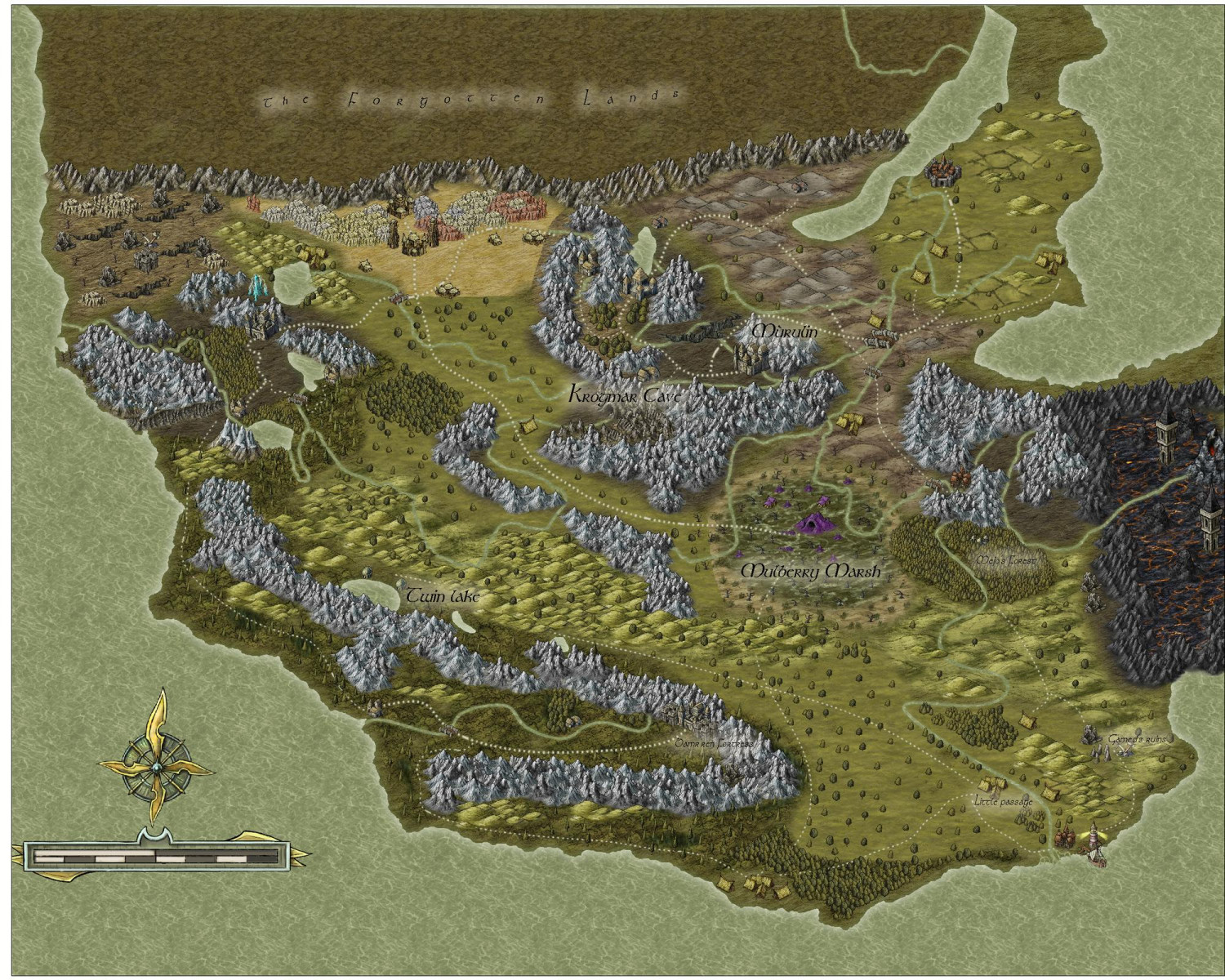
My first completed map utilizing CC3+
 OwlishlyTaboo
Traveler
OwlishlyTaboo
Traveler
Hi!
I am writing this post both to ask for both advice and to share all the challenges and obstacles that a beginner in CC3+ (like me) might possibly face and how I personally tackled some of them.
I bought the CC3+ bundle back around March and have completed a few villages, small towns and dungeons for a campaign I was DM'ing utilizing the CD3 and DD3 add-ons. During this time I tried to dabble a bit with overland maps and was never really satisfied with what I was creating which resulted in a myriad of unfinished maps of little kingdoms and small regions. This mixed with the DnD campaign ending led to some discouragement in map making so I took quite a break. Around last month I started again and faced the same issues with overland maps: all of them were abandoned either halfway through or sometime around the beginnings. I finally decided to force myself to finish a map and these are the issues I have found which might have made me unsatisfied with the creative production in the first place (I have absolutely zero art background in general):
- I found very hard to divide different terrains and to make the transition from one to the other look natural or aesthetically pleasing. (For example going from mountains with some trees and forests in them to some hills with only farmland and trees to then a swamp/marsh area).
- I definitely forgot to organize my symbols and layers a lot. This made deleting different symbols and certain layers that I was unsatisfied with very hard (this has made me restart overland maps in the past). The confusion was brought by the fact that some symbols automatically select the correct layers and sheet while others did not. I will definitely need to pay more attention to that in the future.
- I do not know if the map is too large or if I simply scaled the symbols incorrectly (I left most of them at default scale 1.0): when I zoom in the map the villages, cities etc. all look pretty to me; when I instead look at the general map zooming out I feel that there are too many symbols and it is hard to distinguish one place from the other. It looks a bit too conglomerated.
- It felt wrong to leave the default terrain on the map. I always felt this compulsion to fill as much as I could with different terrains the whole surface of the map. This might have contributed to everything looking too conglomerated.
- I couldn't find a way to add a sense of "unknown" to some parts of the map. I like the world-building to be collaborative with the group I am playing with. (i.e. players adventuring into some unknown parts of the map and suggesting/creating new landmarks such as villages, hamlets, caves etc.).
- I struggled with the effects that I could give to certain symbols and definitely want to get better at selecting certain effects. (This can also be solved with a better utilization of sheets and layers which again, I definitely did not do!). Particularly I would like to make the text look better.
- I also want to definitely improve on how to connect the whole region together in a natural way utilizing better roads and bridges. The towns look a bit disconnected to my eyes.
- The coast lines definitely look weird (in the sense that it looks weird that the forest terrain ends right up where the water starts, I still have to find some trick that would make it look more natural)
- Lastly I definitely think I want to dabble more with importing new symbols or mixing different styles together; Or even learn how to utilize sheets and landfills in order to create new colorful areas. I encountered this issue because the style I selected had few symbols to choose from.
This ended up being a much longer post than what I expected it to be, hopefully you have been reading along all the way through. I do not expect for anyone to help out with every single point listed so no worries about that! I am very new to the forums so I will definitely have to use the search function extensively in order to tackle these hurdles. Overall I am very happy with the progress I am making and can not wait until I will be able to master this program. Building fantastical worlds and lands is a very satisfying hobby and do I do not intend to stop anytime soon :)
General critiques and advice for the map are also very welcome! I have been getting more and more familiar with the compendium lately but it is never enough :)
P.S. Some areas are still missing names, I just gave some placeholder names to show my attempts to play around with glow in order to make the text readable.
Sam


![[Deleted User]](https://secure.gravatar.com/avatar/c75d9a245b74d9c59be0999ea81ca541/?default=https%3A%2F%2Fvanillicon.com%2F92add7f8c954488718110edc4896ad39_200.png&rating=g&size=200) and 2 others.
and 2 others.
Comments
Looks good.
Hi Sam :)
I can see that you have spent some time thinking about this map. It shows in the details.
I have to confess that a wall of text is not an easy thing for me to absorb and process all in one go, so my comment is a general suggestion more than anything. I can also see that you're already doing some of these things.
When you start a map get the coastline set down first and then lay down the mountains, deserts, plains, rivers, swamps and forests in that order, and spend some time tweaking each of those things as you work until you are happy with the entirety of the wilderness in its natural state. You might need to increase some of the Edge Fade Inner widths to make the blending of terrains look more natural, for example. I am forever doing that in my own overland maps, and can end up with EFIs that are hundreds of miles wide. But that's how it is in the real world. Normally anyway, unless mankind has interfered with irrigation or by mowing down the forest. Where you reach the edge of a forest and want to blend it into a more open savannah landscape, The trees need to be placed more gradually further apart, rather than suddenly being more spaced out. Its more of a sliding scale than a sudden change - a gradient fill of trees. Notice how they also tend to grow in small clumps of 3 or more. Isolated large trees with even spacing is more orchard-like - more manmade.
Once you are happy with your uninhabited world you can then consider where the best soil would be for farmland and how easy it would be for early settlers to get to it and use it. Then clear some of the forest or plough some of the plains and finally place the settlements where they would be most likely to occur, given the local availability of food, resources, trade and defendable situations.
Most villages grow up where fishing, mining, trade or farming is good. Those among them which also find themselves to be on a major trade route for everyone else also tend to become market towns, places of worship and administration - eventually cities if they also happen to be not too difficult to defend.
All of these are considerations I use myself. Some of them you might not agree with, but we each have our own way of working out what goes where. I hope at least some of it helps :)
EDIT: I forgot to say (because I was too busy trying to write suggestions without rambling too much) that's a pretty good map as it is :)
Thank you for the advice! I will definitely try that order of world-building in the next overland map I will be making! Also great tip for the trees placement! I will try that as well :)
Apologies for the wall of text, the post was definitely longer than what I expected it to be but I thought that listing everything could help out some other newcomers to the program in the future!
Thank you for your time,
Sam
You're welcome :)
Oh, don't worry about the text. I seem to have done quite a job of it myself!
Not really seeing too much looking "wrong" with your map, to be honest.
As with most styles, there will be things that seem to work better than others sometimes, and it's often just a question of knowing what options there are, and what (sometimes quite small) tweaks will help make things look closer to what you were hoping for. Sue already covered your points regarding forests, settlement placement, and terrain fill blending, I think.
For your point 3, symbol scaling, sometimes the "correct" symbol scaling just doesn't look right - or maybe not for all the available symbols - so you simply have to rescale the ones that don't look so good to fit more with how you envisaged them looking at the scale of the whole map (not zoomed-in though!).
Point 5, unknown areas. You could add areas of a standard terrain fill with no symbols or other features, and maybe add a new Sheet with a pale single-colour polygon - like a grey or white - drawn over the unknown region, and add a Transparency Effect to that, perhaps with an Edge Fade as well. Or you could try a Blur Effect on the terrain fill itself - again set it on its own Sheet so it's not ALL the terrain that does this! Blur can make the file uncomfortably large if used too frequently, however. Just trying things out with the Sheet Effects is always worth doing, so you get a better feeling for what they can do. If there are terrain features that must be in the region too, you can also partly hide them this way. It really depends what you want the area to have the players might know about in advance.
Well, I think you clearly understand CC3+. Map looks great and your work is only going to get better as you master the techniques mentioned above.
Don't be afraid to import other styles into your map. Remy has detailed instructions all over the forums on how to do that.
Learn Edge Fade as Wyvern suggests...man, this will really add so much.
Use the drawing tools on the right, like Smooth Polygon, to make your own fills from wherever you get them: in program or imported.
Learn to Love: Sort Symbols in Map 😁
Learn to Love: Adding your own sheets and effects
Learn to Love: Draw Symbols in Area
CC3+ and other addons are very profound programs which can seem overwhelming at first, but with a little patience and determination, you'll master it.
Cal
Thank you for all the suggestions Wyvern and Calibre! I will play around with edge fade and some different styles/symbols.
Will probably try to add custom sheets and effects. Will probably require a lot of tinkering around, I will also search for some guides around the forums for directions on how to utilize them to their fullest!
Thanks again for all the valuable advice :)
Sam
You're welcome indeed. Don't forget to check out Ralf and Remy's videos on YouTube as well heh.
Cal
@OwlishlyTaboo i have same perception of @Wyvern on #3.
When this situation happen to me - and is most part of the time, i adjust the proportion not by numbers but by visual (not zooming in), simple way: i select a mountain, hill etc already placed and compare with the new selected one.
When i get the "correct proportion" i continue mapping.
in last few weeks i start a new usual behaviour in those situations, i write on paper all main sizes (and color number used... plus you can add size/color records to background, medium ground and fore ground on map):
back ground middle ground (optional) fore ground (optional)
mountain : 0,5 color 35
hills : 0.4 color 37
tree : 0.35 XXX
city : XXXX XXX
This helps me remind fast witch size/color i use as base refference in a great size scenario.
Nice Work mate, keep on!
Cheers
https://forum.profantasy.com/discussion/11988/small-argentina-town#latest
sizes notes are particulary helpfull in this kind of situation. as i go mapping this cases by thirds, quarters etc