Blending
 Lord Scarab
Newcomer
Hello,
I'm making a parchment map with structure symbols from different map catalogs.
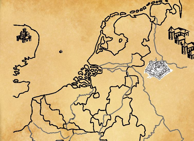
When I blend symbols on the symbol sheet I have no issues with the structure symbols of CCB3, but the blending effect doesn't work with the symbols from Mike Schley Inks (although they are on the same sheet). They remain white. (see picture below)
Any help on how I can solve this would be welcome!
Tagged:


Comments
That is the difference between vector symbols and bitmap symbols.
For reasons of performance I think, the bitmap symbols are redrawn twice, which means that not many sheet effects apply to them, or apply only to the first time the symbol is drawn.
You could try this:
Type DELAYDRAWSYM and hit enter, so that the prompt appears in the command line at the bottom, and then type zero and hit enter again, then redraw the map. It stops the second redrawing of the symbol.
It works! Thank you and also for the other posts you wrote in these forums. Always very helpful 👌
You're welcome :)
Hello,
I have a follow up question for another map. I am blending mountain symbols from Mike Schley Inks on parchment, but the mountain lines do look quite thin. Is there a way to make them thicker? The symbols kinda get lost when I zoom out.
That's not possible because those symbols are bitmap images created by the artist and the linework is an integral part of them. I recommend either making the rivers and roads thinner, or the mountains larger.
Ok, thank you!
So I have another question. When I blend my parchment bitmap (multiply - 100%) nothing happens. I can't see the underlaying symbols and lines. Is there a setting that I might have change without knowing? First time this happens and I can't find out why:
Type DELAYDRAWSYM and hit enter.
It should be set to 1 by default.
Type 0 (zero) and hit enter.
Then redraw.
Ok, thx Sue :) Maybe one more if you would please?
I made 2 maps with the same technique as described above. On the map furthest below the lines of the mountain symbols come out strong and clear (from the annual B&W fantasy), while this is not the case with the map above. What am I doing wrong?
I think it may have something to do with using only the smaller hills in the top image, which are less bold than the larger mountains in the second map. I recommend thinning the drawn lines down a bit to about half what they are, and maybe making the hill symbols a bit larger.
In the bottom map you have a slight issue with the text being a bit invisible against the trees. If you add a white Outer Glow to the TEXT sheet it will wipe out the trees just around the letters so you can read them better.
(The text sheet will need to be under the parchment sheet, so that the white simply disappears)
It worked out fine. Really appreciate the help. Have a nice weekend :)