Filling unneded space
 BlindSeer
Traveler
Hello,
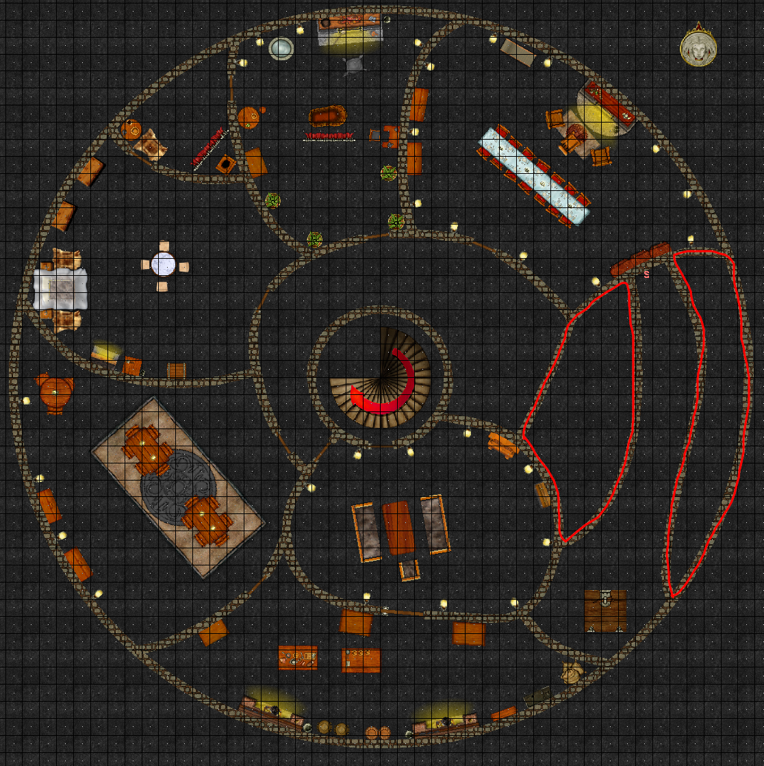
me again. :D So I finished level 1 of my to be dungeon and while creating level 2 I noticed I will have some blank space between walls I just do not need. Is there any way to fill it? Or do I have to draw walls until it is all enclosed? I made a screenshot of the level (Don't be too harsh, it is my first dungeon in this case the living area) and marked the areas in red.
Thanks a lot and regards
Tagged:


Comments
Unless I'm misunderstanding your issue...
... you should be able to place a filled polygon with your desired texture there.
Either I'm blind or I do something wrong. All I got was another wall without fill (after using the dropper to select the wall). Am I missing the "fill" option with the polygon?
It sounds like you may have a line width set that is other than zero. Set the line width to zero and try again.
Don't worry - I forget sometimes and still end up drawing a line around an area instead of a filled polygon.
It looks pretty good for a first map. If you switch on the sheet effects those walls should cast shadows and feel a lot more like walls.
THAT did the trick. Okay I will have to get behind that logic of setting a line width to nothing to get it filling everything. :D But as I said, I'm just starting. Also noticed I accidently delteted the floor when copying and cleaning lvl 1 to habe an identical shape...
Yeah, I just noticed. I copied the 1st floor and delteted everything without noticing I also deleted the floor. It now looks like this:
Any other recommendations? :)
You can switch on the sheet effects by opening the Sheets and Effects dialog and checking the Activate Sheet Effects box on the top right of that dialog. Click Apply, or Ok and you should see quite a difference in your map.
Yup, interesting enough it does hamper with Greenshot if effects are on. :D Looks quite different. Is there any way to "hide" that secret area on export (for player handouts), or do I have to create a second map with this area "filled", too?
With effects on it looks like this:
But the symbol shadows seem too weak in contrast with the wall shadows, or is it just me? So far I like CC3+ and my first map. Let's see what wall I will hit when trying to create underground areas or wildenress sites. XD
Remy wrote an article on how to show and hide secrets here:
You can edit the sheet effects to taste. Open the Sheets and Effects dialog again, pick the sheet with the effect you want to modify, and then pick the effect itself in the right hand pane. Then click the Edit button and a dialog will appear with all the settings you can adjust. Click Apply when you want to see how your changes affect the map.
Playing with sheet effects can take a while, but time spent playing will pay off in the end when you will be able to tell exactly how you want something to look and know how to make it look that way in the future.
Will check the staircase. I guess you are right there. No need to have space there.
I think I forgot the torches in the kitchen, the sleeping room and the toilet. I could try to talk myself out with lightning on the ceiling, which is not visible, but I simply forgot them. :)
The scale is 1m per grid square. So this underground living area is about 22m in radius, the map is 50m*50m in total. I used the "draw grid" function to get this grid. Any way to restrict it to the "used areas"?
That was really helpful. I removed some of the torches I went overboard with, added some to the rooms without them, turned and adjusted the stairway.
As I draw for DnD you are actually right, the grid should be 1.5m/square. I corrected that too and limited the grid to the living area. I guess I need to make it more visible. In the exported image it is really faint, in CC3+ it is nicely visible without distracting from the map.