[WIP] Custom Map for Dune Boardgame
 Fersus
🖼️ 11 images Surveyor
I just realized that I've been annoying everyone with my questions about my latest project without showing it to you, so here I go:
Me and my friends fell in love with the (rereleased) Dune Boardgame (https://boardgamegeek.com/boardgame/283355/dune/images) and I stumbled upon a custom map that uses the tileset of the Dune 2000 computer game (https://boardgamegeek.com/image/6297390/dune). Unfortunately it's not available to buy and its in Russian, so I decided to make one myself.
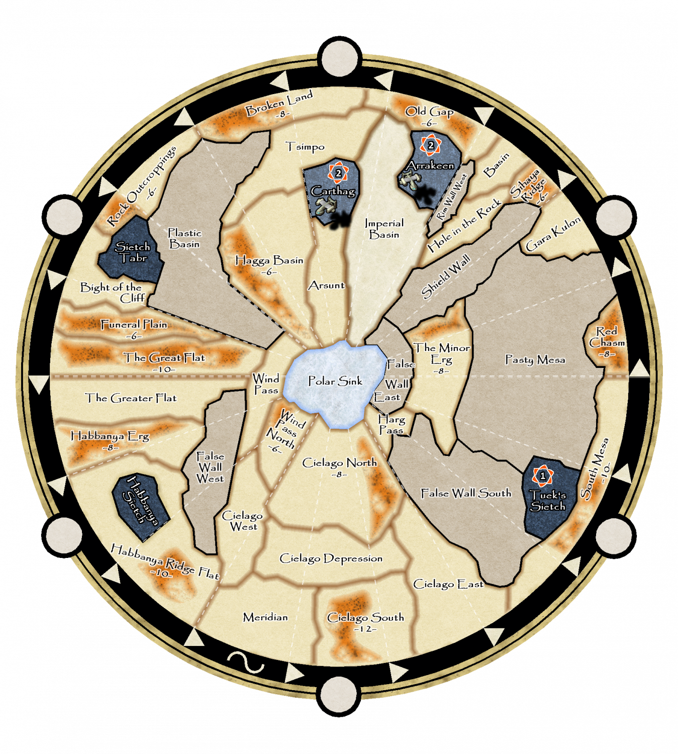
So far I just took a scan of the board and manually traced the borders of the different areas to get this:
I think it's quite apparent now what my latest questions to you all where about: As a first step and a test run I wanted to get the airplanes from the computer game and the borders between the desert areas blurry enough.
Then the lockdown was announced here in Austria, so my game group searched for a way to play it online. We found treachery.online, wich allows for a custom skin, and so I thought I could adjust my map in a way that it fits this online version and so I took my WIP map above and put it in there, but I had some troubles getting it right. So I asked in their discord channel about it and posted a screenshot from my problems and got the response that they liked "my new skin". That's why the map above has already some effects on it, so I can release a skin for the online version. But enough with the tangent, back to the map itself:
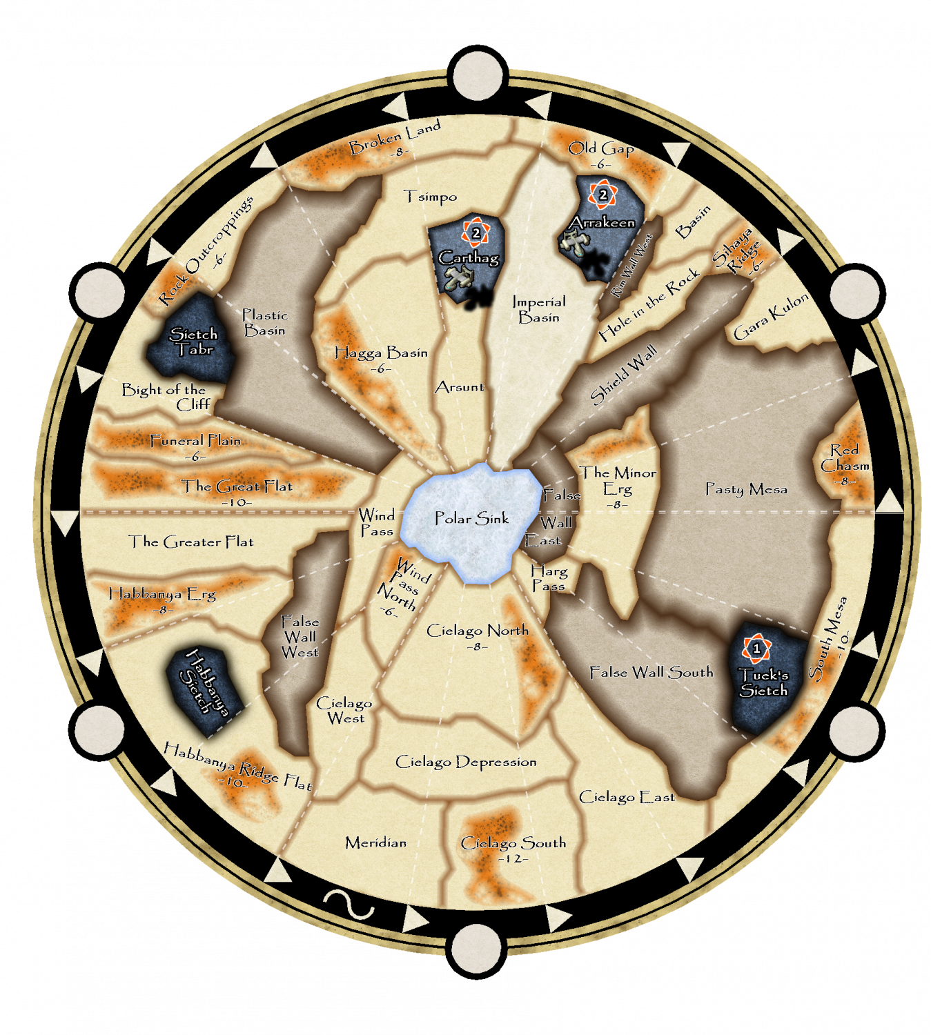
While I was trying the edge fade Inner effect between two desert areas by putting them on different layers I discovered, that I didn't like the result, as it created a similar impression like a bevel effect and so it looked like the areas where all elevated. This in turn gave me the Idea to use this effect on the areas that represent mountains:
Alas it seems that more people like the "simple" version better, so my attempts to make the map fancier where in vain.
But that's ok, now I have a deeper understanding of some effects and can carry on making the map in the tileset of the computer game, as was the plan all along :)
However, as always: If any of you have ideas on how to improve the second map, I'll be glad to hear them!






Comments
The mention of Dune and your maps make me think back to the original Dune II computer game. It set the standards for the future of the RTS genre, and provided me lots of fun in my younger days. Fond memories.
Dune 2 was also my first RTS and I played it a LOT. My preferred faction was Ordos. In the second to last mission I had a higher score than with any other faction in the last mission, so it wasn't even close.
I thought about the dune 2 tilesets as well, but these are just too pixelated for a map that's supposed to be printed at some point (I'm even not sure if that's feasible with the Dune 2000 tileset, but the carryall looks good, so I have high hopes...)
Yea, the original Dune II artwork isn't much for printing or looking at these days. It's probably fine for people like us with fond memories of the original, but everyone else would be put off by them.
Ordos was fun, but my original fav was the Harkonnen. Not as much difference between the three factions back then as in modern games, but I loved the heavier arsenal of the Harkonnen. Although the mind-influencing Ordos thingy was a bit of fun. One thing I don't miss from that old game was the inability to select more than one unit at a time, sending your army to the enemy was a chore on the later maps.
That's true.
As Ordos I liked Harkonnen as well, as there was no better target for the mind altering power as the Deviator, as you could easily blow them up while they where still advancing along the other Harkonnen troops weakening them profoundly. As the mind alteration ended as soon as the unit got shot, the best one could do otherwise was just to send them to the other side of the map to delay them for a while. But the deviator was just gone and with some luck weakend or even took out an other enemy unit along them :)
But yes: the single unit selection thing was annoying, but isn't there a reimagining of Dune 2?
Update on the Dune Map:
The bad news is: I hadn't had the time to extract all of the tiles myself :/
the very good news is: the stranger who made the dune 2000 board contacted me and asked if I'm still interested in the map.
I said yes and he said: that's great, because I'm not interested in this project anymore. Take it!
And he sent me ALL OF HIS ORIGINAL FILES!
I was totally blown away!
Now the extraction of the tiles is still annoying but I only have to do it for additional assets (buildings and units or minor corrections of the original map)
Here's what I got so far:
Details:
I think the text has too much outline and I'm not sure if the borders are too much/too little or just right (that will be determined by a testprint)
I used the spice silos as "settlement" buildings, but I think they don't quite fit- Mostly because of the bright ring on the base, which is in the original image. I either edit this or remove them completely. haven't decided yet.
As stated above: the bulk of the work was done by the kind stranger. I added the borders, the buildings, the text and the spice fields. The original spice fields where not vivid enough, so I added an orange smooth poly with a strong edge fade effect, setting the other border to just 1% in the inner opacity to 25%. That gave the orange spice fields just enough orange glow to make them pop more, without giving away the effect like the borders do.
In the full picture you see the background rotated slightly. Everything outside of the black Ring is not part of the planet anymore and I'd like to add some Space background. There will be fields for gamephases, Round counter, Bank and the tlailaxu tanks, so it's not that important what I use exactly, but it should look nice anyways.
Any suggestions? I do have the cosmographer addon, but I've never installed it so far as I've never needed a space map before...
Just a quick off topic question:
What does it mean, that this (and other posts I recently posted in) are flagged as "Necro"?
It feels like I'm the Necromancer as a lot of threads I'm touching seem to have this flag :D
Means they are an old post that has a new reply.
I see. That's why I keep seeing those. Given my mapmaking workcycle of
"I've a weekend to myself, lets goooo" - "the weekend was way to short :(" - months go by - repeat
I'm destined to be a Necromancer ^^
The Necro flags disappears after a couple of replies.
It is meant as a warning, basically saying "Someone has revived an old thread. Pay attention to what you are replying to, as the original poster may not even visit the forum anymore. Also note that any technical information in this thread may be outdated".
I've seen more than once people starting commenting on a many year old map where the poster haven't been here for years, or people trying to help someone who asked a question years ago.
It's nothing wrong with replying to a necro thread, it's just a marker informing you to keep in mind that it is an old thread being resurrected.
I was half asleep when I posted last night and forgot to mention that when I reply and necro my own map threads, it means I got distracted and just remembered to make maps for that thread again.
Same with me. My main uses for CC3+ are: (Battle)maps for my RPG group and Boardgame prototypes
The later one usually does not have a deadline, while the RPG maps have to be done for the upcoming session. So my boardgame projects are prone to be forgotten for weeks/months when the upcoming RPG session calls for a new battle map...