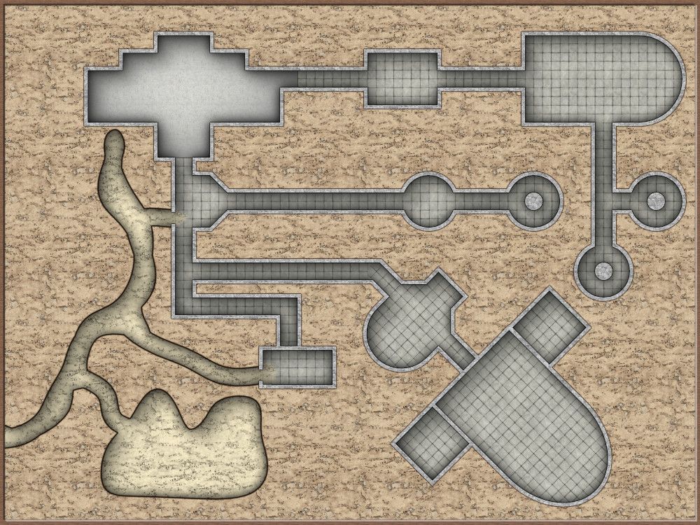
WIP - Rise of the Runelords: Catacombs of Wrath.
 Raiko
🖼️ 32 images Surveyor
The map for the next location in Rise of the Runelords, an ancient underground temple dedicated to the sin of wrath.
Just a work in progress at the moment to find a style that I like (this is version 6 lol). I ended up liking the general look of my Glassworks Basement to use the same style here. The corridors are only 5ft, and I need a grid as I'll be playing with a printed map, but the diagonal section looks a bit rubbish with a square grid.
So I've rotated the grid for the diagonal section and also changed the tiles to 2.5ft instead of 5ft to get a better look. I'll figure out how to emphasise the actual 5ft double squares later. I'll also tidy up the bend from straight to diagonal.
Should look better when details are added I think. I'll add some colour back into the dungeon walls and floors if the final map looks too dull.
Should have another update tomorrow, or later tonight. I also want a printable map of the main inn in Sandpoint - The Rusty Dragon - as the party have decided they're staying there. So will probably swap back and forth. I've probably got at least a week before they reach the Catacombs of Wrath.

Tagged:


Comments
I think I've finished tweaking the style now though - going for a cartoony style - so I think I'll be happy once I've got all the detail added. I'll be tweaking the wall textures to include 45 degree rotations in the areas where it's needed.
I'm hoping to mostly finish this weekend, so it's ready for next weekend, if the kids reach that stage of the adventure. So I'll hopefully have a less barren version of this dungeon posted tonight or tomorrow.
Click for the high-res version in my gallery.
The handful of symbols so far are all from forgotten adventures I think, but I'll be adding many symbols from SS4 and Tom Cartos before I've finished.
I'm trying to draw as many details as I can myself with CC3 textures, bold lining and color key - so it's taking a while.
I remember saying I said that I'd be getting these first maps for Rise of the Runelords done quickly, and not fuss over little details, and here I am going all OCD about everything.
I've drawn the pool in the middle too big, should only be around a third of the room diameter, so I'll redo it later so there's room to walk around it.
I'll probably move the large pool in the temple room slightly as well, to make room for another couple of pillars.
And I've still not drawn in the missing room!
Should hopefully be finished in a couple more updates, probably depending on how happy I am when I add details to the caves.
Although it's taking a while, I'm happy that I've found a style for other dungeons in the campaign. So should be able to get future dungeons drawn a bit faster in the same style.
Mostly just need to add symbols in now, and some more damage and rubble.
Looking nice. I love the look of your cave, and also where it breaks into the dungeon.
@Raiko Super well done!
The new cave looks much better to me, I love it.
Yes, the original was always likely to be a placeholder, I just wasn't sure how I was going to do the walls. I'm glad that they turned out nicely, there are quite a few cave areas in the adventure and I think it's a lot more of a challenge to get a nice look to caves than dungeons or buildings.