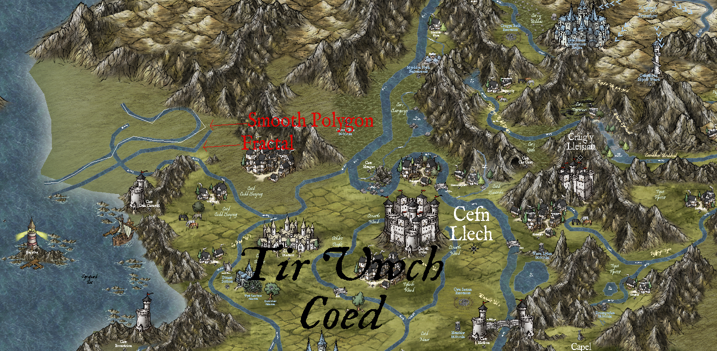
How to remove white line on smooth polygon river; Herwin Wielink Style
Can anyone please tell me how to get rid of this white line on the smooth polygon feature of the rivers and lakes. I've tried clicking every combination of toggles in the advanced dialog box, but all to no avail. The fractal draw method is working fine, but it is too hard to navigate in the tight spaces I'm trying to pull off. I find I'm spending more time moving nodes, deleting nodes, and adding nodes trying to smooth out the river "flows" than I am drawing the actual rivers.
This white line is also occurring on the smooth polygon function of the lakes as well.
The baseline map style is Herwin Wielink.
Any help in this matter would be GREATLY appreciated! :-) Kimberly


Comments
Tools -> Drawing Aids -> Toggle frames, or just hit Ctrl+F
That white line is a guideline that shows where the actual nodes are for smooth entities.
CTRL+F
It toggles the frames on and off. These are to make editing smooth lines easier.
That's a really nice looking map, apowers :)
Wow! That was fast and SO easy! I almost feel like a fool! lol
Super appreciative of this quick response.
Thank you both so much for the help and the compliment. :-)
So the sample image on the setup wizard for styles never looked good to me for Herwin Wielink. But your map looks so much better it makes me want to try this style now.
It would be good to see the finished map at some point, if you'd be willing to share it. It's impressive enough now, and there are some wonderfully inventive touches - I think my favourite is the use of the Mike Schley grazing horse symbols to spice-up the look of the farmland!
Yes, this map is a mixture of Herwin Wielink, Mike Shelly Overland, and Perspectives Bitmap B. A couple of other random symbols from other styles, but mostly those three. I absolutely love Wielink's baseline features, but Shelly's symbols help to brighten it up a bit.
I'll post pictures of some results as I get farther in. It will look better when the trees are on it... at the bitter end and in a new file... I learned a very tough lesson by putting too many trees in too soon and I had to start over because the original map was a computer-bogging monster! lol
Example from the "original monster"...
There are learning curves with most of the mapping styles, I've found - remembering what symbols and drawing tool fills are available in each, particularly - and it does help if you're working with one, or a few together (as here), for some time. I like the Herwin Wielink style as well; it was the primary alternative to what was just CC3 when I started working with the program, and I made plenty of mistakes trying to recreate a map of part of the D&D Sword Coast region of their Forgotten Realms setting for 5e using it.
This latest shot is very impressive of your own map!
Yeah, "learning curves" is an understatement. I haven't a clue what I'm doing, and I'm certainly not going to pretend. My biggest problem is outright stubbornness. I'll spend 30 minutes trying to stack medieval chateaus in an attempt to create some waterfront hotel for drunk sailors in leu of just plopping a little village in there. The overall amount of time I spend clicking, moving, and grouping is damn near insane. Hopefully, it will be worth the effort in the end. Thank heavens for CC3 and the artists who support it. Without either, I'd have nothing more than a white sheet of paper with a bunch of stick figure horses and triangle mountains.
I’m hearing you! But for some maps that kind of effort isn’t justified or necessary, the trick is working out which is which!