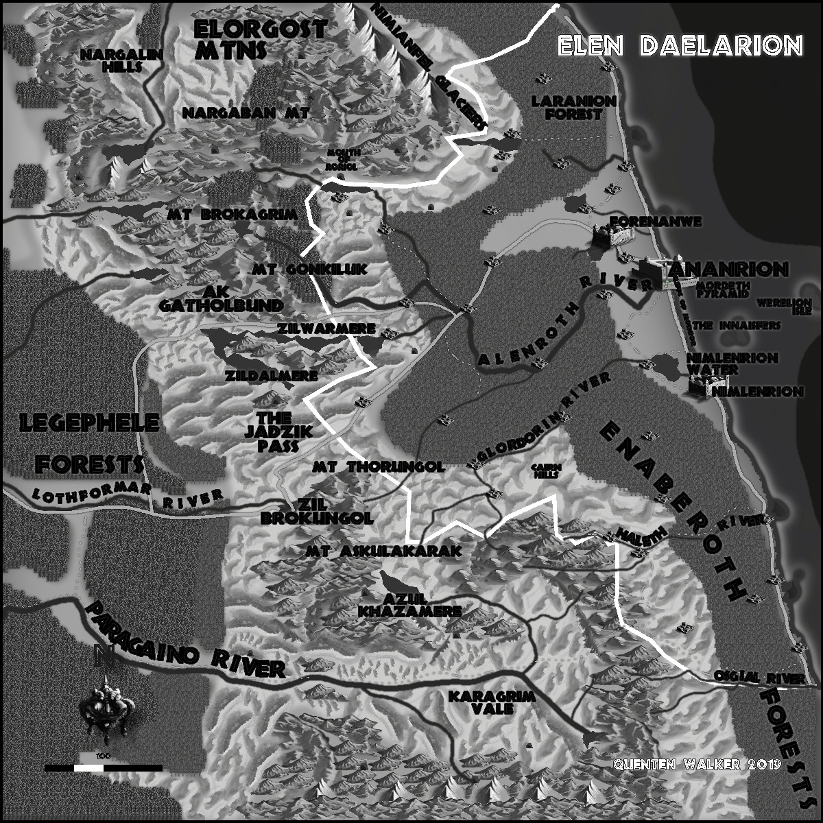
Community Atlas - Artemisia - Elen Daelarion - Fantasy Illustration Style.
Back on track to doing Elen Daelarion in all the overland styles.
A rather dark style, with not many settlement symbols, and rather inadequate hill and mountain symbols IMO.
Still some tidying up to do, but I hope my usual commentators will add their comments first.


Comments
Apparently my eyes and brain don't like dealing with B&W with gray... but I can see the beach, mountains and hills, roads, forest, rivers, cities, etc.
Just having a hard time seeing it. Ah, I think its lack of variation in the grays. I see some variety, but there isn't much.
It needs a larger span of grays.
Otherwise great !
Pale lettering seems to work best for this style, judging by the samples with the Annual (not a style I've tried myself as yet). The dark labels here are hard to read in places.
I get the impression from the samples too that areas of hills might be better represented as simple untextured coloured polygons, with just a few of the more significant hills shown with symbols, as also, if to a lesser extent, the mountains. By contrast, the terrain here seems a little too "busy".
The tiling across the Legephele Forest seems unusually obvious for some reason, whereas it isn't on the forests nearer the coast - different fill textures? The Legephele may need adjusting slightly, if so.
LATER EDIT: Just noticed coming back here that the Paragaino River label is probably a bit too crushed-up as well. Text on a curve can be irritating sometimes...
I didn't realize the Legepole was a forest at first. Just looked like a gray textured area to my eyes, but I realized eventually it was forest... due to the label.
I have fixed the text and the river and added tower symbols. I rather like the hills and mountains as they are, but thanks for the comments, regardless, Wyvern. The forests will have to be redone - they are indeed badly tiled. Then I think that will be it.
Comments please.
Not sure you have Effects on on this current version Quenten. There's a hard edge on one of the solid colour fills near the map's top left, for instance.
It looks as if the labelling still needs some tweaking. Several remain hard to read, and those crossing the white border line especially so. Might be OK with Effects on, but might need a tweak if not, or simply moving the labels a little to take better advantage of what the background colouring is.
Thanks - I'll go over it in the morning.
I've tried this style before and it never looked right to me. It is good to see that someone else has had better luck.
I have fixed things up now, I think.
That's much improved now.
Might be worth saying what the "100" of the scale is (and perhaps also put a glow around the scale and its caption so it stands out a little more).
I can see why the white border line passes under the rivers and roads, though it does look a bit odd that way.
Will do