

Community Atlas: Errynor - Aak and the Aak Hills
 Wyvern
🖼️ 293 images Cartographer
Wyvern
🖼️ 293 images Cartographer
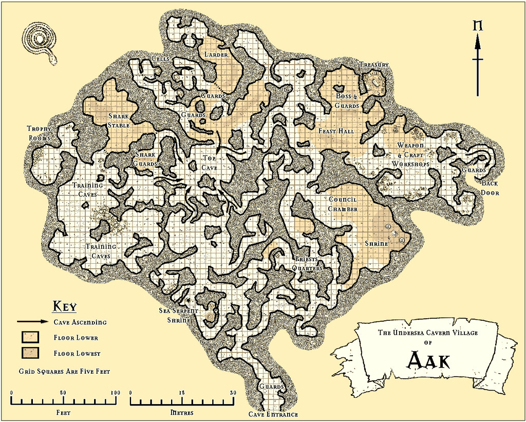
Having spent so much time concentrating on detailing the tiny unsubmerged areas of Errynor Map 01, it seemed about time I plunged down and started providing some sample maps detailing equally parts of the deep ocean's bed. I thought I would start with the Sea Orc/Ketorka cavern village of Aak, and so drew-up that map:
When I began preparing the notes to accompany it however, I realised I needed a second map to show some of the places across the nearby area as well. Thus was born the Aak Hills map:

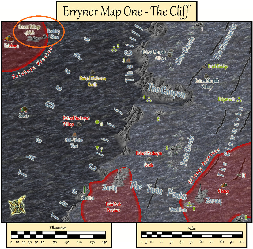
For orientation, this next map is Errynor Map 01 - The Cliff, showing the seafloor view, with the Aak Hills area ringed in orange:
In terms of the layout designs, the Aak village map originated as another of those Curufea's Random Cave Map Generator website plans I'd used previously for the Kobalt Mountain Caverns on Zariq. As before the chosen suitable layout was dropped-in as the bitmap base for the CC3+ drawing, rotated, amended and added-to in places as required. The map was constructed by hand-tracing over this using the TJ Vandel's OSR Dungeons style from the 2015 Cartographer's Annual, labelled with the Mason Serif Alt Bold font that comes with CC3+. I wanted a more or less black-and-white style as a reminder this setting is in the deep ocean, where there's no daylight, and most vision will be purely monochromatic.
The Aak Hills map was a straightforward adaptation from the pictorial version in The Cliff map, now in close-up. However, its contents beyond the previously-mapped elements were randomly allocated using a variant of my own tables and system that were used to generate the original Errynor base maps' features.
I thought for this map it would be interesting to experiment with the only CC3+ style package designed for mapping seafloor areas, Marine Maps from the 2017 CA. This though is intended for mapping small, near-coastal areas only, so some adaptation and improvisation was needed. Basically, I inverted the usual contour colour scheme in Marine Maps, where dark blue shows the coastal shallows, with white reserved for the deeper places only. On the Aak Hills map, dark blue is used for the normal deep ocean floor level, with increasingly paler blue to white contours (several levels of these, just like in Marine Maps) showing progressively higher areas above that floor. With almost 12,000 feet, 3,660 metres, of seawater above even the highest peak shown, by no stretch of the imagination can even these higher white places be classed as "shallows"!
The Marine Maps symbols were repurposed, sometimes with minor additions, and like the Arial font labelling, this created a few problems as I'd added Sheet Effect glows to make things stand out more. The Marine Maps style uses very few Effects overall. What happened? Well, where the Effect-amended black symbols and text lay over the equally black contour lines, those contour lines showed through as breaks in the text letters and symbols. This was, as ever (for me anyway; not my first encounter with this!), easily overcome by simply copying the affected symbols and text onto another Sheet above their original one, but which had no Effects added to it.
After some brief experimentation, I decided to place the anchor "north" pointer and the scale bars on Sheets without Effects, as I found them too distracting otherwise. This "vanilla" appearance is how such labelling would appear using the Marine Maps package ordinarily.
Of course, I had to try out the automated contour-labelling option in Marine Maps as well, where I was delighted to find ANY text could be typed-in per label, not merely numerals. Thus I was able to label the contours clearly in both feet and metres without needing to resort to adding a map key.


Comments
As usual - another collection of really interesting and well drawn maps, Wyvern :)
I love this.
Great maps - as always. Are the numerals shown as levels above sea bed, or as below water-land interface . I find it counterintuitive that 15 metres is the deepest, with 360 the highest, rather than the other way around, when it comes to sea levels. I also find the upside down figures hard to read - do they need to be upside down?
Thanks folks!
@Quenten: The height measures are up from a nominal solid surface zero, just like a land-based map. The PDF/text description should clarify that in the Atlas.
The map was designed the way I'd expect a sea-dweller to think - i.e. just like a land dweller. We don't measure distance down from the "top" of the atmosphere, after all. Gravity still operates at the bottom of the sea, and that's the only place for fixed settlements and markers to exist, for instance, so I don't see any reason why such imaginary folks would think differently.
The angled contour labels are done exactly the same way they are on modern land maps, as it helps clarify which way is "up" for some folks. So yes, they are meant to be - and will remain - that way. It may not help your argument that I don't have a particular issue with reading them whichever way they are (lifetime of map reading and drawing, I suspect!) 😁
Although the Aak Hills map uses the Marine Maps style, that's as far as it goes; I had no intention of mirroring the conventions it represents, because that's based on purely land-dwellers' thinking, and this is intended as a sea-dwellers' map after all!
I understand your argument - I do disagree, though I respect your decision. I still would like the numerals all to be right side up, so people who do NOT have a lifetime of map reading and drawing can find it a little easier.
Leaving the labels as-is though also means people can learn a new skill, should they wish!
Well, I have found left handers can read upside down easier than other folks. My ambidextrous sibling sometimes can read upside down, and sometimes not.
I think it depends on the things you did as a child more than left-handedness. I always wanted to read my brother's comic, but he always had his nose in it for several days, so I would sit very quietly opposite him at the table and pretend to be reading my own book, though really I was reading the comic strips in the comic - upside down.
I find it relatively easy.
Like most things, I think you can train yourself to do it if you set your mind to it. I started out predominantly right-handed, but don't ever seem to have had much problem reading at different angles, for instance. Not necessarily by choice for ease, of course! Plus for layout of objects or text, I find I have far better accuracy with things the normal way up.
Now in the atlas: