

Community Atlas: The Vale, Panaur
 jmabbott
🖼️ 39 images Mapmaker
jmabbott
🖼️ 39 images Mapmaker
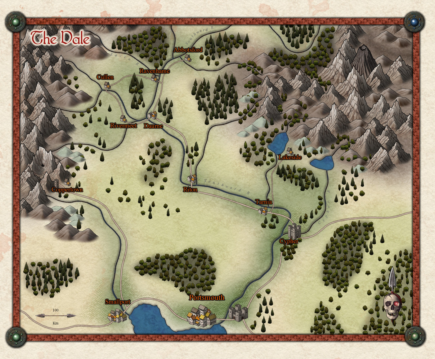
@Monsen Here is the final map for the atlas. I'd like first dibs on mapping the cities/towns (with @Loopysue's matching style when it's released), the copper mine and other POI as they arise, namely some of the encounter areas from the supplement if that's OK.
I'll post all the completed maps in this thread as they're done.


![[Deleted User]](https://secure.gravatar.com/avatar/c75d9a245b74d9c59be0999ea81ca541/?default=https%3A%2F%2Fvanillicon.com%2F92add7f8c954488718110edc4896ad39_200.png&rating=g&size=200)


Comments
Thanks for the contribution. Map is now in the atlas.
@Monsen For some reason the text is larger in the Atlas version, Rivermeet and Daurne overlap each other.
Ah, I see.
Seems like you have used a font I don't have available on my machine (which means ordinary atlas users won't necessarily either) so CC3+ picked a replacement font.
If you could grab the map file currently in the atlas and change the font, I can render a new image.
There is an old text-file of the fonts available via a standard Win 10 installation plus those fonts that come with CC3+ and its numerous add-ons and in the Annuals, which is intended for use by Atlas map creators, although it hasn't been updated for some time (and I did run into a problem because of a duplicate font name for the "Mayan" font that came in the 2019 Annual, which I already had installed; so the list won't be infallible under such circumstances for others). The text file is available via this post from March 2018.
I have to admit, I now tend to list whatever fonts I've used in my Atlas maps as part of the Submission document for Remy, which makes it easier to spot if there could be a problem (I hope!). Plus it also serves as a reminder to me to check that text file to see what fonts are preferable to use.
Interesting. I assumed each style came with a preferred font, obviously not. I’ll fix it a little later.
@Monsen It's very weird, the rivers use the same font and are fine.... The font is Calisto MT, when I opened the .fcw file it appeared to be correct...
Anyhow, I've modified the font; it is now Book Antiqua.
Sorry, but Book Antiqua is also among those fonts that people won't have as standard. Did you check the file Wyvern linked to (it is also available in the FAQ on the atlas site.)
Sorry, I don't want to make this difficult for you, I just want to make sure that all people can open the map just fine. The issue being that if they don't have the font in question, they'll just get a plain Arial font as replacement. Now, that fact isn't a problem for the atlas per see, but as you yourself observed, it can lead to the map not looking as you intended.
But I am a bit worried about the size of the text here, I opened both versions on a computer that do have these fonts installed, and they are still huge. Have you made this map on a Mac or Linux computer using Crossover/Wine perchance? There is a bug it the text rendering system on those platforms that causes text in CC3+ to display at a different size than intended. For most fonts, just accessing the text properties of the text entities and uncheck the 'Use new Metrics' checkbox should cause CC3+ to fallback to an older way of sizing the fonts, which for most fonts means you would see the same as you would under windows. If that works out, the actual font replacement is probably not really a big issue at all.
Hi Monsen, I am using a Mac, but I'm running CC3+ via a bootcamp partition so it's running in Windows 10. Let me have another look at it.
Hmm, interesting. Running bootcamp should be the same as running it on Windows. Makes me confused indeed. Out of curiousity, when you had the atlas version open, how is the font sizes in the atlas sidebar? tiny? The text 'Contact Information' should be a bit wider than half the width of the sidebar.
Yeah that all looks good. I turned off new metrics and reset the text back to Calisto MT. For the life of me I don't know what happened. When I look at the atlas version (PNG) the font looks like it's Calisto MT just larger, the title and river text looks absolutely fine...
Can you do me a favour and try this out on the machine you used originally and see what happens...
Looks fine now. The font is still being replaced (By Times New Roman it looks like) but the difference between that and Calisto MT are miniscule anyway, so it doesn't really matter IMHO.
Is there a recommended font list for the atlas?
Yes. It's in the FAQ at the atlas site.
Wow. The difference is all but negligible. At this scale it seems the serifs on the Calisto font (I assume that's the one on the right) are a bit more curved. That being the case, with this style for Atlas maps I'll just use Times.
Yea, they're pretty equal.
I am pretty curious about why you had to turn off use new metrics though. I've only ever seen that in relations to mapping under crossover/wine before, but since this happened under bootcamp, I am wondering if a driver issue is to blame here. Maybe apple's display driver for bootcamp does something similar to the native macos driver that creates problems. Guess I need to find a mac and do some investigation.
I don't know mate. Way, way over my head. I wonder why the river names, created by using the text-along-path command, were unaffected...
They are, it's just less noticeable because they are broken up into individual letters.