

Game of Chess, anyone?
 amerigoV
Betatester Traveler
amerigoV
Betatester Traveler
I originally posted on Facebook, but I wanted to expand my thoughts on it.
Been a lurker for awhile here, so first time posting creations. I have following along on all the great live streams (well, watching the recording) and making some maps of various (lowish) quality.
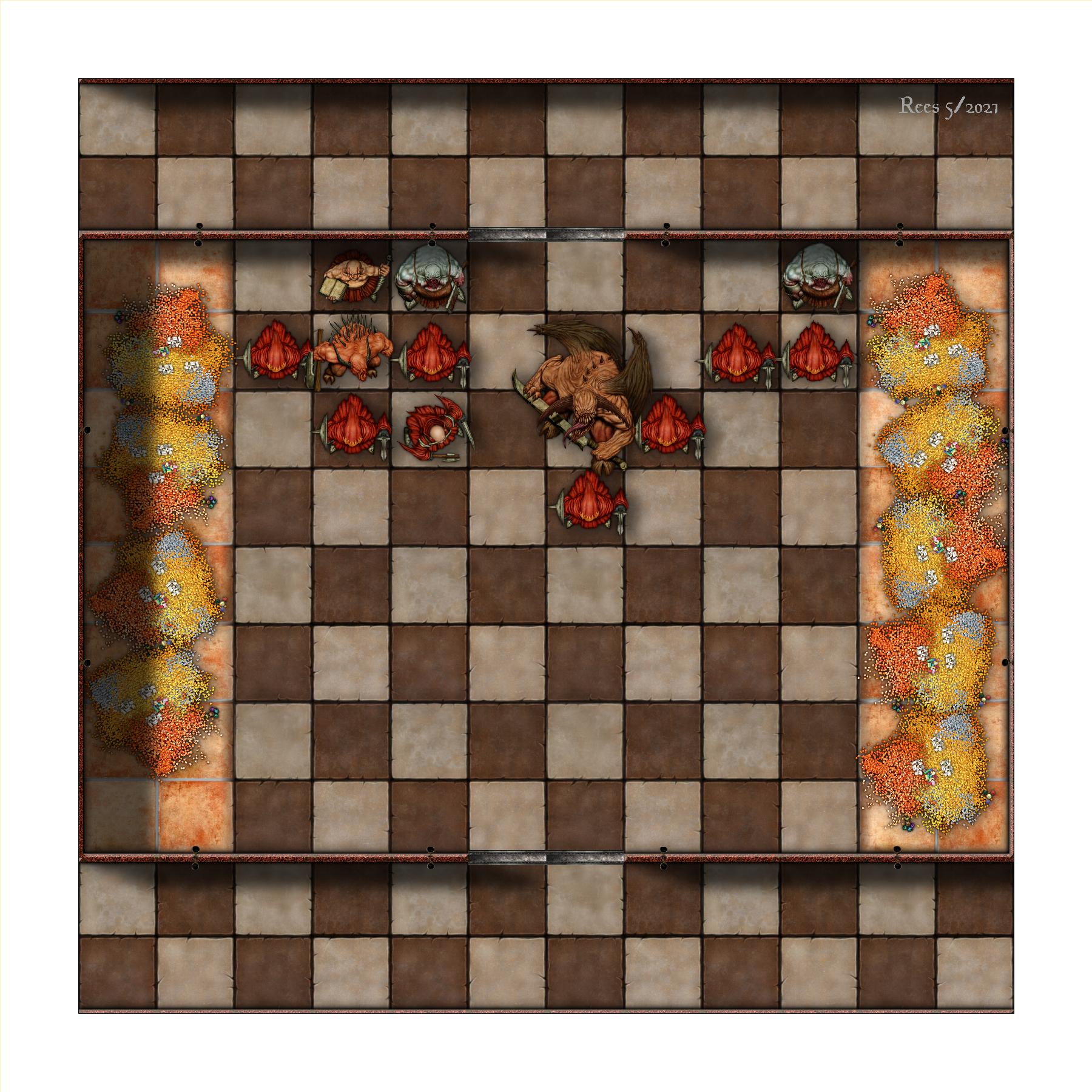
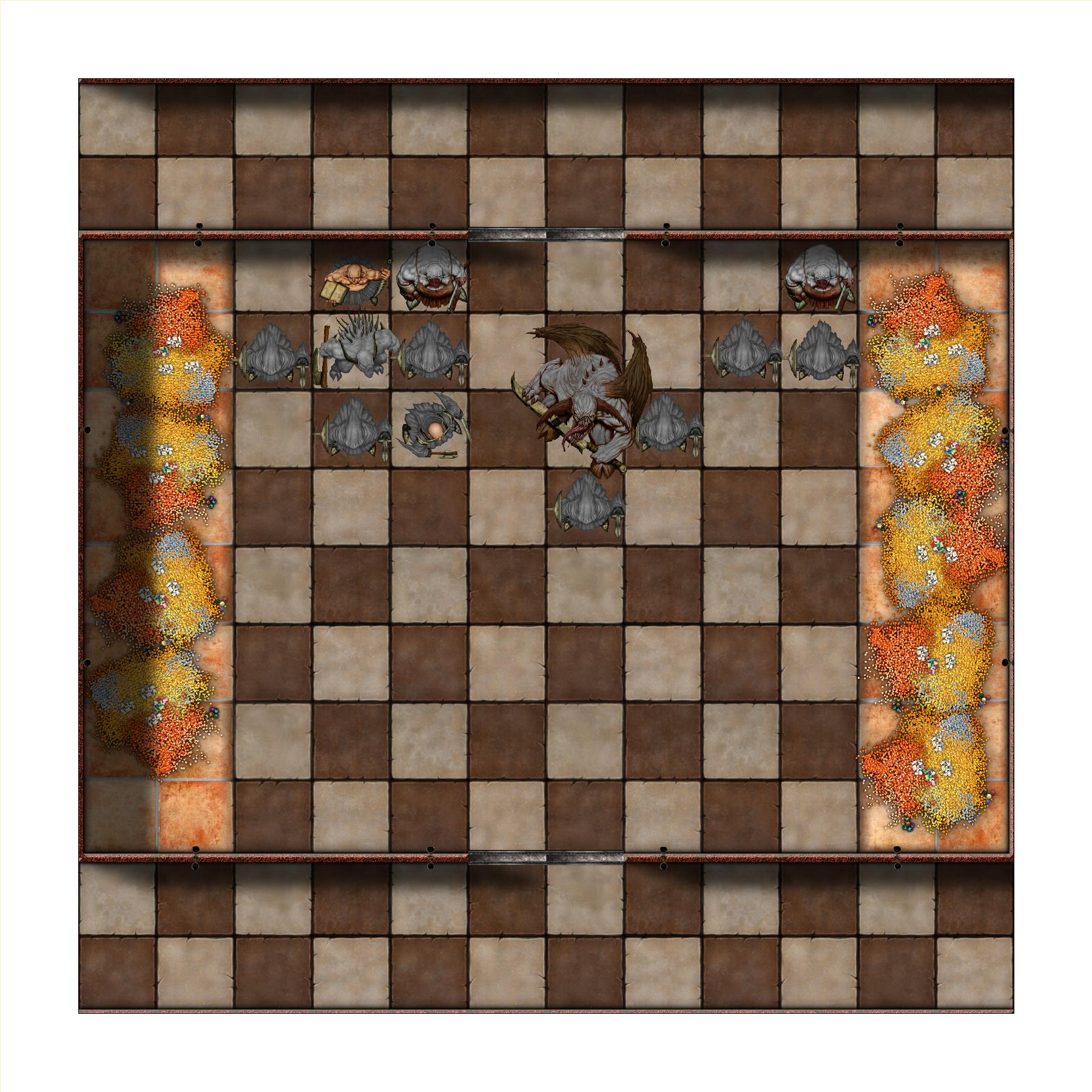
Yesterday I was playing a bit of Baldurs Gate EE (the enhanced version of the classic) and came upon a chess puzzle/trap room. Then I though to myself - "I need a chess trap room map just cuz"
So here are a couple of variants using a rather simple design. At first I wanted a sectioned off area to be the playing field, but then I liked the idea the hallways leading up to it having the same pattern - in a dynamic lighted VTT it throws off the immediate "its a chessboard" reaction.
So one version is just the board only with tempting phat loot. The version with the gray tokens are meant to be statues in mid-play (king-side castle with a classic defense of the position - the huge demon is the Queen). The color version is that same situation "live"
I added torch sconces but no lighting other than for depth purposes for the walls and such. VTTs lighting is such that its better to leave that off and add it based on your scenario (I'll post a vid of it in a VTT later - its really sweet with dynamic lighting).
This was made with the SS2 Dungeon A style, with maybe a few basic DD3 items.
More thoughts beyond the FB post.
Quick aside on CC and me: I have had a version of CC since DOS, but its always been "play with it for a bit and put away. " But I was doing more online games in 2019 and 2020 even before the Pandemic so I was getting interested in making maps and not just searching the internet for "close enough". So around the fall of 2020 I dedicate some time to learn the tool and just make some maps.
While this is a rather simple map, I am surprised the number of semi-advance things I did to make it. These things likely turned a longer project for a beginner into a <1 hour project (if you ignore me playing with it in Fantasy Grounds).
Some things I did that I would have had no clue about this time last year:
- First is having a vision. The thing the hurt me in the past would be to open the program and just "draw a dungeon". Always a mistake - one has to have a sketch or clear vision in their head. I learned this from and artist friend of mine. If you have a good idea of what you want, its easier to then figure out the techniques to get there. Otherwise you are trying to design and build the airplane at the same time. In this case my only real decision was if I want this 2D or perspective. I have only tinkered with Perspectives so that decision was pretty easy. I may come back to this once I have a better understanding of the Perspectives tool.
- The square parquet floor. So while this is a no brainer, there were a couple of things here. One is I was lucky in that the SS2 Dungeon A had one I liked off the bat. But even if not, I did learn how to add my own fill style from a Remy video. I mean the brute force way would have been to make individual squares filled (which is still an option for something exotic) would work and not take that long, but no need if you have something that works already made. Secondly, the native size of the squares are 10' and I wanted 5'. I probably would have just made a bigger map but instead I recall from that same video that you can change the size of the pattern. So I was able to easily modify the fill style to result in 5' checkboard pattern.
- While I give them almost no thought now, I am sure the auto cut doors and the sconce wall features would have been all over the place last year. Now those are easy must have features. I bring this up as earlier in the day I was playing with the Castle add on and it was much more primitive in that area.
- For some reason the universal sun was a different angle than I was used to (and I have used this style previously). A quick easy fix since I understood what it was.
- All three maps are in one file. I made two layers for the "chess pieces" - an easy toggle between them. I had figured this out on my own as the difference between Layers and Sheets became clear to me and was confirmed in the video with the bridge that Ralf made. One of these days I want to learn macros so I could just have a button or something to toggle them.
- After initial creation, it was not quite the size I wanted. So a simple Scale to increase. A very simple thing, but it was not until I was watching videos that I fully grokked what the dimensions really were when I started a map (its an obvious thing now, I was not sure if they were some pixel measures). Being more conscious of that made scaling it very easy (I had made the map 10x10 squares (50x50 feet) and later wanted 60x60 (12x12 squares)).
- The white boarder. I needed to stretch it out to hide some of the border wall shadows. While initially it was an easy corner node stretch, the bottom left was not so nice. I used the info to see this was not just a 4 node empty square, but it was made using the typical mask technique. I recall Ralf had a trick of using the arrow keys to move between the nodes and I was quickly able adjust the various nodes there to keep it a nice wider rectangle.
- White Boarder item 2 - I put this into Fantasy Grounds and my grid did not line up (if I export 12x12 inches at 150 resolution, my grid in FG should line up at 150 as well). It was the white boarder that exported with the map. Exporting using rectangular section to JPEG solved that (you can see in the attachments I have not re-exported two of them as they still have the boarder). As an aside I can likely export at a higher resolution as its just not that big a map. I really like the rectangular export - I did the Silver Mine via that video and used the big map for exploration and the rectangular export to zoom into specific encounter areas.
- Treasure - I probably need to rotate that bottom right pile more, but just a simple rotation of stuff can change a look. So while I could vary it more, it was quick to make a pile from a couple of symbols and then copy/rotate a group (much like with trees and other background items).
- Sheets - I did not need do much here. I did add a Symbols Low sheet for the Treasure and copy/modified the effects from the Symbols. There is not much shadow in this style as it is, but the glow is nice. That said, I did start with the old CC in DOS, so its taken me a bit of time to appreciate the difference and its importance. Now I at least have an idea of an effect I want but I still need to practice them.
- Drawing Tools - I am really understanding them better. Not much for their use here other than the walls, but understanding that you need to use Edit to fix something versus just drawing over something (since the effects apply in a certain way on a layer) is key thing. This comment comes more from that Castle addon where the tools were more rudimentary.
- I did not need to do this here, but I love the fact that I can come back to this map and swap things out as I need them. If I want a different style board its an easy change. I can add different creatures or change the walls if I have a specific need.
- Lighting - as I noted above, I did not add lighting (and I would have to do the tutorial again and probably would have used the lighted dungeon template). I use Fantasy Grounds and they finally have released their lighting system so I feel doing actually lighting is less needed (shadows are still good for the illusion of perspective). Incidentally I did export the map but I had forgotten to turn on the effects. There are not many here - its mostly the wall shadows. But in FG it looked really cool that way with the lighting system providing shadowed areas. So I plan to re-export it with the effects on except for the walls since those shadows are so pronounced. I'll keep the others since it helps establish scale, order, etc.
A lot to say for a simple map. I probably spent as much type writing about it as I did making it. So progress!


![[Deleted User]](https://secure.gravatar.com/avatar/c75d9a245b74d9c59be0999ea81ca541/?default=https%3A%2F%2Fvanillicon.com%2F92add7f8c954488718110edc4896ad39_200.png&rating=g&size=200)
Comments
Your point 1 is of outmost importance. Always have an idea for what you want to make. Just a rough idea with a few concepts is good enough, but never just "start a dungeon". Have a little thought about your desired layout, or perhaps a central feature you want to develop the dungeon around, or something....