

Amonkhet maps
 Dak
🖼️ 37 images Surveyor
Dak
🖼️ 37 images Surveyor
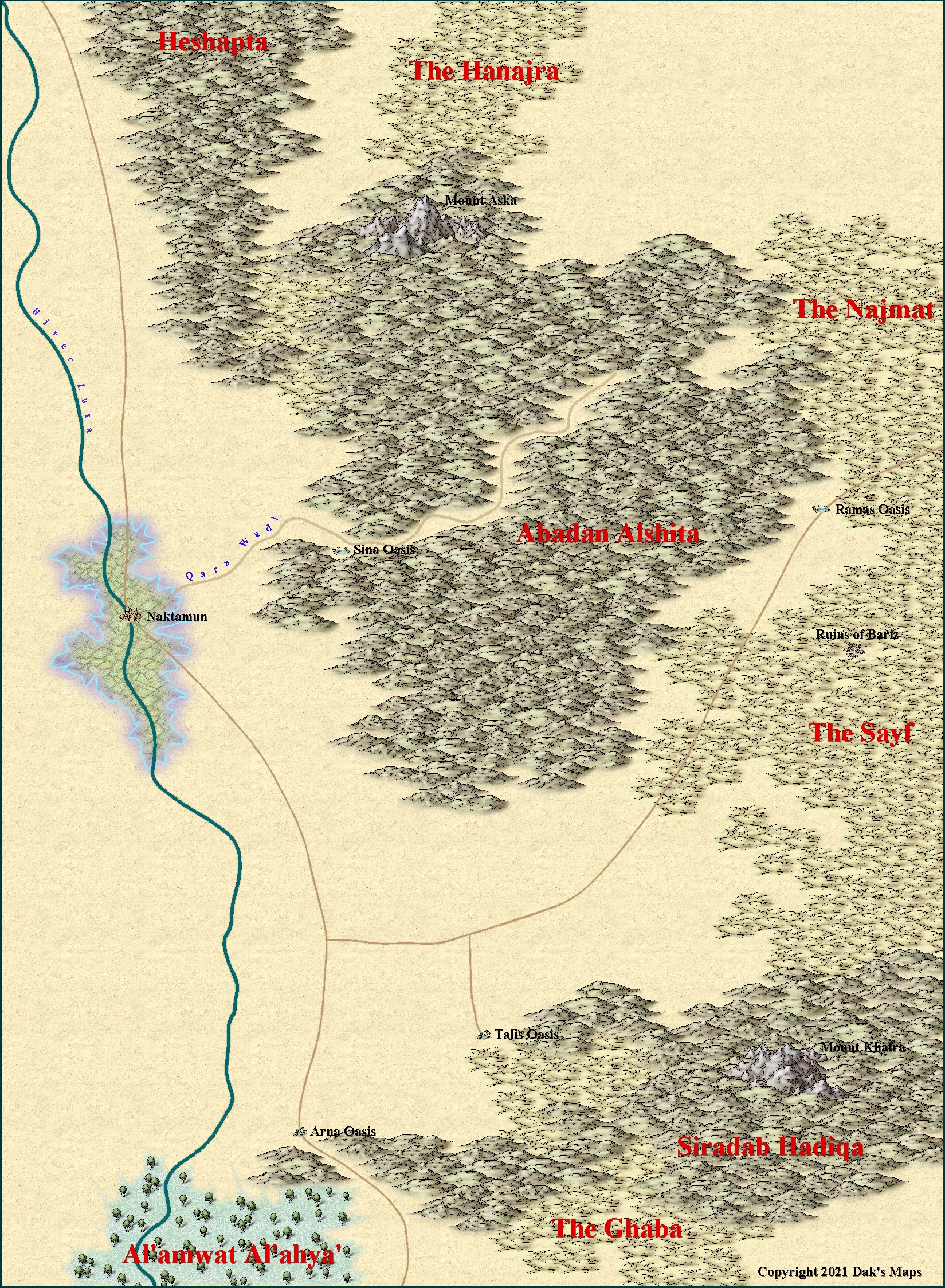
Short of any official map, these are my imaginings of the Amonkhet MTG plane to go with the Naktamun map I made a few months ago. The second map is for an adventure I have adapted from a well known 5th ed' adventure.
Having uploaded them, they don't look sharp at all even though they are lower res' versions than the maps on my PC. Which also seems to be the problem with my Bone Hill maps.
I just checked the rendering when saving the map as a JPEG, and it was doing 8 renders for a 5000x5000 map now it is only doing 1 render, and I'm wondering if this is the problem with my recent maps looking dull, and not sharp.


Comments
@Dak wrote:
Having uploaded them, they don't look sharp at all even though they are lower res' versions than the maps on my PC. Which also seems to be the problem with my Bone Hill maps.
I am not really following you here? Why should they be sharp by being lower resolution than the ones on your PC? Lowering the resolution removes details from an image, and can certainly make it look less sharp.
I just checked the rendering when saving the map as a JPEG, and it was doing 8 renders for a 5000x5000 map now it is only doing 1 render, and I'm wondering if this is the problem with my recent maps looking dull, and not sharp.
This is because you followed Sue's advice in another post and changed your max pixels per pass, allowing CC3+ to export more of your map per pass. This doesn't affect sharpness in any way.
Thanks Monsen, but I didn't express myself very well.
I think I've narrowed the problem down to the map not printing all the Active Sheet Effects, which are on. For instance the Text is printing without its border colours; black for the red text, and white for the black text. I think this is making the maps look not as sharp as the other area maps I have on this forum which are printing with the Active Sheet Effects. Compare these maps with my maps of the Feydakin sultanate from a few days ago. They are all lower res maps but the sultanate maps look sharper and the text has its border colours.
It's definitely something to do with these Amonkhet maps, though. I just printed off the Sultanate map at the same res as these maps and it has all the effects on and the text has its border colours.
Any advice on how I can fix this will be most appreciated.
How are the effects defined? If the effects are defined in percentage of view width instead of map units or percentage of map extents they tend to disappear when you export the whole map, because the actual "view" during a high-res export is pretty large.
Thanks for the advice Monsen. Here are the maps again and they look so much better.
Why is the Percentage of View width still in there, let alone set as default for quite a few effects? IE what is its purpose that justifies it still there. And I so dislike it being set as default for so many effects.
Legacy. There must be thousands of maps out there which have their effects set like this, so I shouldn't think that removing it is really an option. I read a perfectly good explanation of why it was created and why people use it some time ago, but I can't remember where.
If it's any comfort I never set up any of my own styles with percentage of view width effects. They tend to be always in map units - which have their own unique disadvantages if someone decides to make either a humungous map or a very tiny one, but based on a regular 1000 x 800 map unit template.
Percent of View is a very useful effect setting if working with the map in CC3+ is the primary goal rather than exporting it. You can for example use it to ensure that things like text glow are the same absolute size as you zoom in and out, instead of having it almost disappear as you zoom out or overly large as you zoom in. But it is less useful when you are producing exports, although there are some instances it works there too, but it is important to realize that this setting means that what you get out isn't the same as on screen (not necessarily a bad thing).
But yea, it shouldn't be the default setting, that's not the optimal choice.
That's the explanation I couldn't think where to find.
Thanks Remy :)