[WIP] It is strictly prohibited to throw jewellery into the lake.
 BlackYeti
Traveler
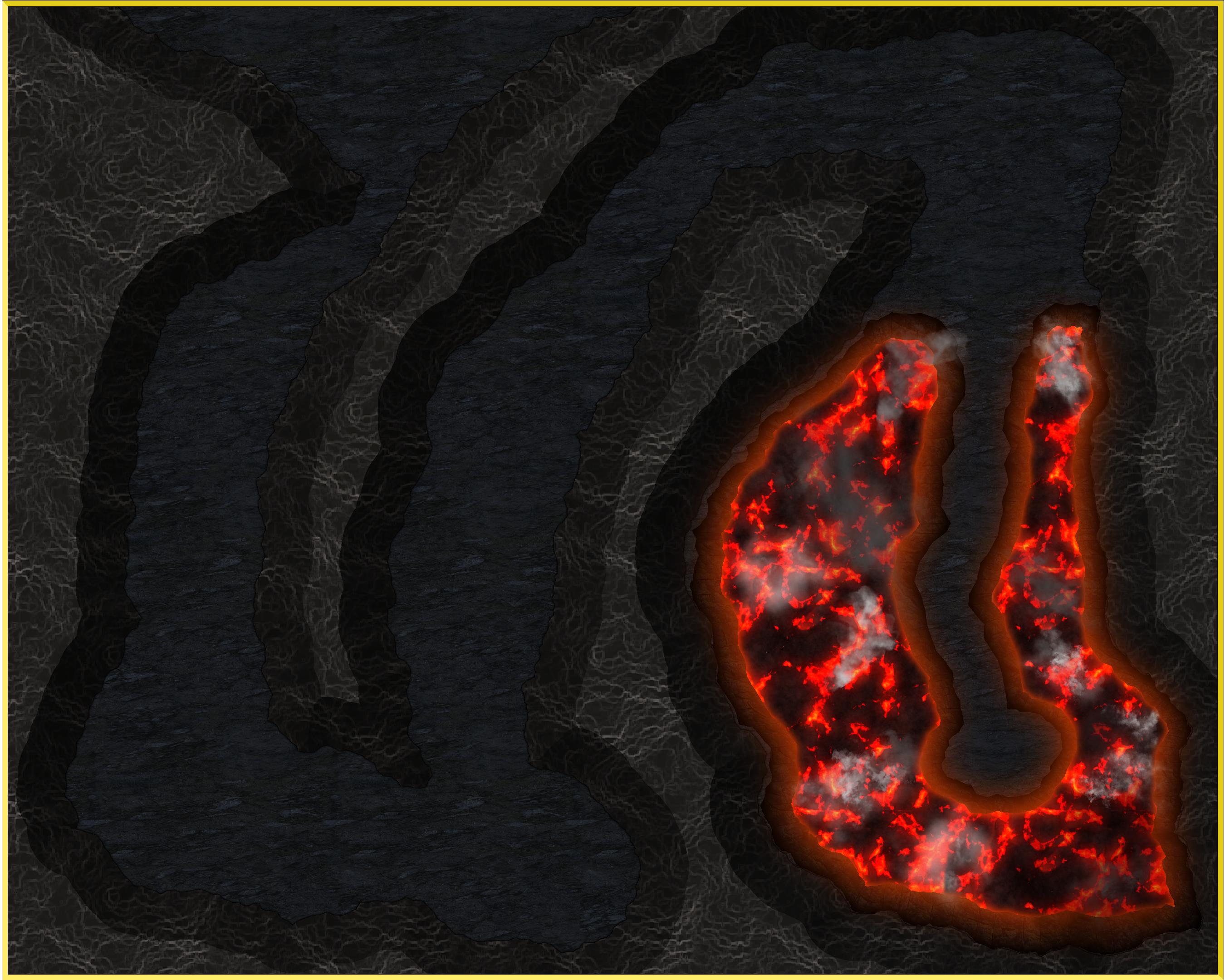
I was by inspired Remy's recent video on ice caves to make my first map (not what I thought it would be if I'm being honest), and so I've started on a proof of concept version.
I'm not 100% convinced regarding the look of the toxic fumes coming from the lake's surface (though I've no idea at the moment how I would do them differently) but in general I quite like the look of it. It's time now, I think, to move on from the lava lake and start working on other parts of the cave.
I had a couple of spectacular failures when making this, but it seems to be progressing far more smoothly than I was anticipating. ?






Comments
"Spectacular failure" is simply another rung on the learning curve ladder. I have many such rungs...
Looks fabulous. What about a hint of yellow for sulphurous fumes?
Why do the fumes glow?
Thank you all for the kind response.? I didn’t intend to take so long to respond, but life got in the way there.
Joe, the fundamental reason that the fumes looked the way they did is that I had repurposed some of the symbols from the Dundjinni Archive’s fog catalogue for the effect and that’s just what those symbols look like. I suspect that it was exacerbated by the contrast with the darker colours elsewhere in the map, and possibly there’s some glow from the lava shining through the pngs. I hadn’t actually noticed this myself as my monitor is rather bad at displaying the colours; it makes everything look rather muddy so it was only after seeing the exported image on another device that I got the full effect (that’s also why the lava’s so red, I exaggerated that colour too much as it looked more like orange on my monitor). I’ve now gone back and redone the effect using textured polygons with sheet effects, so it hopefully looks better now.
Quenten, thanks for the suggestion, I like it a lot. I’ve applied RGB Matrix Processes to remove a little of the blue from the fumes sheets and thus nudge it towards yellow.
I'm not quite ready to call this "done" yet, I think that the middle corridor in particular needs something added to it (I'm not quite sure what at the moment, but I'm sure I'll think of something). I also want to try experimenting with lighting. I do think it's starting to come together now though, so I hope it won't take that long to finish.
Out of curiosity, I just counted the number of different sheet effects that I've added to this map and it turns out that there are 42 of them. I can only assume that this is the universe's way of telling me that I should probably stop tinkering with it.
I welcome any criticism that you have of this, either positive or negative, but unless anyone has any suggestions for improvement, this is essentially completed. The only thing that it's lacking at the moment is a title, which is a little difficult right now since I did this as an experiment and haven't developed a setting for it. I'll have to think about this a little more and see if I can't come up with something.
You can do all of that with only 42 sheet effects? You're doing well. I had a map with 135 sheets and an average 3 effects per sheet.
Looking great :)
Yeah, 42 effects spread over 38 sheets (34 if you exclude default sheets that I'm not using) seems to be all that I needed for this. For the sake of comparison, here's what it looks like with them turned off:
I'm rather in awe of your use of 135 sheets though, how on earth did you keep track of them all? I was getting mixed up regarding where I had put specific sheets near the end with my comparatively modest number and was seriously starting to wish that I could expand the size of the dialogue box just so that I didn't have to scroll through them as much.
Part of the reason I had that many was that the map had 8 terraces, so each had at the very least a rock sheet and two grass sheets, never mind the 3 types of building sheets for each if that terrace had houses on it.
I kept track of everything in a notebook. In those days it wasn't possible to copy and paste effects, so I had to cross out and update things I changed so that I could see what I'd just done to the lower terraces in terms of colour and bevel changes, so that I could carry on the series up the hill.