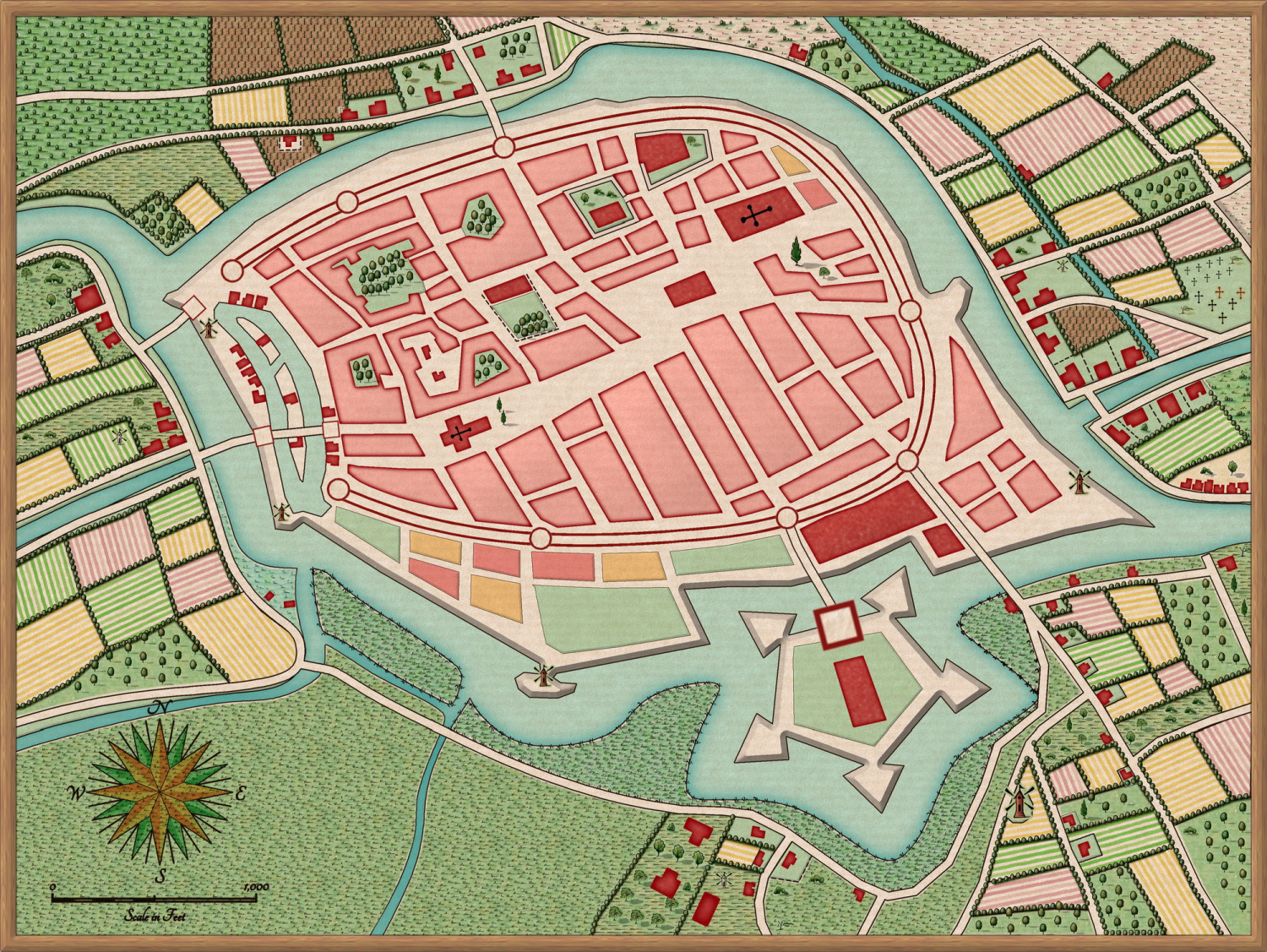
First Map - Ferraris Style City
 ledge
Traveler
Hey folks, after having had CC for 5 years then getting the humble bundle this year I finally made some time to start making maps :) I wanted to do a city map and have had hanging on my wall a print of an old map of the city of Groningen in the Netherlands from 1613 (http://ledgerwood.info/GroningenOld.jpg in case you want to see the original). I figured having a per-made template to work from so I could learn CC without having to think too much about the city layout would be a good idea.
I started creating the map using the Jon Roberts style but placing individual buildings was driving me a bit mad. Then the black friday sale came up so I picked up the 2020 Annual (and SS5) as the Ferraris style looked almost perfect for recreating a bit of the feel of the original. It certainly made the buildings in the city much easier :)
Not sure it's 100% finished, but I'm reasonably happy with how it's turned out.


Comments
I like it very much! :)
Well done, ledge :)
The Ferraris Style isn't one I would usually recommend for new users, owing to the relatively complex nature of the sheets and effects, but you've done a great job there.
Hello Ledge! And welcome (back?) to the show!
You are touching a subject I also am wrestling with. Namely a streetmap in an historical style like the one of Groningen (Münster is also a great example black and white version https://wiki-commons.genealogy.net/images/8/8a/Monasterium-Westvaliae_1648.jpg, coloured version https://de.wikipedia.org/wiki/Everhard_Alerdinck#/media/Datei:MuensterAlerdinck1636HiRes.jpg)
There have been quite some annual entries which aim to help you with this kind of map: John Speed, Renaissance Map (based on the Paris map, Isometric maps etc.) However, I could not make these styles work for these kind of maps. I even have trouble using John Speed to get a coloured version like the one he did for Oxford (https://commons.wikimedia.org/wiki/File:John_Speed%27s_map_of_Oxford,_1605..jpg) .
But for the record I think the most difficult thing with a style like the isometric bird exe view is the rate of the size of the buildings compared to the streets and make it look good. Streets are basically empty spaces.
So for historical looking maps I think ferraris is one of THE BEST (one more shout out to Loopysue!!) styles you can have. Especially as the others lack something to make the battlements. But Ferraris can teach you lots of techniques how to use the sheet effects and what to look out for.
Go for Gold!
Cheers Olaf
What I really like about the Ferraris style is that it nicely mixes the city and surrounding area. So you can easily add the fields and start looking at the growth of a city outside its walls.
Despite both you and Sue mentioning the sheet effects I didn't have too many problems with this. Or notice what I was doing, though I guess I did have to play about with the ramparts and water to get some things working.
I also love the hedgerow system in this style, looks awesome and is so easy to use. But yes, big shout out to Sue for this style!
Thank you, both :)
This was one of the most interesting styles I've ever worked on. Research involved examining the original Ferraris Map mile by mile for nearly 8 weeks to be sure I'd got most of the textures and symbols - longer than it took to draw.