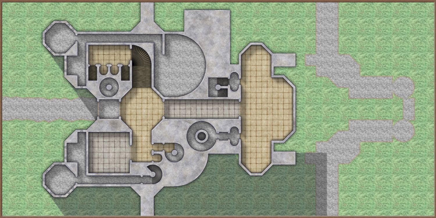
[WIP] Castle Ravenloft.
 Raiko
🖼️ 32 images Surveyor
Yet another work in progress - lol.
I've got a couple of weeks holiday from work, and so I'm playing around with different maps.
I mapped Castle Ravenloft ages ago to run the original I6 AD&D Module Ravenloft in 3rd edition D&D - with a few alterations for balance. I did those maps with DD2 and printed it in room / corridor sections to lay out as floorplans.
I've got the recent Curse of Strahd reboot of the Ravenloft adventure for 5e, but while most of the maps inside are new Mike Schley maps, the Castle Ravenloft maps are more colourful copies the original isometric maps, but are actually much harder to understand than in the original module (smaller print on glossier paper).
So for fun I'm having a go at 2d copies of the Castle Ravenloft maps, mostly using the SS4 Mike Schley's Dungeons symbol set.
I'm also playing around with this map a lot to experiment with colour key (and later with those scary AHS and RGB effects.
This is the ground floor of the main building so far:

The staircases are placeholders - I've not decided how best to do them yet. The castle has lots of spiral stairs in several different styles.
There are a few holes in the walls, as I got carried away with colour key areas on the wall mask sheet. Oops!
The right hand edge of the map will be looking over a cliff, so I'm going to have a go a cliffs like Sue's Amazing Orde-on-the-Rock, to see if it's as hard as it looks!
I've got a couple of weeks holiday from work, and so I'm playing around with different maps.
I mapped Castle Ravenloft ages ago to run the original I6 AD&D Module Ravenloft in 3rd edition D&D - with a few alterations for balance. I did those maps with DD2 and printed it in room / corridor sections to lay out as floorplans.
I've got the recent Curse of Strahd reboot of the Ravenloft adventure for 5e, but while most of the maps inside are new Mike Schley maps, the Castle Ravenloft maps are more colourful copies the original isometric maps, but are actually much harder to understand than in the original module (smaller print on glossier paper).
So for fun I'm having a go at 2d copies of the Castle Ravenloft maps, mostly using the SS4 Mike Schley's Dungeons symbol set.
I'm also playing around with this map a lot to experiment with colour key (and later with those scary AHS and RGB effects.
This is the ground floor of the main building so far:

The staircases are placeholders - I've not decided how best to do them yet. The castle has lots of spiral stairs in several different styles.
There are a few holes in the walls, as I got carried away with colour key areas on the wall mask sheet. Oops!
The right hand edge of the map will be looking over a cliff, so I'm going to have a go a cliffs like Sue's Amazing Orde-on-the-Rock, to see if it's as hard as it looks!
Tagged:


Comments
I have lots of mapping projects in progress. Welcome to the club of WIP.
Castle Ravenloft's the only published adventure I have copies of from all its "official" iterations. Big task ahead!
Though I'm guessing you're not going to be doing the isometric cutaway views as well, and for the original, it's really not orange enough!
[With apologies to anyone unfamiliar - the original I6 module from 1983 came with a big fold-out poster map of the whole castle with isometric floorplans in a semi-cutaway view, with each floor level (twelve of them inside and below the castle, plus another of the courtyard within the castle's outer walls) clearly separated. It was printed in black, white and - several shades of orange to brown!]
Like this?
I don't own the 3.5 "Expedition to Castle Ravenloft" version, mostly because I'd just run Ravenloft for 3rd Edition anyway, but I couldn't resist Curse of Strahd for nostalgia.
I'm not in a hurry to get the maps done, so I'll do every level, but just flat versions, to go with all the other maps Mike did for CoS.
Pretty much, except some of mine are digital only. I'd drifted away from D&D by 1983, so my first hardcopy encounter with von Strahd was via the Ravenloft boxed set.
I also extended the map boundaries to include the whole of the castle grounds.
Close-up of the keep: [WIP]
Castle Grounds: [WIP]
I don't know the game, but this is turning into a really good map :)
Castle Ravenloft Keep, ground floor - staircases added:
A couple of levels further up there is a bridge that connects the towers, and a potentially epic battle encounter mid-way up the northern tower, with its open staircase.
I'd like to make the map for this level, as spectacular as possible, and so I've gone all JdR and I'm planning a perspective view down the centre of that tower. I've also decided to take advantage of modern D&D's 5ft grid to narrow the staircases in the two tall towers and thicken the walls to more realistic thicknesses. The WIP levels maps later in this post haven't been tweaked to these new wall dimensions yet.
Here is my cutaway sketch to plan the staircase, the north tower narrows as it rises (and in my tweak the walls get less thick as well), so the staircase has to narrow as it rises - which will make the perspective view trickier.
For those who have various versions of the Ravenloft adventure, I'm using the smaller heights from the AD&D 2nd Edition House of Strahd version. This makes the tallest tower almost exactly the same dimensions as Galata Tower in Istanbul, which is as far as I know the tallest Medieval military structure in the world. In the 1st Edition & 5e versions of the map everything in the castle is considerably taller, bugs me a bit.
Here are the WIP level maps for levels 2-4:
Green areas are to show me what needs working on; plain blue areas will be roofs, which I'll detail when I've finished the layout.
[WIP] Castle Ravenloft Level 2 - Court of the Count:
[WIP] Castle Ravenloft Level 3 - Rooms of Weeping:
[WIP] Castle Ravenloft Level 4 - Gables of Ravenloft:
Ignore the staircases that should have been deleted in the top left corner.
The wall parapets look weird because they are currently on my floor sheet, which is below the outside sheet. So they currently appear to be below the grass (and the chapel roof!!!), that will be sorted when I work on the exterior areas. I've also not worked on the overlook to the right of the map, so Ignore anything weird looking there.
Don't know whether the newly-released "coffin box" version of Strahd adds or changes anything to this. From what previews I've seen, they've reverted to a nice foldout poster map, but the layout looked pretty similar to most previous versions overall. Couldn't see enough to check in detail, of course. For that, there's the little matter of $99.99 to pay first...
Beautiful and iconic as the iso maps are, I can't imagine that it's easy to DM the adventure using them. The castle is a very clever 3d maze, but it's only the players who are meant to get lost in there, not the DM!
The best thing they could have done for 5e would have been to include the great original Iso map, but also have Mike produce a 2d version for the poster map. The rest of the maps in the campaign are so easy to use.
Yes, I'd forgotten about that too. Meant to check my 5e HB after our previous discussion and naturally didn't remember to do that either...
It looks identical in all respects to that in the new "coffin box" set, so $99.99 saved, by the looks of things!
I quite agree about the maps for running the game. They did ISO drawings for places in a number of the boxed set Ravenloft settings as I recall, so that may just have been a style choice at the time. I can understand them wanting to persist with that, though it is odd not to have provided maps in a more usable format as well, especially in something like the new "special" version.