

[WIP] Community Atlas - Kumarikandam - Xinxing - Ylangxi City
![[Deleted User]](https://secure.gravatar.com/avatar/c75d9a245b74d9c59be0999ea81ca541/?default=https%3A%2F%2Fvanillicon.com%2F92add7f8c954488718110edc4896ad39_200.png&rating=g&size=200)
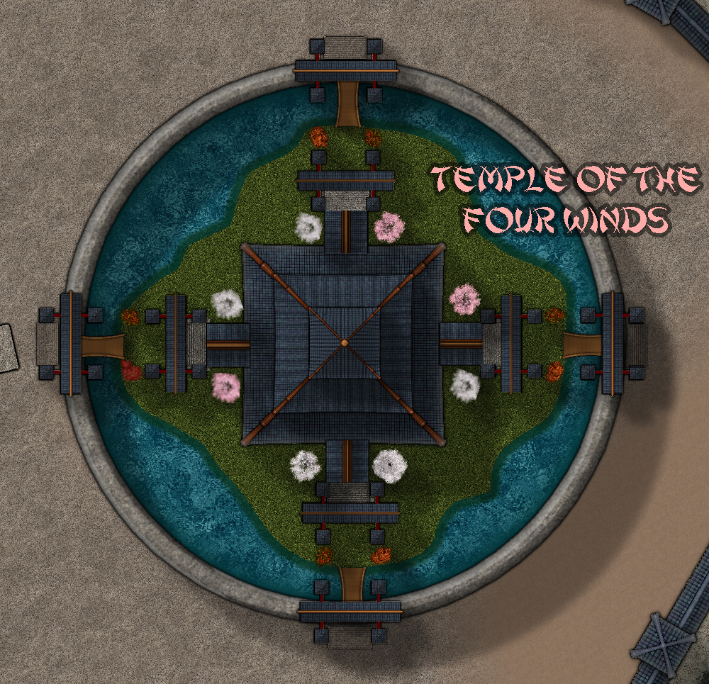
I started this map quite a while ago. Now I am getting around ti finishing it. I am using Sue's East Asian styles. Not much done except the layout (including the cliffs from Sue's Asian style, rather than the new you beaut cliff style from August). I have just finished the Temple. I am using the Shanghai script. Question: Is that an official ProFantasy script - I thought it was, but can't find a reference to it.
Comments
There is a font called "Shanghai" that is installed with the 2016 annual. See the font question here: https://atlas.monsen.cc/Contribute
Thanks - Norway to the rescue again
I think the new cliffs are probably better than the old ones, but you use what you like :)
Looking forward to seeing the rest of it develop.
Today's 'progress'. All the streets done, and houses being put into place. Also trying to work at how to do terraced rice paddies - methinks I need to look at more pics.
Coming along nicely :)
As for the rice paddies I would probably just rely on drawing fields that go around the contours divided by simple walls of stone, then make a few identical sheets and stack them up with a glow effect on each sheet.
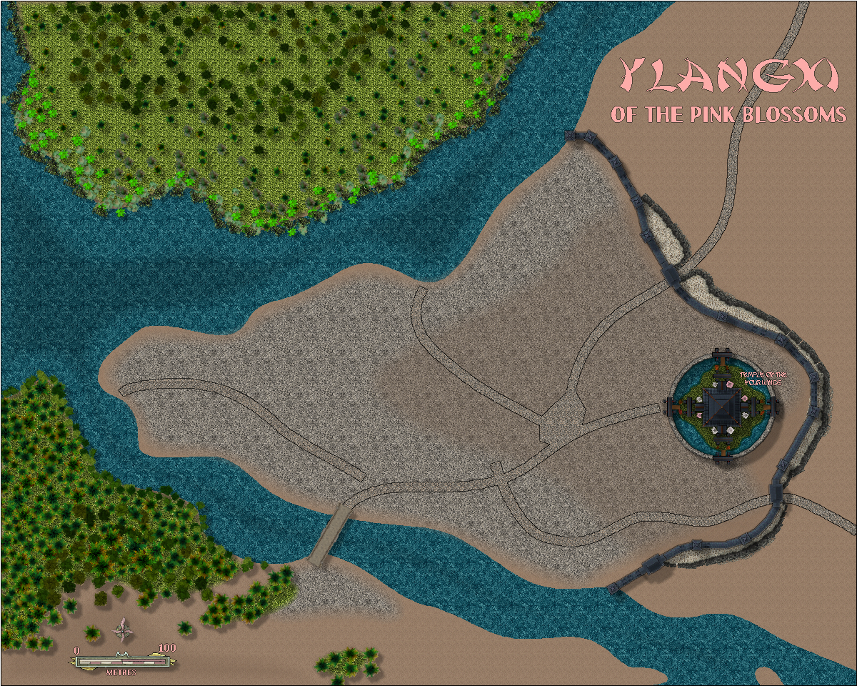
Here is my city using Sue's oriental style. Getting around to finishing it - after 18 months! I may redo the rice paddies - again. And the market gardens. Still some blank spaces to fill mainly with rocks and trees.
My goodness! I had forgotten this one.
But then I do have a memory a bit like a wise goldfish - about 3 months instead of 3 seconds :)
Looking interesting!
Labels are getting a bit lost currently though - and is there a reason why some are in the same fancy typeface as the title, while others are like the subtitle line?
Not really up to sorting that yet, but thanks for the reminder to do so. My first aim is to fill the city and surroundings, to redo the rice paddies and market gardens, then sort out text etc.
At last I have finished the city. Now awaiting critiques and comments.
A few blow-ups.
The water texture looks rather "busy" to my eye, but that's probably just me.
There is an issue with some of the text however, where the grey glow is blending into the background in places - on roads and buildings, especially where the road edges are outlined with narrow dark lines - e.g. "Petaluma Stockyards" and "The Heart Markets". In other places - e.g. "Northwind House", "Xi Ling's Market Gardens" - the text itself looks somewhat transparent when set above paler backgrounds. This is all based on the Gallery image, incidentally. However, it did look as if there problems with the text in parts of even the lower-res whole-map view posted above here.
The bulk of the city seems a little empty of named places. Maybe even a few major street names might help here, although perhaps a few of the larger or different-looking properties might be named as well/instead?
OK, thanks for your insightful critique, as usual. I will attend to these in the next few days.
Very cool map. Thanks a lot for sharing it with us.
Features I especially like:
Thinks I might do differently:
Other remarks:
The smaller text looks a bit small/ pale in the 1000x1000 picture in here, but good in the larger gallery image when zoomed in a bit.
Same with the textures. Some look a bit "nervous" in the smaller picture but fine in the larger version.
One question at the end: You mostly used ready-made house symbols for this map. was this mainly a question of speed, or did you just prefer the look, compared to the "custom ones"?
Houses: both. LOL
There is always a balance between what looks good small and what looks good large. For cities in particular, I use what looks good on mid to fairly large.
I will fix the nitpicks - thanks for picking them up.
I will ponder on the market gardens.
Thank you for your critique
Thanks to @EukalyptusNow and @Wyvern for your very helpful comments. I hope this fits the bill now - I would like to hand it in.
Very good. The new fields look a lot better, and the intersection is fixed.
Numbers on the map could be a bit more visible (especially 1, 2 and 3), but think they're ok when viewing the map full screen.
However, the colour scheme and transparency effect on the map key look "off" to me. Maybe remove/ change the pinkish transparency background and turn the letters pink to match the actual map?
And there's also still this corner (sorry to red-mark - was the quickest way to point it out).
I will fix the area marked red, but the rest I will leave as is, because I rather like it. But thanks for the comment
So what style set is being used for the fields? Really liking the look of the rice paddies.
CA169 - Fantasy Town. And thanks about the paddies.
Thanks. I don't have that one. Been waiting on a coupon to use for that annual.
This map is now in the atlas. Thanks Quenten.