

First map feedback, and tips on how to make text more readable?

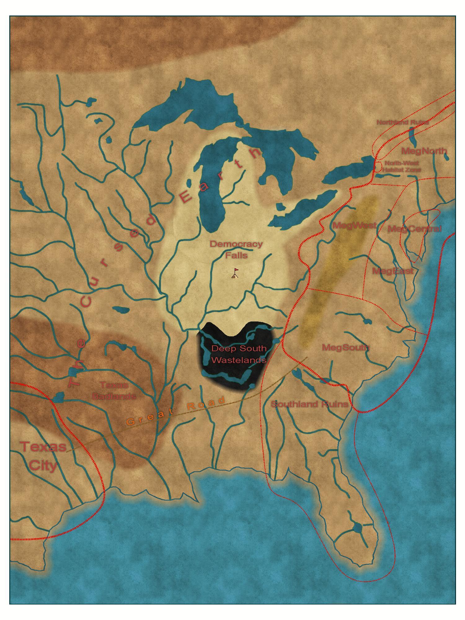
Just joined, and here's my first attempt at a map for my Judge Dredd RPG campaign. It's an overland map of the eastern and middle part of what used to be the USA.
The learning curve of CC3+ is quite steep, the UI is very different from what I'm used to, but slowly getting a hang of it.
I've been trying to make the text clearer, but it's still not there. Any tips? Also, are there any general guidelines how I should go about with titling of places, roads and regions? Should I have subtle changes between geographic features and political regions, or completely different formatting?
I just noticed that the northern edge of Deep South Wastelands is hard, while the rest is soft. How do I control this, so that the edge is consistently diffused in that region?
Any feedback in general on how to make my map better would be welcome!
Comments
The text is very similar in colour to the background of the map, so the first thing to do is either make it a lot darker or a lot lighter.
Once you have decided which way to go with it you can open the Sheets and Effects dialog by clicking the S: box in the properties bar at the top and locate the TEXT sheet (its usually called something similar if not that exactly) pick it and then look on the right where the effects are listed. There will be a Glow sheet effect. You will need to edit that to make it the right colour, and possibly stronger and less diffuse than it is.
I still don't understand why the black wastelands have sharp edges. I checked the sheet effects on "Land Features" -sheet, and they are identical to the sheet effects on "Land Features (Wastes)" -sheet, which should yield identical results - but they don't as you see.
If either the land features and the wastes are still visible, or none are, something is on the wrong sheet.
If something is on the wrong sheet, you can move it via move to sheet. That command is in the right click menu of the change properties button.
Also changed the text color to off-white for better visibility as suggested by @blckassn.
Here more or less final version. Quite happy with the results!