

Aerden
 smhollingsworth
Traveler
smhollingsworth
Traveler
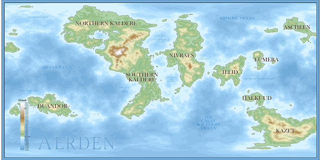
After creating - literally - dozens of worlds in FT3, using Loopy Sue's fantabulous worldbuilder tutorial, I have finally found one that (I think) I like. This is the world map for Aerden, which I intend to use for either RPGs or writing, maybe both. I would love advice on font selection and font colors, since a lot of the labels are difficult to read. I tried several different fonts and text color schemes, but none of them were more legible than what you see.
Comments
The thing about labels is that we all get pretty much obsessed with how visible they should be, but I can read those pretty well, even though the image is probably a lot smaller than you mean to use it. I don't know why this is, since if you look at any modern atlas the labels don't have massive glows on them and you can't read them a metre away.
If anything I would say they are possibly a little on the large side - all but the title, which is fine.
One thing I would suggest is that you move the altitude bar so that it doesn't interfere with any of the land. You could scale it smaller and it would still be ok. No one expects to be able to read the text on the key from a metre away.
Not sure I know what the issue is with the edge alignment. Not had that one happen before.
For the font and colours, as Sue said, always a tricky one! I like the ocean labels, and I wonder if perhaps something similar on land - a mid green perhaps - might work similarly well? Not sure, because of the tan and brown mountains, however.
I'd be inclined to move the altitude scale off the map completely - maybe fit it into the border, or just outside it, if it's important to show? - as it's going to spoil the effect wherever it is. Not sure the linear scale or compass rose are really needed. The scale will be accurate only for a limited part of the - presumably - spheroidal world in this rectangular projection, while the Kaldere labels make clear which way "up" the world's meant to be, for those unsure (
I have to give props to Loopy Sue for her tutorial. In the few months since I discovered FT3 and CC3+, I have learned so much (mostly about FT3 and WIlbur) from working through her tutorial over and over. Such a huge help for beginners.
Edit (I forgot to add this question for Sue): For something like the migration map of Helena, included with the tutorial, can that be done in CC3 or are arrows and such better to add using apps like Photoshop or Gimp?
As it stands, if you are familiar with PS then it might be eaiser. I don't know, since I never had PS and am only a recent user of Affinity Photo as a less extravagant one time purchase.