

My Foray Into Designing A Symbol Set - Episode 2
 Terraformer_Author
Newcomer
Terraformer_Author
Newcomer
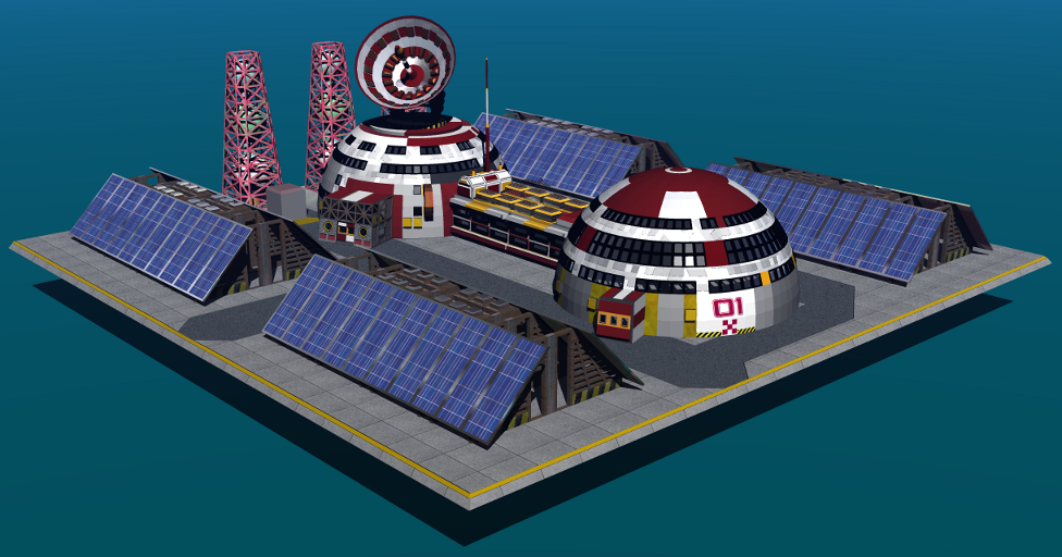
Ok, I have just added a few new Bryce materials to my future CC3 Sci-Fi Overland Symbol, after building it in Wings3D. What I need to know now is how these textures / colors will translate on a CC3 map? Will they look "goofy", or will the colors bleed or fade too much? Will they be too dark? Will scaling the image within CC3 cause it to lose too much significant detail, and thus - make it look crappy?
I want to add more textures but a little voice in my gut keeps telling me "Knock it off Bill - it's good enough - if your not careful your gonna garb it up too much, and it's gonna look like something out of a badly written Anime cartoon!...Hmmm...Actually it already does...Lol") "
"
By the way Jay_NOLA, - let me tinker with this thing a little more and I'll post the Bryce Model for you here, or I'll get it too you some other way - whatever. Come to think of it Jay, this model would be PERFECT for your tutorial on Bryce to GIMP Transparencies and CC3 symbol import!
I want to add more textures but a little voice in my gut keeps telling me "Knock it off Bill - it's good enough - if your not careful your gonna garb it up too much, and it's gonna look like something out of a badly written Anime cartoon!...Hmmm...Actually it already does...Lol
By the way Jay_NOLA, - let me tinker with this thing a little more and I'll post the Bryce Model for you here, or I'll get it too you some other way - whatever. Come to think of it Jay, this model would be PERFECT for your tutorial on Bryce to GIMP Transparencies and CC3 symbol import!
Comments
This is more or less a record of the process.
Actually it really doesn't look quite as awful as I thought it would, lol.
The empty spaces in the framework of the towers, and the empty spaces just under the Dish Antennae look a little weird though - hmmm?
I can see right now that if I'm going to start doing symbol sets for redistribution, then I'm going to have to solve the problem of trying to fix the weird areas in the tiny enclosed empty spaces if I ever want to get them up to Pro standards. Is it the GIMP that caused this - or did I do something to cause these artifacts?...Hmmmmmmm...
Otherwise - looks pretty clean...
If anybody wants to Beta test this image by taking the initiative and loading it into CC3 for a test drive - be my guest. I'm going to do that myself - but first - I gotta get some sleep, Lol.
The areas you mention as weird are set up with partial transparency, so they doesn't look as weird when you place them on a real map instead of a uniform white background.
I did import it into CC3 and when used in a map, I believe it might be a bit too detailed. It looks very good when zoomed in, but when you view it at a more normal symbol size, it can look a bit cluttered. You can combat this by designing all of the different resolutions yourself (instead of letting CC3 make them automatically), and create simpler models for the lower resolutions, but that will be a lot more work, since you need to create four different models with different detail levels, instead of simply making the highest quality one, and simply re-size the image for the other resolutions.
Hope you put the model when finished up on ShareCG.com or some other free model archieve. Im certain many 3D artists would love using it scenes.
If you have any recomendations for my alpha msk tutorial let me know. When ever I get around to start typing up my 3d models & CC3 tips I'm thinking of starting off with explaing why an alpha mask is important and if you need to make one or not. The to make or not make one isn't that straightforward in some cases.
The empty spaces like around the towers I've had happen with other models and some ways do exhist to deal with that if it is happening. I post something on how to dealw with it if it happens in the next day or two.
The Bryce Model of the "Generic Outpost" can now be downloaded from Share CG at:
http://www.sharecg.com/v/53608/browse/5/3D-Model/Bryce-Generic-Sci-Fi-Outpost
Also Jay - if you use the model for a tutorial - then here is the ALPHA MASK that I have posted on this thread. I would suggest using the previous thread on this subject as well to harvest any more images that you might need.
Monsen, THANK YOU for that test run sir!!! INPUT INVALUABLY CRUTIAL!!! What would be great though - if you wouldn't mind - is if perhaps you could show / post an image of the prototype symbol at zoom out scale on this thread - to the point where you said it looked a bit garbled (normal symbol size). It would be helpful, but not mandatory, lol
Footnote to Jay_NOLA: Jay I need to know what version of GIMP your using - because I had to use the abbreviated "wand" method of transparification - and I did not see the "Eye" icon in the layers dialogue for making the suppressed layer(s) visible again. I believe that there were also a few menu items and boxes that you referenced that may not be on my version of GIMP. My version is one of the most current (2.6.11) that will work on a 32 bit - monocored machine running Windows.
So what so far have I learned?:
#1, MODERATE DETAIL ONLY on future models - excessive detail (according to Remy) does NOT translate well in the CC3 window. Will have to do the test myself and export a test map to check if the "cluttered" appearance carries over to a working export specimen.
#2, Check transparency edges - and don't panic about partial transparency zones, do a slide test.
#3, Instead of building seperate models for different resolutions (as Remy has recommended - which is intrigueing), perhaps the image could be converted to vector (.svg) format in Inkscape, rescaled at different resolutions, and reconverted back to trans PNG? Hmmm, might pay to try BOTH approaches.
Below is the original Alpha Mask that I did for this project.
At this point, I'm feeling oddly both very pleased - and somewhat disappointed with the results. Input and critism is welcome - but please be gentle, lol
By the way - no more large graphics for me on this thread. They are only included here for instructional and technical purposes - and I don't want to slow the thread up.
I've used up my large graphics qouta for this thread already, lol.
The one fact that seems painfully clear is that the symbol models are probably going to have to be extremely basic and rudimentary to keep the "wow factor" at the peak of the tolerance curve.The symbols are going to have to be designed to accomodate "recognition at a glance" - instead of someone having to squint their eyes and inquire to the effect; "What's that thing supposed to be?". Remy Monson's experience with this prototype has been sufficiently scientifically verified, and Mr. Monson's perspective is now fully relatable by yours truly.
Thank goodness he tested this - otherwise I would've been hard pressed to overcome my own occasional laziness, and investigate this further as immediately as I did.
I am inclined to chalk this up to being either an extremely dynamic and positive failure - or an extremely mediocre and "ho-hum" success. It's really a hard call. I am somewhere between being inspired and motivated to push on with this type of endeavor more than ever before - or being obsessively perfectionist enough, to get all bent out of shape over the lack of immediate electrifieing impressiveness, and throw in the towel in a whiny, spoiled rotten bout of "over the top" disgust, lol
I looked over the PNG last night and downloaded the model.
The semi-transparency in the symbol is because of how the light is making shadows. the semi-transparency in the PNG is to give the darkness to the background caused by the shadows. It just doesn't look right against certain background types. I did a couple of tests last night with it against various colored backgrounds to check this.
Don't panic like you said. This is normal.
If you find it is a problem change one ore more of the following: light settings, light placement, how Shadows are set to work, render settings, Sky Lab settings and/or object placement.
The best thing to do as a first step in Bryce is changing how "Link Sun To View" in the Sky Lab is set and seeing if that is all that is needed. A small minor adjustment or 2 is all that may be needed.
The other in a previous method of creating an alpha mask in the link I posted may need to be used in some cases to.
Checking the transparencies to see they came out ok and no problems with the mask layer exhist is a good idea too.
I popped the Outpost into a Bryce scene I had working on several weeks ago. I've attached the render. The lighting isn't great and I've got a bunch of things to fix in it at some point. The scene was a test of somethings and for a class. No postwork was done on it.
I've got Gimp version 2.6.11.
The eye in my instructions should have refered to the eye you see next to each layer in the Layer's Dockable Dialog. Thanks for catching that. Just updated my Word file with the correction. When I get around to typing up a better version I'll add in screen shots for each. Need to fix steps 7 & 8, and come up with something a bit better written. Also, have to make sure to not type up instructions at a late hour after spending several hours working with bryce, Gimp, Elements, & Paint. When I made the word file a couple of months ago I was pulling my hair and such trying to figure out how to get some planets, asteroids, and a spacehip from Bryce into PNGs that could be used to make CC3 symbols and was getting very fustrated with my PNGs not looking right.
I'm sort of doing the same thing again now with some prep work I doing for some future posts on 3D tips.
When I do get the instuctions fixed I'm certain I'll have to fix stuff on it again.
Might have something else to post latter today or in the next day or two I want to try some stuff with the Bryce Outpost file.
Latter.
Actually the reason why I am frustrated with MY PNGs is that I have - like Remy stated earlier - placed too much detail in them, and also that the symbol model itself is too geometrically "flat". I was able to put them into the CC3 Symbol Manager and export the scale views, but for some reason I couldn't get them to visually stick to the map. Whenever I manuevered the symbol to where I wanted it - clicked it - and then clicked "Finished" on the pop up, it would vanish again. I'll have to check that out because obviously I'm missing a step somewhere. An outputted map view would really give me a better idea of where I'm going with this - so I'm going top have to iron it out and do a full map export.
Putting a lot of detail in my models is something that's going to be a hard habit to kick.
Any pointers to additional tutorials and info on creating Symbols, Styles, and Catalogues would be awsomely sweet at this point. I had tried accessing the help menu in CC3, but Vista choked on the help files because the winhlp file format is obsolete - and when I tried to download a copy of the "winhlp.exe" fix from Microsoft - it wasn't there, (the download page prompting you to validate and Run WAS there - but after validating - I was rerouted / bumped out to a storefront), and I was rerouted to the downloads main front page (apparantly Microsoft has said "tough tacos folks" to everybody that still has programs that use the old .hlp files in their help menus). According to them - seemingly - nothing's useful or valuable to users after five years, and file formats spoil with time like room temperature cottage cheese.
The old help file format (.hlp) does NOT work on any version of Windows AFTER XP (Vista, Windows 7, etc.), and apparantly the solution to that problem NO LONGER EXISTS because the trendy kids over in "Windowsville" declared to everybody else in the world that they should - qouting a classic Rush tune - "Conform or be cast out" - I'll have to either consult the paper CC3 manual, or try to locate a PDF version.
Profantasy developers need to address this - and replace the help system in CC3 to either html, xtml / xml, or a PDF that's recallable from the GUI menu / task bar.
BTW - the image is cool, visually and figuritively amigo.
Thanks for the kind words on the image.
I thought the help file issue was fixed in the latest CC3 Update.
You can get a zip in the thread bellow that you can see if that works.
http://forum.profantasy.com/comments.php?DiscussionID=1778
Try this link too if yyou haven't if your using Vista 32 bit.
http://www.microsoft.com/download/en/details.aspx?displaylang=en&id=5143
I need to do some check some stuff about that the semi-transparcy areas in the next few days. Might have to make some additions and/or changes to stuff I said, since I have the alpha mask you used to look at. I think my knowledge of alpha masking with Gimp is improving.
I got chance to do some testing last night and this morning with the Outpost model.
I made several renders with alpha masks using various lights and position settings.
I can confirm that the semi-transparency is a aresault of the light, shadow settings, and position of the model in Bryce. Bryce add that semi-transparency so the shaows look right. Unfortunetly against certain backgrounds it may not look great, but it isn't any reason to painc.
If the stuff I mentioned in the previous post doesn't work turnning Shadows off, etc.
I tried exporting the Outpost as an .obj from Bryce and bringing it into Carrara. I couldn't get the texture files to load Bryce created. Bryce made over 100 textures in the output. I'm not sure if the export to .obj is the best format to use.
I'm not very familiar with .svg format but Carrara can export to it. Carrara has some option on how it looks, but I used just the default. I made an untextured SVG of it and have attached it. If it helps with your expermentation let me know.
Will be doing more experimentation as time permits with exort and import settings.
Do you have a link or picture you can post of how the color's need to be changed. I'll play with the image this week if I have any free time.