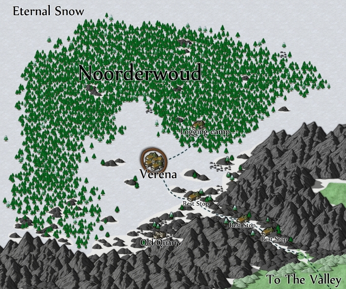
Verena region
It has been a long time ago since I last used CC3 for overland/regional maps, as I have been using CD3 exclusively. This weekend I started experimenting with a regional map and this is the result. It's a small city located on the edge of civilization. Snow and ice claim large parts of the land and directly to the north the eternal snow plains start.


Comments
I like the way you placed your trees and mountains. It looks very natural.
What doesn't though is that the base of the moutain range is more white than the snow. What about some light tan color, with blured edges ? Or is it meant as ice and the other snow ? In that case I would use your snow bitmap for the ice and the same, but lighter, for the snow.
Very nice.
And there is a good reason for the contrast, yes :-)
Although I like what you are saying about the trees, I think I am going to leave it like this. The depth wasn't really something I planned for.
I will post another version soon though, with some snowcapped mountains and a border.
Bigger version: http://img33.imageshack.us/img33/6103/verenaregionfinal3.jpg
So I am enlarging this map... this is a work in progress of course.
The sheep are part of the Symbol Set 1. The cities are basically several house symbols that I placed (sometimes I added in a tower or castle). I created a couple of custom tools to create walls and the farmland.
I had to redo a lot of stuff today as my sheets and effects had become a mess. I hoped to finish the map today, but alas...
As an added bonus, a bigger version:
http://img199.imageshack.us/img199/9669/verenaregionlarge2.jpg
Am not sure about the river coming out of the mountains (just below the sunken lands).
Doesnt look quite right in my opinion.
All in all, I would be proud if this was one of my maps.
Is it all the rivers or just the one directly under the Sunken Lands label?
Bigger version: http://img30.imageshack.us/img30/8440/verenaregionlarge4.jpg
I think this is an attractive map and I like some things you have done here, although the fields - IMHO - are a little overdone and are losing their impact. That may be just me, but the quilt look seems too much and I'd like to see it thicker near the main cities and thinner between settlements. For instance, the fields between Westdiep and Dudsmerp (?) to the east are equally thick for the entire length, including right along the coast (is this sea or lake? the water/salt air might make a difference to the farm proximity). The heavy, heavy fields to the SE corner is also too much - but, again, just in my humble opinion. sometimes 'less' is 'more'.
Its not the depth thats my concern. Its the background color.
Think a bit less fields would be visual more appealing.
But its still a good map and a nice example of what you can do with CC3.
- Adding perspective to the forest has been suggested before, but I wasn't aiming for a realistic perspective look (also, if I start adding perspective to the trees, I might have to add perspective to some hills and mountains, I am not prepared to make such an investmest at the moment).
- I experimented with several backgrounds for the forest and dropped them all. As Joachim also said, to me it suggests a permanent snow covered ground (or rather semi permanent, as in high summer the snow is gone).
- The white border around the mountains and rock doesn't actually make sense, but I like the look of it.
- And as for the patchwork farmland. You seem to all agree I need to do something about it. Still, I like it a lot :-)
I might try softening it a bit up, but it was my full intention to make the farmland dominating the southern part of the map. That part is heavily urbanised, so there's not just farmland around the cities, it's connecting them. The water to the south is fresh, it's basically a large lake. The area is very fertile and it can be considered the bread basket of the northern part of my world.
Did you see any other weird stuff?
The map was designed for poster size (not that I am going to print it). I am using it as a reference for my stories. I had an overland map of my world and maps of some of the cities, but not a regional map like this one.
I will definitely experiment with the farmland some more and I might experiment with the background for the hills and mountains. A cartouche is also something I would like to add. So much to do, so little time...
I made several more expansions... will post a bigger version later.