EukalyptusNow
EukalyptusNow
About
- Username
- EukalyptusNow
- Joined
- Visits
- 661
- Last Active
- Roles
- Member
- Points
- 1,250
- Location
- Germany
- Rank
- Surveyor
- Badges
- 8
Reactions
-
Community Atlas - Alarius - North Central Region - Silver Spring - battlemap
-
Quo Vadis Monthly Symbols?
Hello dear fellow mappers.
I would love some bonus content for dungeon maps / floorplans, especially SS4.
It's a beautiful style, but the rather unique look sometimes makes it difficult to substitute other assets if I really, really need a symbol that's not in the catalogue.
Monsen's suggestions are already pretty good.
I would add:
- The Necromancer's room
- 1001 nights
- The Far East
- The Jungle
- Various creature packs
I would also welcome Japanese / Chinese / Indonesian add-ons for the Mike Schley Overland style or additional Content for Cities of Schley.
-
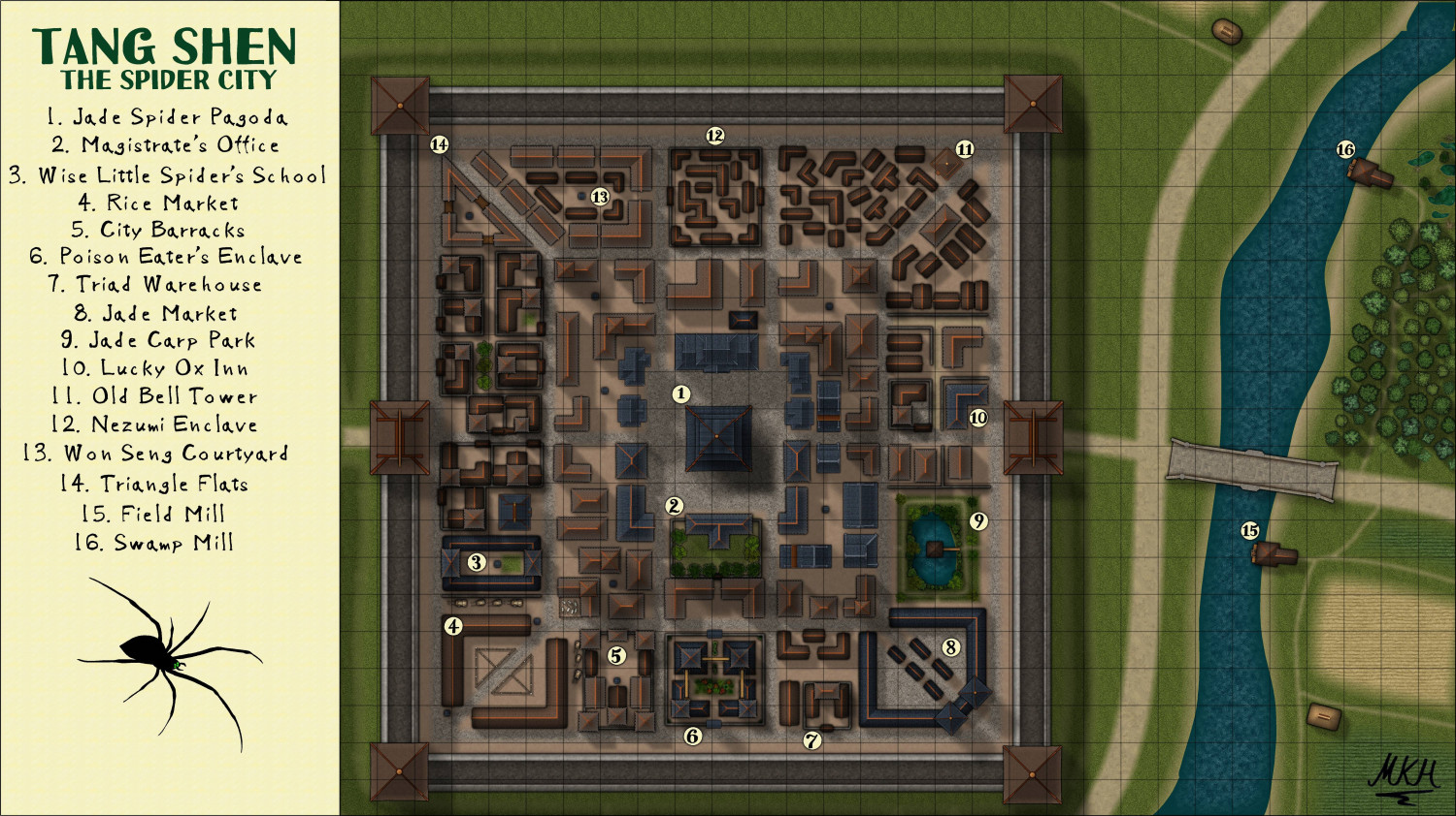
Tang Shen - The Spider City
Very good point, @jmabbott
Labelling things according to categories/ importance instead of map placement might seem like a good idea... until you search the Inn labelled No. 17 on a huge map and eventually find it - right between numbers 4 and 32. ;-)
I remember grumbling about this myself as a user, so thanks a lot and here's the updated version.
-
Drabarmund - an SS5 village
The bad guy was the one orderimg and overseeing the burning. An evil cleric who has bribed his way up, so he can use the king's men to do his bidding. He's going to be the first main villain of the campaign.
The style used is almost pure cities of Schley, with some modifications to the sheets and sheet effects (modifyimg edge fade values and shadow lenghts, adding a few sheets and putting a slight brown glow onto the roads and fields).
The only symbols from other styles are some of the chimneys.
-
The Swamp Rat - Playing around with Lighting
@OverCriticalHit Neither. These are rounded polygons that I've traced over a picture of a rat and a picture of a beer mug. If I remember correctly, the rat consists of 40-45 elements, and the mug of about 25.
It takes a while to find the right pictures and to get the drawing right, but once it's done, you have scaleable symbols that can be used with all kinds of colours and effects.
See the dragon fish and spider symbols in my Asian fantasy town maps for examples.
I came up with the idea, when I could not find a proper spider to decorate a map, so I drew / traced one after a photo.
If you want to try, just greate a "Trace" sheet with a transparency effect of about 50%, import a crest/ drawing or photo on that sheet, zoom in until it fills the screen and start drawing filled rounded poligons. It gets better and easier with practice. :)
I'm currently on vacation away from my PC, but if there's interest, I could do a short tutorial with screenshots, when I'm back.
-
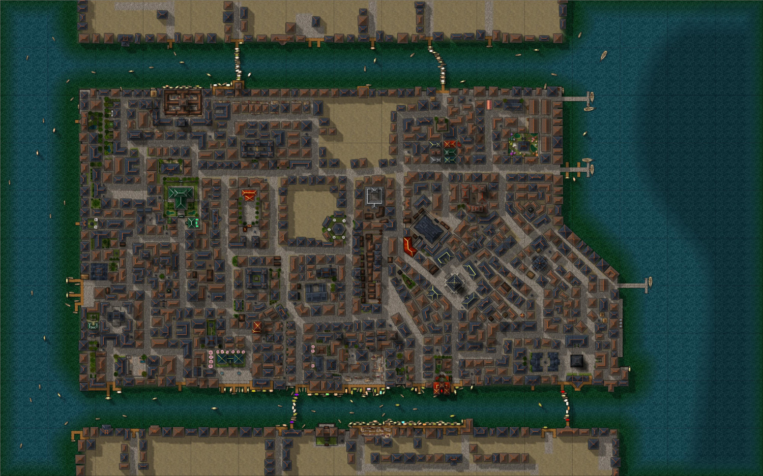
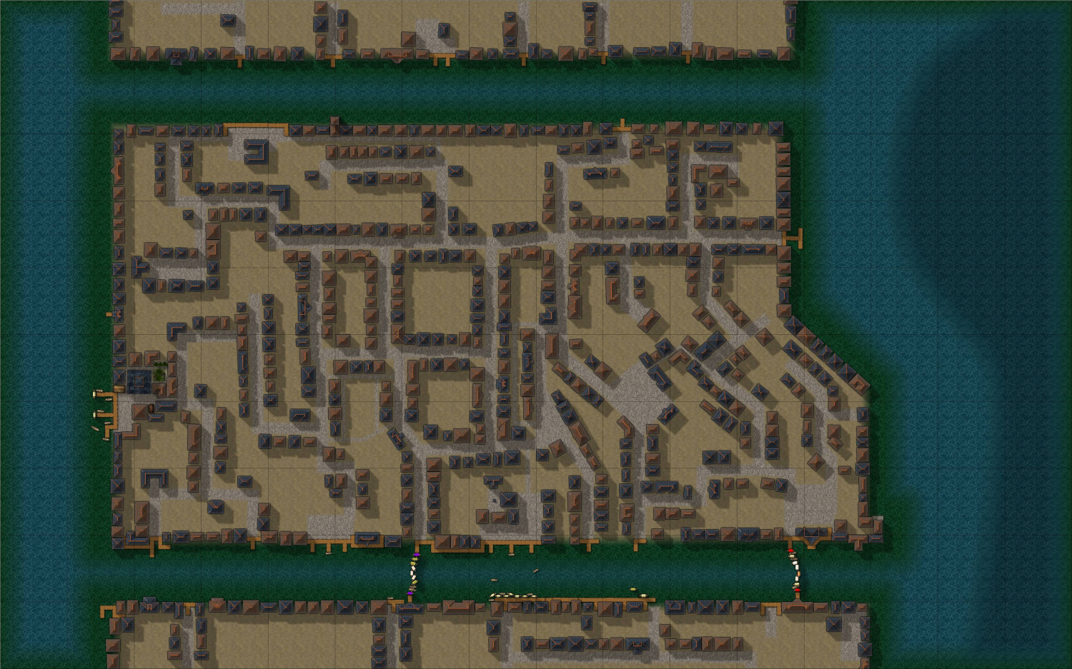
WIP - The Pink Lantern Quarter - A Kowloon Walled City Style Asian town map
Weekly Update: Slowly moving towards completion:
Did not like one of my "evil landmarks", so I rebuilt it.
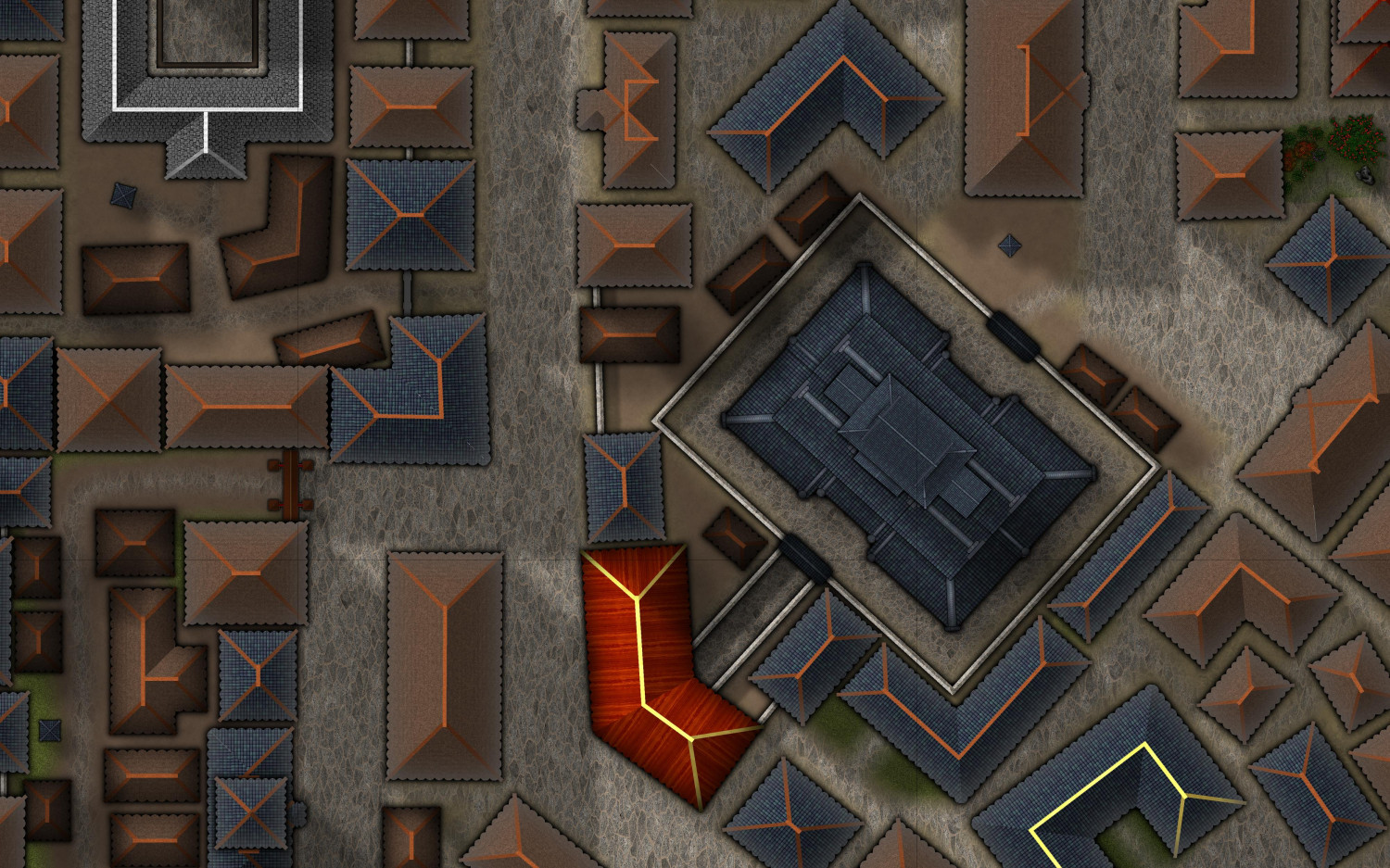
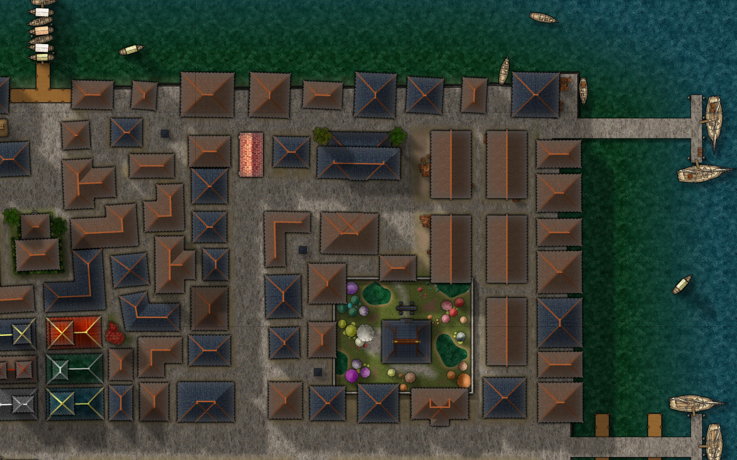
Here's the Northeast Harbour area, with the temple to the Swamp gnome's mushroom pantheon.
They do allow recreational worship...
Plan is to fill up the remaining empty parts, before adding detail and final decorative tweaks.
I've uploaded the current WIP to my gallery, so you can see some of the details.
-
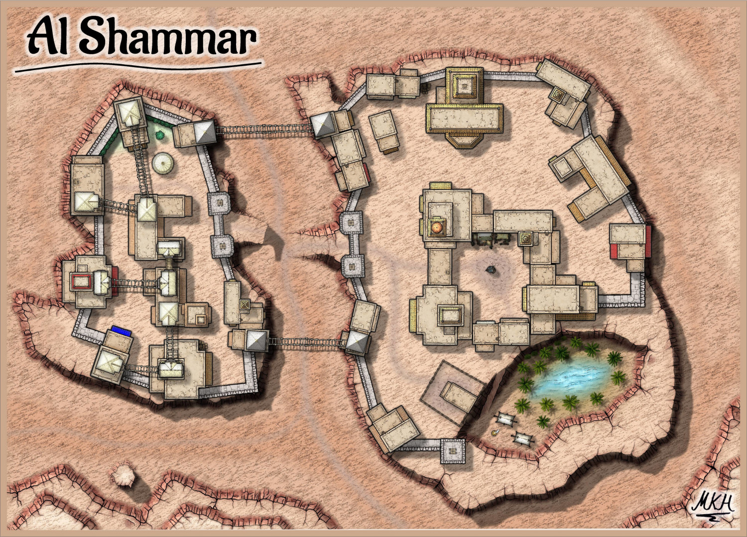
Al Shammar - Cities of Schley fortified oasis
Thanks a lot, Sue.
I've created a "cliff shadow update" sheet, that is almost transparent (1% opacity) but casts a wall shadow.
This works well on the right side of the map, but fails at the ascending section near the left gate. I partially put a non shadow "mask"-sheet above the shadow, but it seems to create more issues than it solves.
I'll take a look at your FCW files and draw the left side shadows by hand.
-
WIP - The Pink Lantern Quarter - A Kowloon Walled City Style Asian town map
-
Something Evil has awakened =O
-
My First Attempt at Village Scale...
Hello Jim,
you might try adding some shadow effects to the keep tower to make it more apparent that it's higher than the other buildings. Maybe similar to the shadows on the "normal buildings" but on a higher sheet.
The stone "main road" in the "South" looks a bit too "separate" from the ground to me. Maybe a very slight edge fade or mud from the "castle path" at the join might help.
The font used for the description might be slightly larger. My old eyes... ;-)
Apart from that, I really like the map, especially the the colour scheme and spacing.


