Fersus
Fersus
About
- Username
- Fersus
- Joined
- Visits
- 907
- Last Active
- Roles
- Member
- Points
- 247
- Rank
- Surveyor
- Badges
- 4
Reactions
-
Ritual in an elephant graveyard
Ok, made some small last minute changes before the session tomorrow:
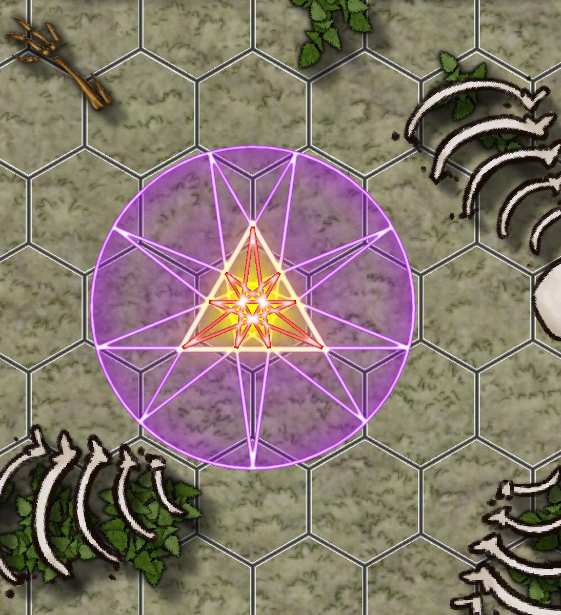
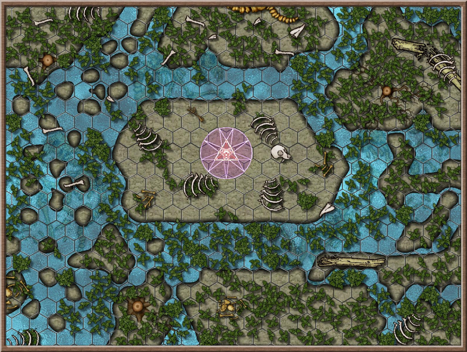
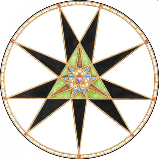
1) I removed the glow on the outer lines of the ritual circle and replaced it with a transparent circle of the same size. I like me some spooky glow like anybody here, I guess, but in this case I thought it might look more eerie if the glow unnaturally stops at the circle in some way.
So I made two layers. the first has a purple circle on it and a classical edge fade effect that starts with 0 on the outside and gets up to 40% in the centre where the glow of the inner lines takes over.
The second layer has a copy of the purple circle, but here the edge fade effect is reversed. it has a very short range and has the 40% on the outside and 0% on the inside.
the combination looks a little bit as if the glow from the inside bounces back on the edge of the circle and overlaps with the energy coming from the inside, creating interference patterns, as there is a small band that has no glow at all:
I kind of like the result :)
(on a side note: my inner Monk compelled me to adjust the size of the circle such that the spokes line up/touch the grid. For no practical reason at all ^^)
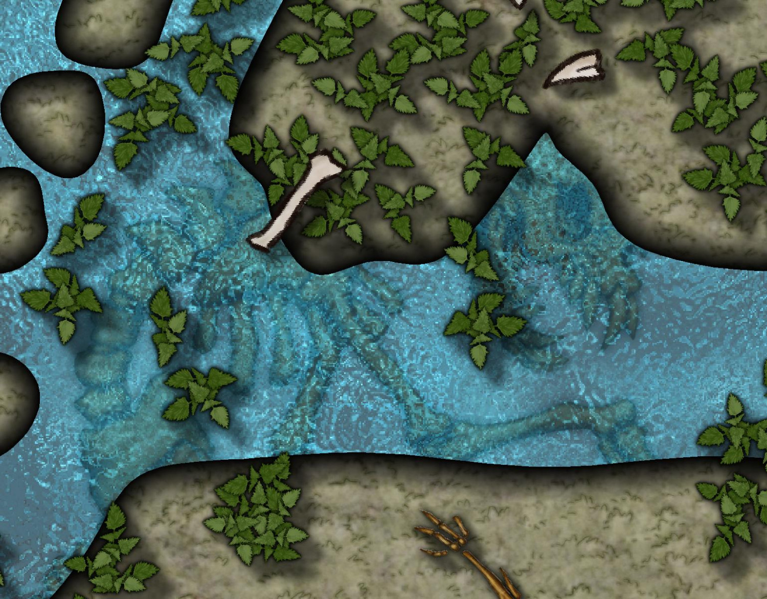
2) Even though this is supposed a brackish swamp water, I decided to use brighter water and make it about 80% transparent to give the players a better chance at spotting the now less hidden... well... some call it "easter egg", others call it "second phase of the encounter" 😈
P.S.: there are four of those on the map, but the others are better hidden under the leaves...
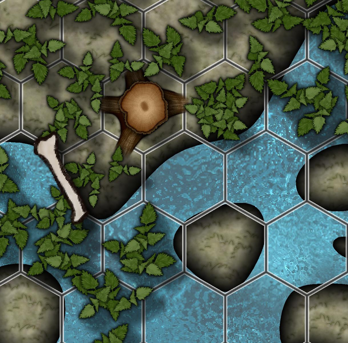
3) I decided to get rid of most of the roots, as I did not want to deal with visibility changes where they reach into the water. Sloppily covered the tree trunks with leaves. should be good enough for printing purposes...
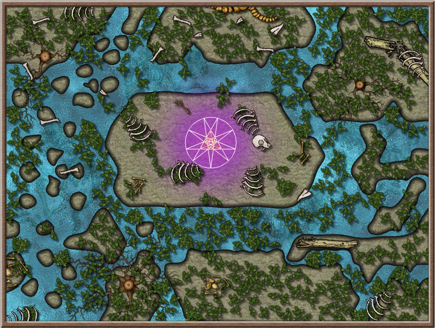
And here the full map in its final form:
I think this is the first encounter map I made with assets from different styles. The way I handled the switch between the styles felt a little clunky. Well, the switch itself was not that bad, but finding styles that had skeletons/bones in it in the first place was a bit of a challenge.
How do you guys handle this?
-
Ritual in an elephant graveyard
Hi Everybody!
After a long hiatus, where I was only able to visit you on the live mapping sessions, I finally found some time again to make a map myself 🤗
behold: the ritual place in an "elephant* graveyard"
*not actual elephants
Pretty happy already with the result, not so happy that it took my rusty brain way more than an hour to get it done :P
might want to play around a bit more with visibility of the roots when they get into the water and maybe add some more fluffy stuff. But now I'll call it a night :)
-
Path along the coast
@Loopysue Thank you so much for this explanation! I did not like the planks as well and tried to adjust the fill png in gimp and then import it again. Which did not yield the desired effect, and thus I gave up on this. With this and your other suggestions it looks way better now! :)
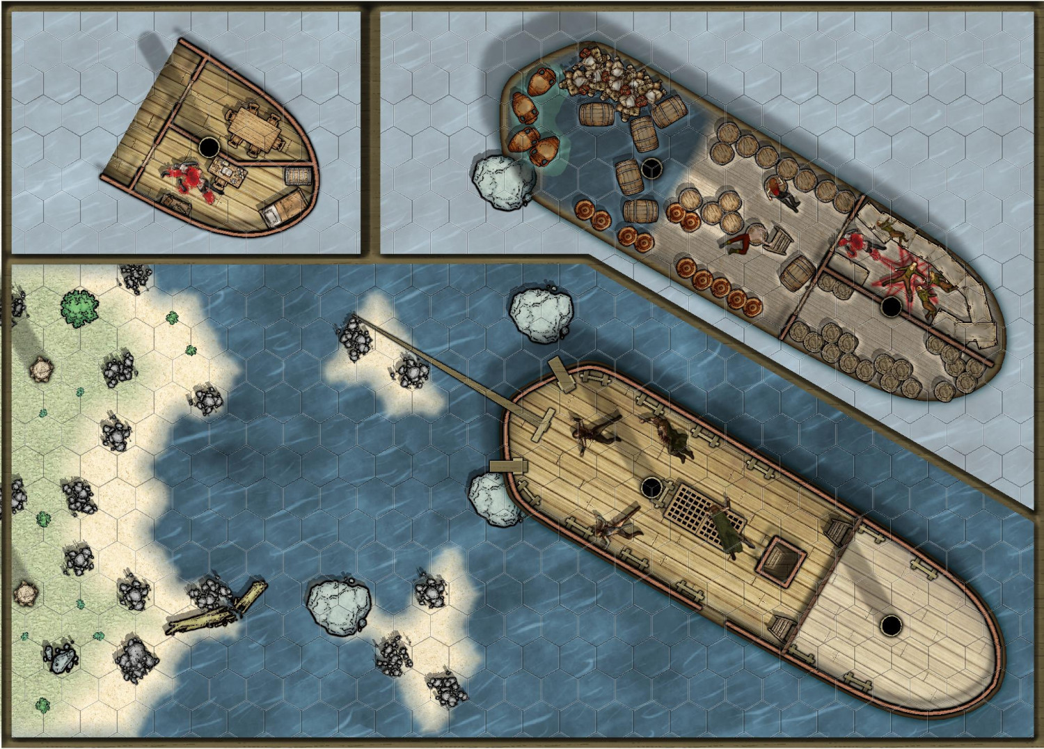
@Ricko Hasche Thank you for your kind words! In fact this is the first rule of my design principles: Design the maps in a way that ambiguity is minimized as much as possible. I really dislike when a beautiful map is drawn, but it doesn't really align with a grid at all. So I avoid half filled hexes (and squares, but I vastly prefer hexes over squares for several reasons). That way, the work of clearing up ambiguity is done while creating the map and during the game itself we don't loose time because players have to ask how a bad alignment of the map and the grid is to be interpreted...
As you can see in the update above (now with the grid), it's hardly a problem, except when I have to cut through a hex. To remove ambiguity in those cases I place objects there, such as the cargo in the lower deck or the fittings on the main deck. that way it's either clear that this is occupied and the ambiguity is gone...
-
Path along the coast
Part 2:
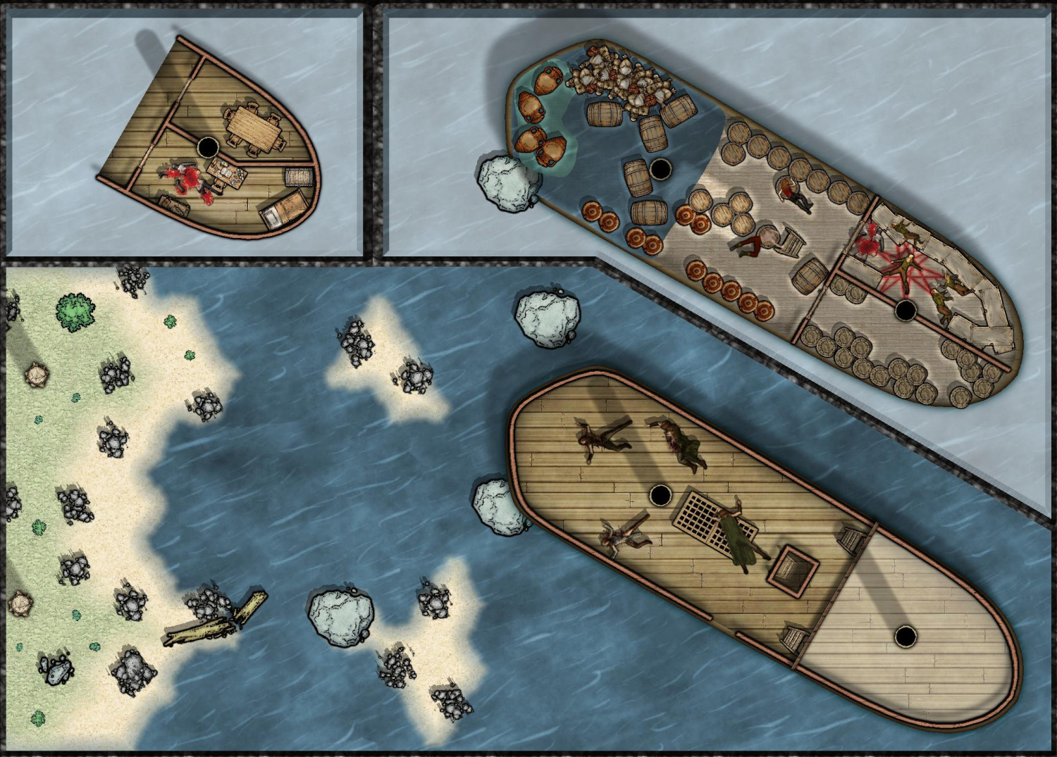
This time with a proper ship deckplan template from the annual 172.
the upper and lower deck are placed in the cutouts on top. So the players can decide to either enter the shipwreck where the boulder tore the hull apart or to climb to the maindeck directly. the evil symbol painted in blood of the dead crew in the crew sleeping quarter on the top right does not bode well...
Things I'm still not 100% happy with:
- I'm not sure about the choice of the border for the cutouts
- still not good with stairs, therefore just ladders.
- unsure why the symbols on the lower deck cut through the shadow overlay (the shadow is just a copy of the lower deck, fillstyle completely black, with transparency, color key and edge fade. the dead bodies and the goods are on the Symbols sheet). I like that they are "highlighted" by cutting through the shadow layer, but I don't know why it happens...
-
Annual 2023


