Loopysue
Loopysue
About
- Username
- Loopysue
- Joined
- Visits
- 9,977
- Last Active
- Roles
- Member, ProFantasy
- Points
- 9,858
- Birthday
- June 29, 1966
- Location
- Dorset, England, UK
- Real Name
- Sue Daniel (aka 'Mouse')
- Rank
- Cartographer
- Badges
- 27
-
Birdseye Continental - style development thread
-
Birdseye Continental - style development thread
-
Birdseye Continental - style development thread
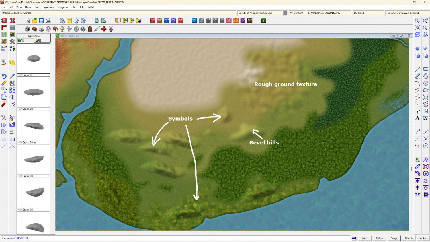
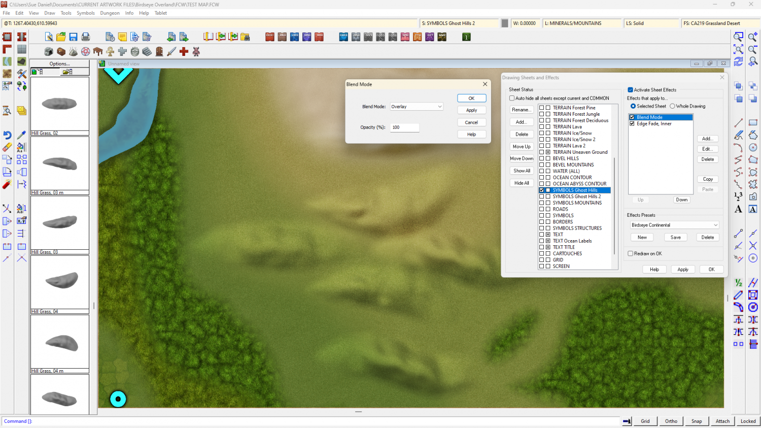
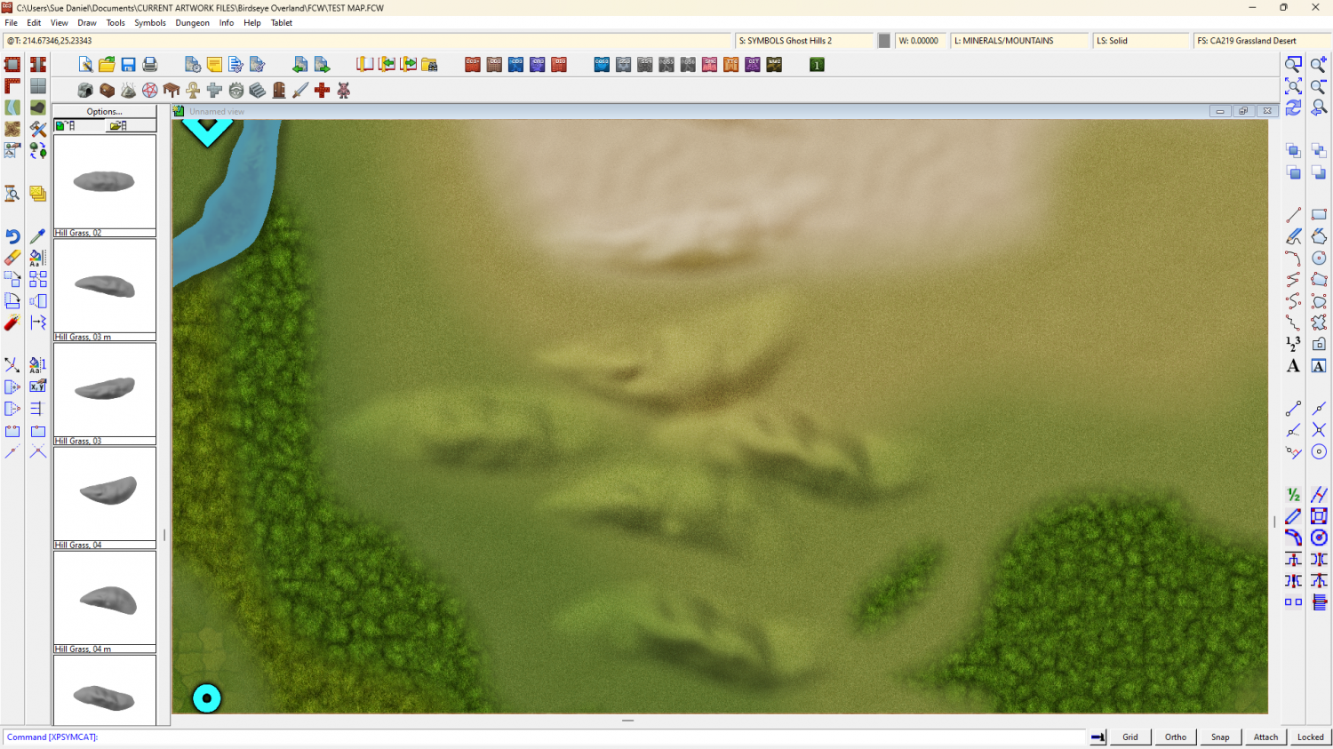
They're solid grey, just a bit darker than neutral grey, and because they are mapped symbols I can use an Overlay Blend Mode to make them take up the colour of the terrain.
The blend mode does odd things around the edges if I feather the edge of the symbol, so the EFI after the Blend Mode is to soften the base and help the hill sit into the terrain.
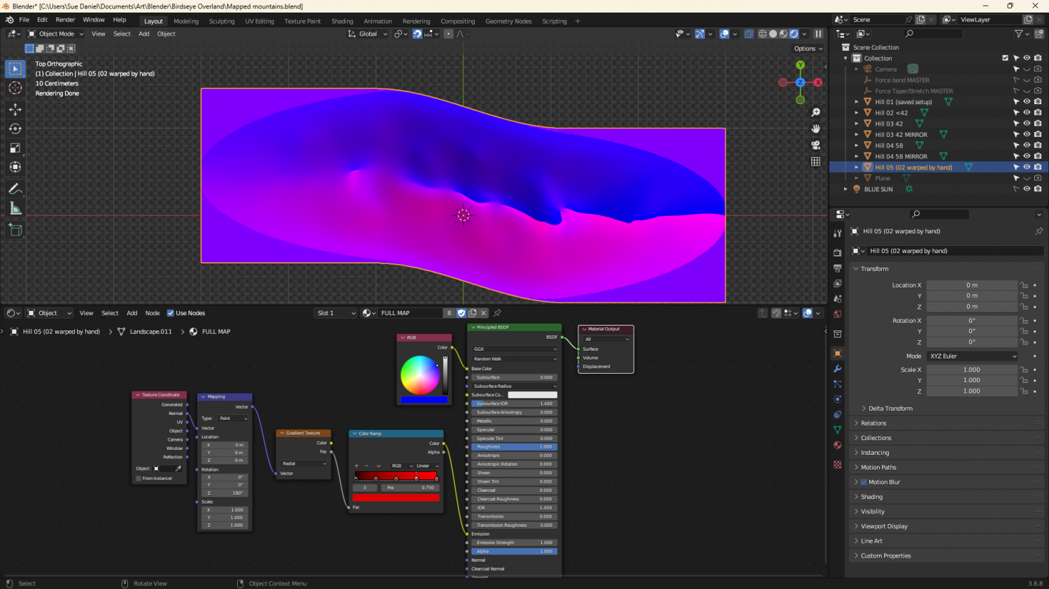
They're relatively simple map files, exported from Blender. I made a material that could mimic a map file and put it on a very simplified 'Landscape' object. The blue part of the map material is a simple blue material that reflects more or less light from the 'BLUE SUN' directly above it. The red part of the material is a radial gradient based on the normals of the object faces, and expressed as an emission, rather than reflected light. That way it stays constant depending on the direction each face is facing, and regardless of the sun.
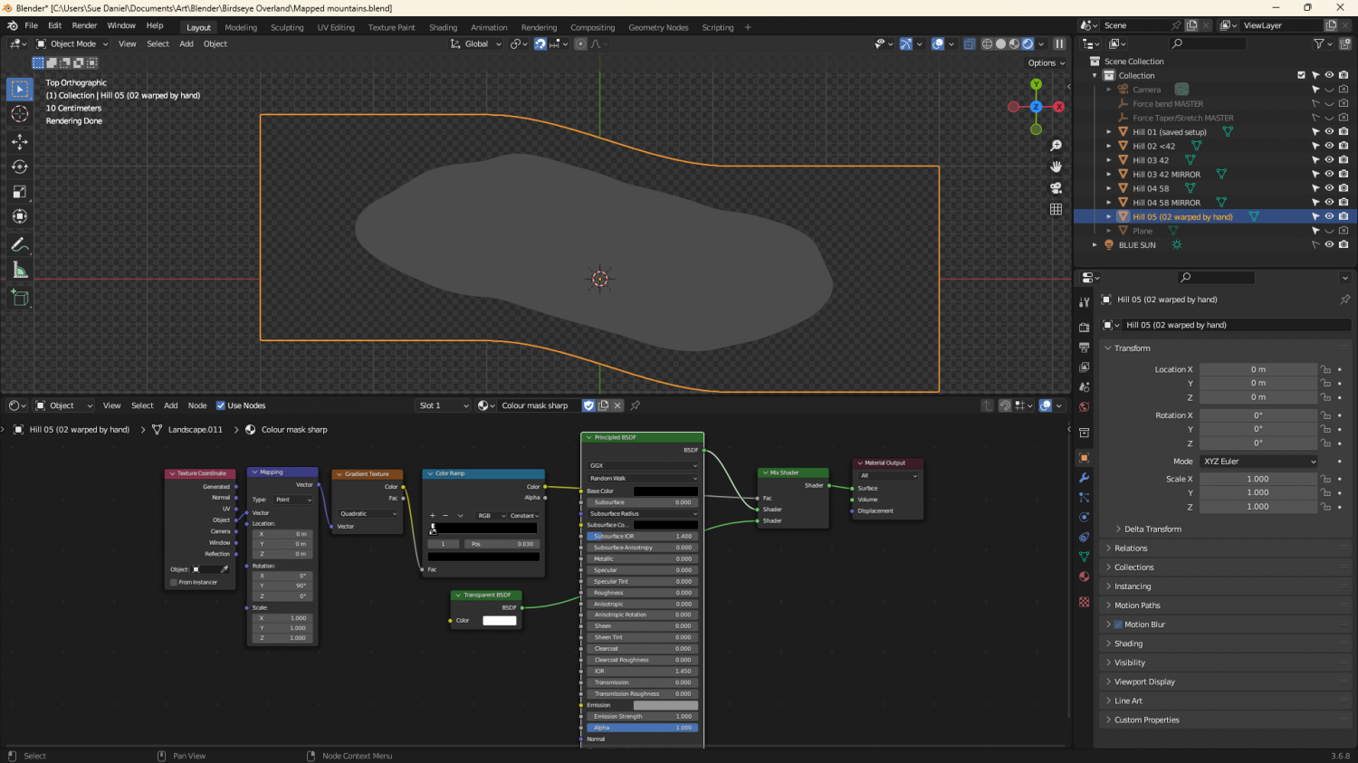
The grey image is a gradient material that maps only the parts of the ladscape above a certain point.
-
Birdseye Continental - style development thread
-
Birdseye Continental - style development thread


