


Loopysue
Loopysue
About
- Username
- Loopysue
- Joined
- Visits
- 9,972
- Last Active
- Roles
- Member, ProFantasy
- Points
- 9,853
- Birthday
- June 29, 1966
- Location
- Dorset, England, UK
- Real Name
- Sue Daniel (aka 'Mouse')
- Rank
- Cartographer
- Badges
- 27
Latest Images


-
WIP: need some help with making text more visible
Hi Brian! :)
The most important thing to remember with lables is contrast. If you turned your map black and white the map itself would be all shades of grey, ranging from a very dark grey to a very pale one. To make text stand out from it chose either a very pale label colour with a very dark glow, or a very dark colour with a very pale glow. The kill-all solution is to use the palest and darkest shades of grey - one for the text and the other for the glow.
Drop shadows don't generally work very well for readability, but can look good on a title sometimes.
Your labels are pretty much mid-tone, which is the most difficult colour to make stand out, even when you intensify the native white glow.
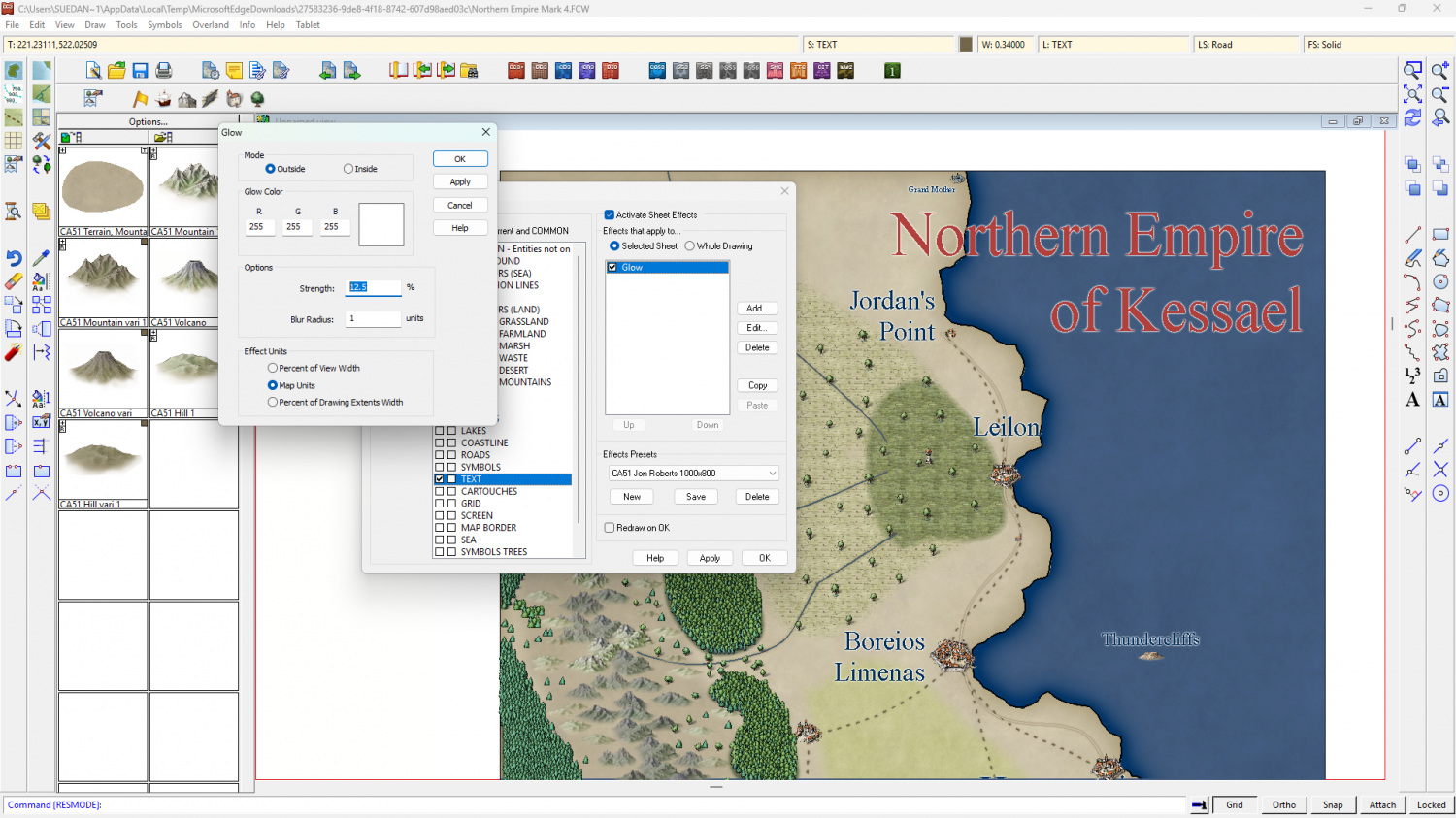
I recommend picking lighter or darker labels, and maybe using an Outer Glow instead of the slightly less tidy Glow, like this.
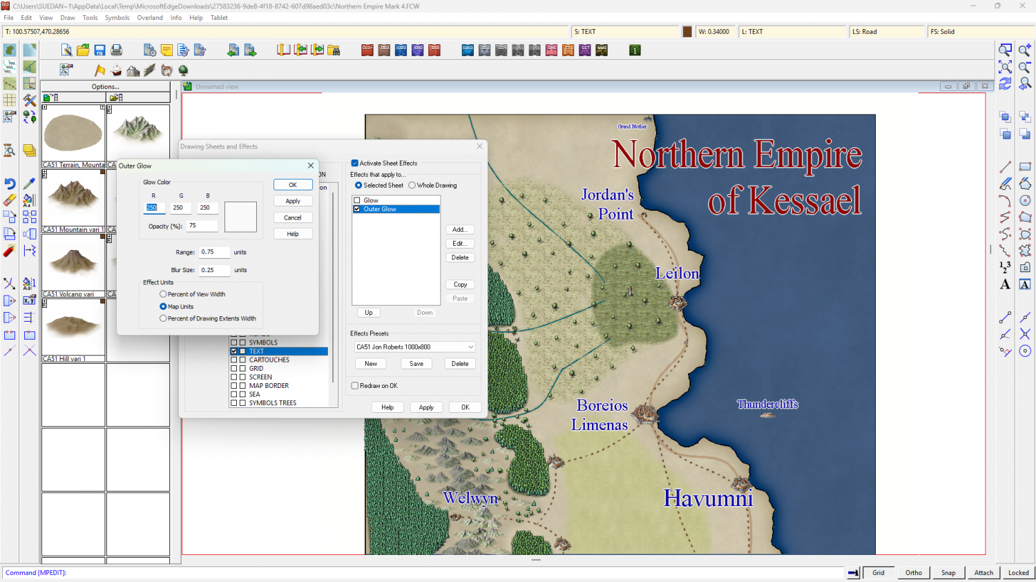
Or like this.
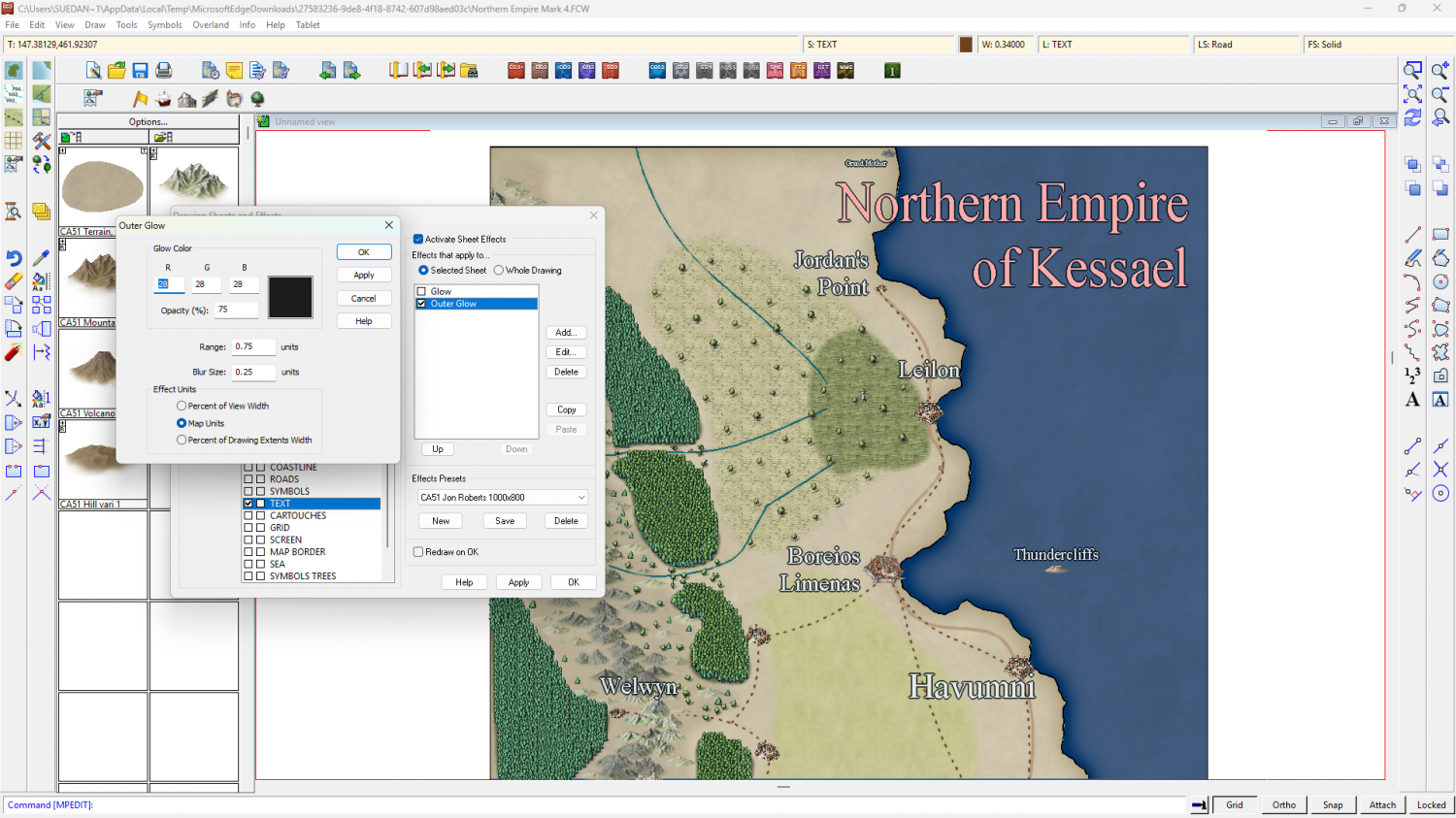
You could use both on two TEXT sheets - one way for the title and the other way around for the map labels.


-
WIP: ESTONISCH CONTINENT BIRDSEYE
Ah ha!
I forgot to switch off the antialias.
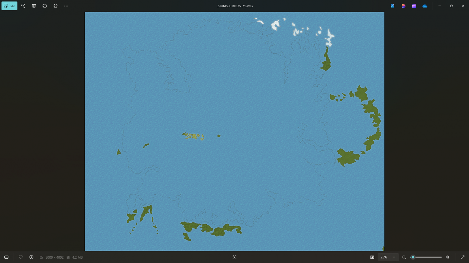
For some reason you need to have some antialiasing going on.
Try about 20-33%
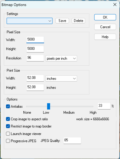
That definitely shouldn't be happening at zero antialiasing. Please can you report it to TS for me?

-
[WIP] - Lumadair: Birdseye Continental
Great first map in the style :)
I wouldn't use the same symbol size for such a gigantic map. You would barely notice them on that scale. Perhaps create it at 1/4 of the eventual size? It's difficult to say what would look good, but why not try a couple and see how visible the symbols are. Remember that at world scale a single ridge symbol might indicate a small mountain range.
-
[WIP] - Lumadair: Birdseye Continental
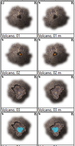
It's one of the volcano collection.
-
[WIP] - Lumadair: Birdseye Continental
I don't think the hill poly works in that context very well. It was set up to be home to small smooth shapes about the size of the chameleon hills. The other options are down to personal taste. Feel free to experiment.

