Loopysue
Loopysue
About
- Username
- Loopysue
- Joined
- Visits
- 10,012
- Last Active
- Roles
- Member, ProFantasy
- Points
- 9,874
- Birthday
- June 29, 1966
- Location
- Dorset, England, UK
- Real Name
- Sue Daniel (aka 'Mouse')
- Rank
- Cartographer
- Badges
- 27
-
Community Atlas - Doriant - Galahais - The Morstarik
It's better, but... have you got some kind of blur on the text sheet? If you have, switch it off and see if that makes things clearer. The very tiny imperfections seen on screen when no blur is used usually vanish on export if you use about 20-30% antialiasing.
Also, some fonts don't really work when they are emboldened because the characters touch each other, as you can see between the 'a' and the 'l' of 'Caldach'. Consider using normal instead of bold, or a different font that doesn't have that particular issue.
-
CA143 Asian Town - Eliminating TA & purple box issues
I suspect that the structure shading has slipped somehow for the symbols that are showing purple. Try hiding the layers called STRUCTURES (SHADING), and STRUCTURES (OUTLINE).
You are mostly there with the transparency acne separation sheet, but instead of using a new polygon on that sheet, copy the actual grass polygon onto that sheet and use change properties to turn it solid and whichever blue colour you are using. Copy the EFI effect from the paler grass to the separation sheet, and edit it slightly to make it wider than it is on the grass sheet.
If there is transparency acne happening between the blue and the grass, try using colour 227 instead of that blue. The exact colour of that polygon only needs to be a colour that definitely isn't included in the overlying grass texture, not even as a single pixel.
-
Panzer sample thread
-
Live Mapping: Modern Atlas
-
The Creepy Crypt project
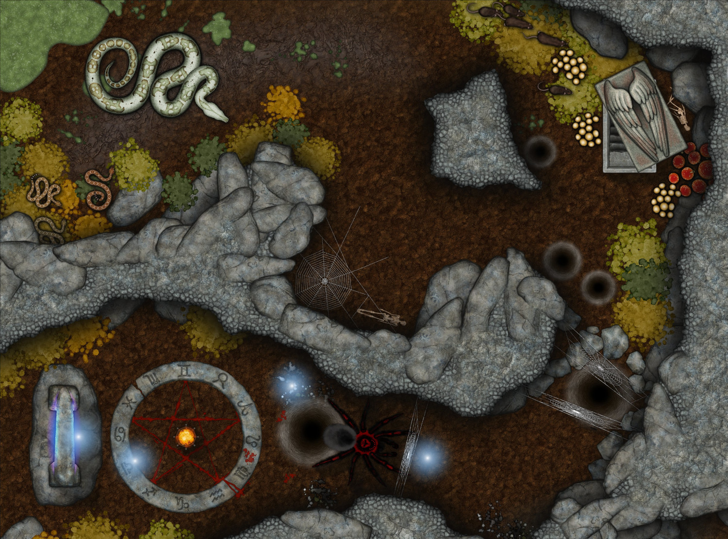
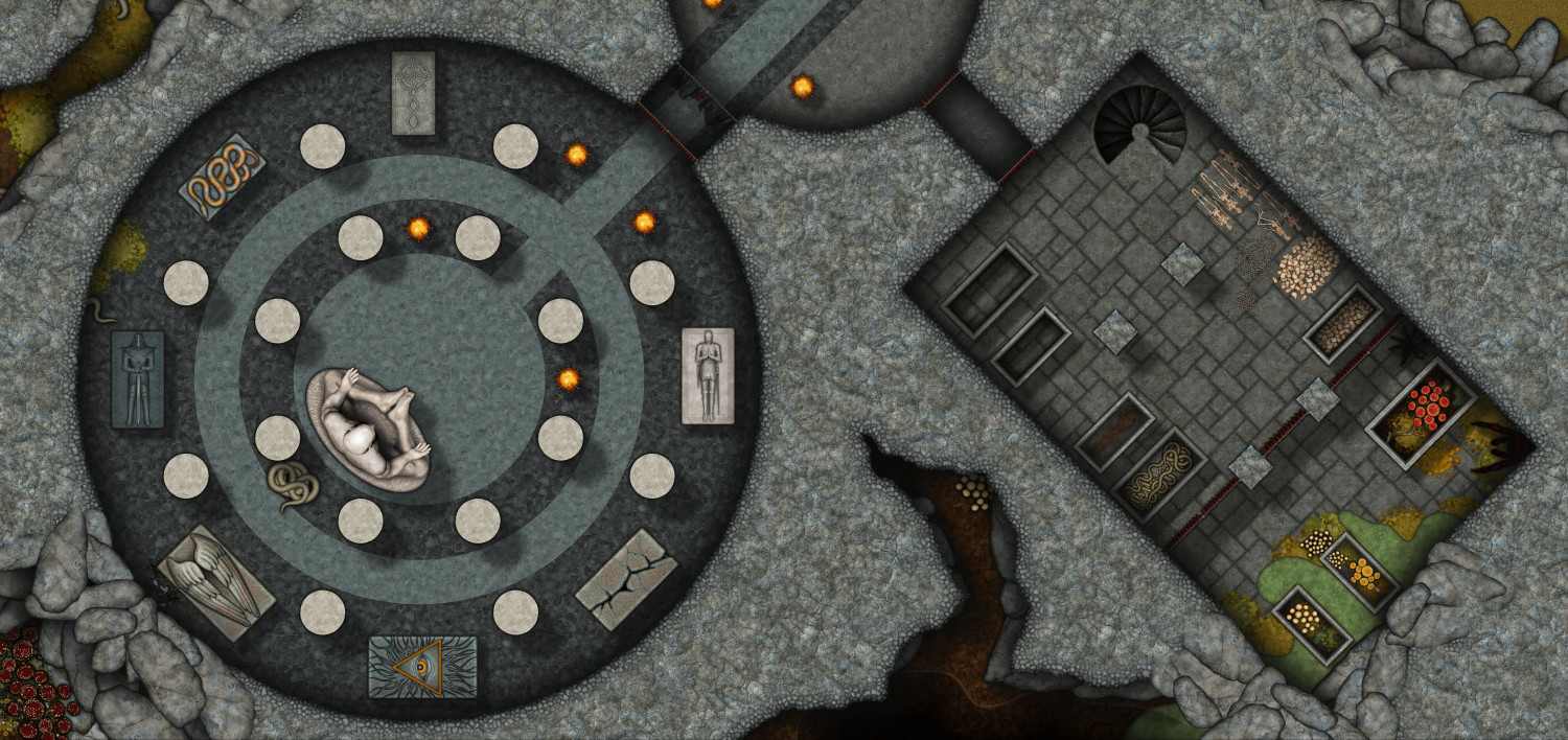
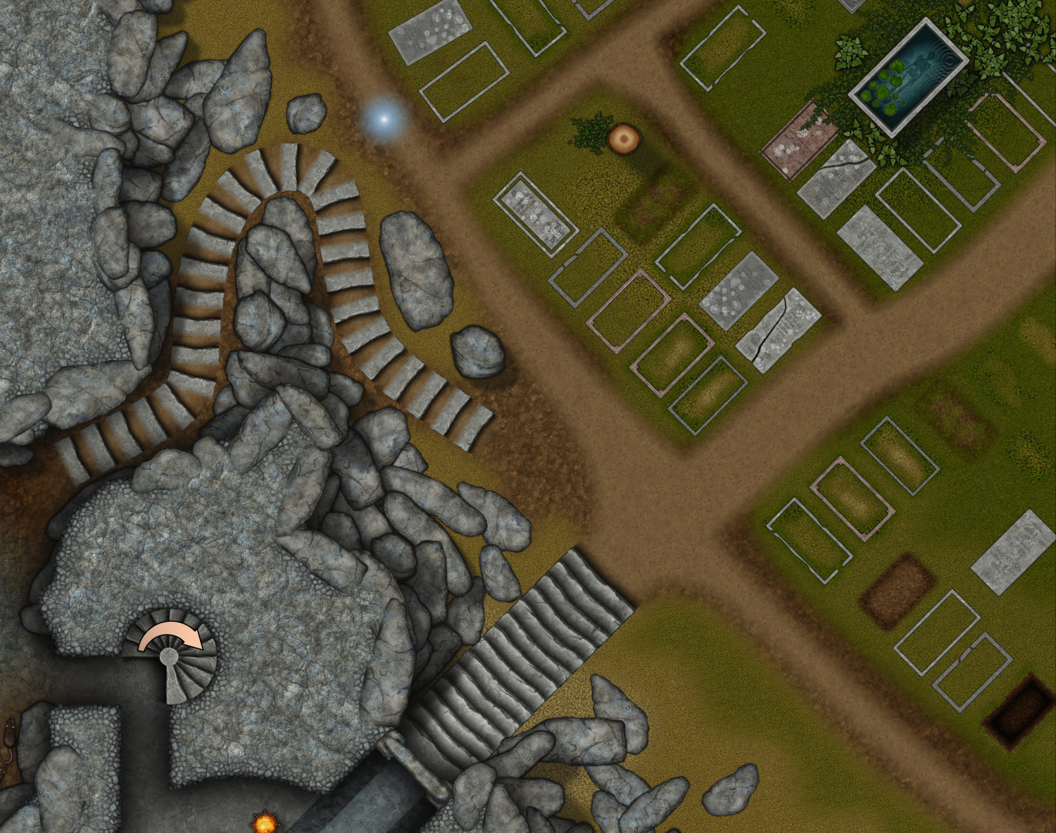
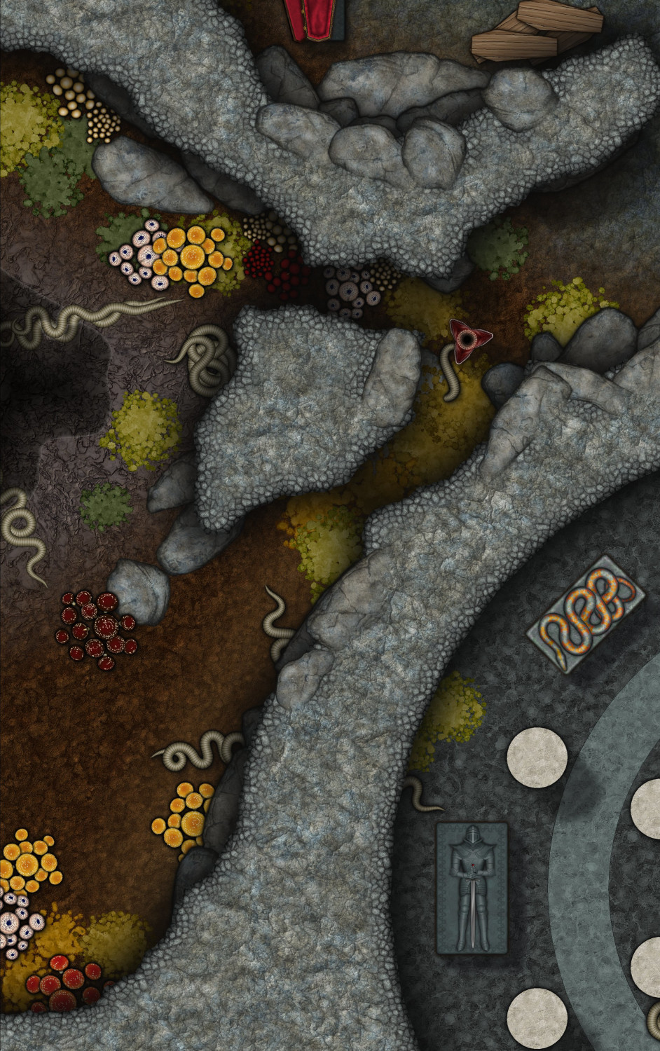
Here are a few extracts from the finished example map for the June issue of the Cartographer's Annual. The map is a bit large, so I'm not sure if it will be the final example map since a normal sized render doesn't really show the details. These are taken from an 8000 px render.
However, I can say that there will definitely be a smaller part 2 to this style in August, so I'm open to suggestions for additional symbols to fill out the set. Most things are shown, though I forgot to use the tree roots.
I have just put these in my gallery here.
https://forum.profantasy.com/profile/gallery/4615/Loopysue/125
If you want to see the full sized image, click the ones in my gallery with your mouse wheel click.


