


Loopysue
Loopysue
About
- Username
- Loopysue
- Joined
- Visits
- 10,014
- Last Active
- Roles
- Member, ProFantasy
- Points
- 9,874
- Birthday
- June 29, 1966
- Location
- Dorset, England, UK
- Real Name
- Sue Daniel (aka 'Mouse')
- Rank
- Cartographer
- Badges
- 27
Latest Images


-
Wet medley and a city!
You've done a wonderful job, Ale :)
Do the labels need to be so large and the glow so intense?

-
The Creepy Crypt project
Do you think these are a good compromise?
They look a bit flat in CC3. I think it's back to Blender for better contrast lighting on the sides.
-
The Creepy Crypt project
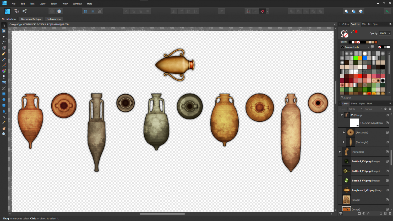
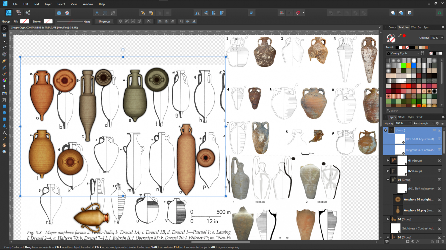
Ok. I think I have got the colours mostly ok, bearing in mind they have to blend with the existing amphora.
I haven't done the broken ones yet because I might need to retexture them again if I can't make them work properly.
In this screen shot I've laid out the rendered draft symbols from Blender on the carefully scaled reference diagram in Affinity Designer to process them further - add dirt and stains. I can't go as far as to make them real like the reference images on the right, or they just won't work with DD3, but I'll see what I can do. DD3 is very colour saturated, which means my amphora have to be equally bright, rather than more pastel like the photographs.
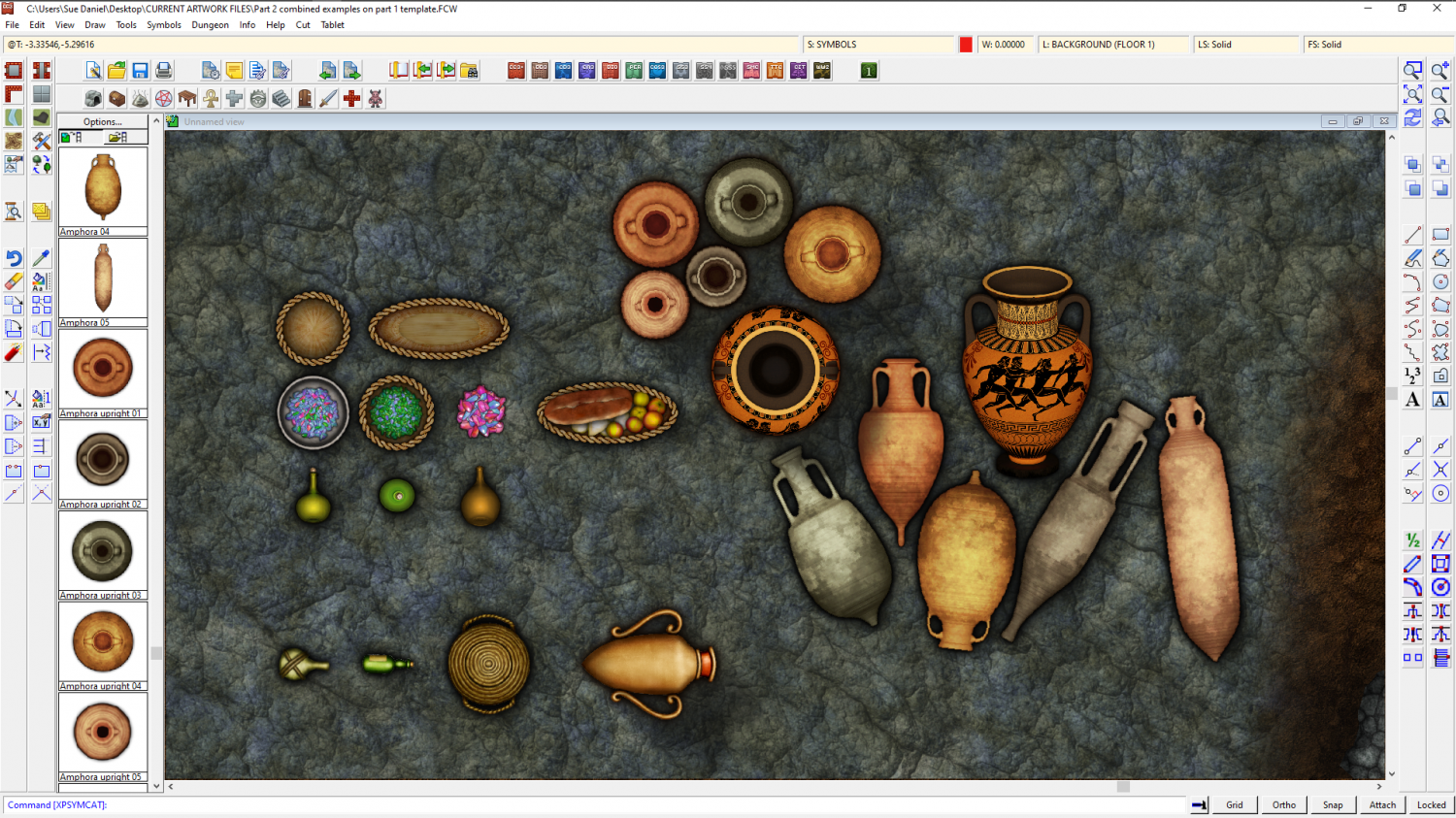
It looks like there may have been several ways of stacking them. It may have been different for each type of amphora.
I found this article quite interesting as well.

-
The Creepy Crypt project
Thanks Wyvern :)
I really meant the right look being similar enough to DD3 that the styles wouldn't clash and could be used together. It's a fine line between getting it too close, and not close enough. I want to be able to show a certain amount of detail, but too much makes them look too different. For example, the existing amphora is pretty homogenously coloured and textured, so if I start adding too many stains and too much dirt (though I will try to add some at least) or go too authentically grey-pink or white instead of orange, they just won't look right with DD3 assets.
I looked into how they used to seal them because I was concerned about that as well. It seems that back in the beginning they tried straw and wool and such, but later they were cork bungs. They couldn't really use much else because most of what was transported in them was wine and olive oil, and wine in particular goes bad really fast if too much fresh air gets into it in transit.
The inside walls were often waxed, or glazed in later times, and if they weren't then the inside walls would be even darker than you might expect with all that wine and olive oil soaking into them.
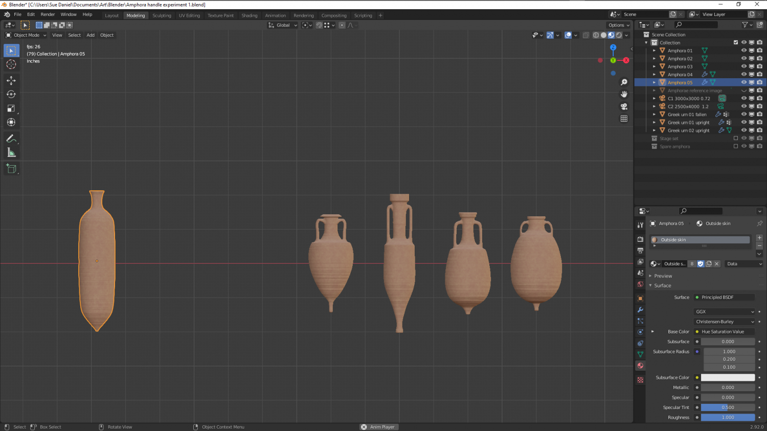
These are all too pink by far, but retexturing is nothing compared to adding handles, and I only have one more to do. I picked the 5 most variable amphorae. Doing more than that would seem to be a bit excessive - especially since there will be 3 versions of each one. Whole and lying on its side, whole and standing slightly on a tilt as if stacked in a ship's hold, and of course broken. That's 15 symbols that are all amphora!
Regarding the use of the pointy end bit. It is said that they were pointed like that to make it easier to stand them in sand, and one source suggested that ships stood them upright in a bed of sand! That I find seriously doubtful, since adding a large enough volume of sand would be such a huge amount of ballast as to be likely to sink the ship without adding the cargo itself. However, if you look at the shape of them you can see that it wouldn't be too difficult to store them in wooden racking, possibly built around them during loading, and if you look even closer you can see that a double row end to end would interlock if they were lying flat or against the inside of the hull and all the same type.

-
Community Atlas - Forlorn Archipelago - Fisher Isle, several villages and surrounding areas
Oh I see! I didn't see the sarcophagi before. I thought they might be quite useful :)
