


Loopysue
Loopysue
About
- Username
- Loopysue
- Joined
- Visits
- 10,014
- Last Active
- Roles
- Member, ProFantasy
- Points
- 9,874
- Birthday
- June 29, 1966
- Location
- Dorset, England, UK
- Real Name
- Sue Daniel (aka 'Mouse')
- Rank
- Cartographer
- Badges
- 27
Latest Images


-
Commission WIP!
Decision time, then. We can't help you make the decision, but it might help you if you do a blank Watabou and Fantasy Cities map of the correct size and just dot a single housing estate and a few trees on it to see what they look like when rendered to the correct size.

-
Commission WIP!
That's a good idea, Quenten.
@jmabbott I would put a modified selection in front of them made up of all the ones you think would be more suitable, and explain the problem with using a more detailed style printed so tiny.

-
Commission WIP!
You may need a style that is more simple and straightforward with simple blocked in houses and no fancy artistic stuff going on. A highly detailed style like Darklands has a tendency to look quite horrible when printed so tiny. There wouldn't be a problem if this was intended as a poster map to put on the wall, where you might still expect to pick out the details of individual rooftops and chimneys, but it isn't.
If you have a free hand to suggest other styles I recommend something like the Ferraris Style, which is more suitable for larger areas printed small, or the more recent Tactical Maps published in April this year in the Cartographer's Annual. Something more Ordnance Survey in style than artistic. There are other relatively simple styles to chose from, of course. Have a look at what you've got and take the time to consider carefully just how much detail you really want when each house will be little more than a squashed ant in size on the finished letter-sized map.

-
Live Mapping: Creepy Crypts
Hi everyone! :)
Ralf's back from a distant and slightly soggy holiday in the Outer Hebrides, and ready to take on another Live Mapping session. This week he will be demonstrating the Creepy Crypts style from the June Annual issue.
Come along and join in the fun! :)


-
Crypt
The easiest way to do this quickly, even if your building is quite complex in shape, is to use a Color key.
The first thing I do is move the GRID sheet to just below the SYMBOLS FLAT sheet in the sheet list. This places the grid underneath the wall.
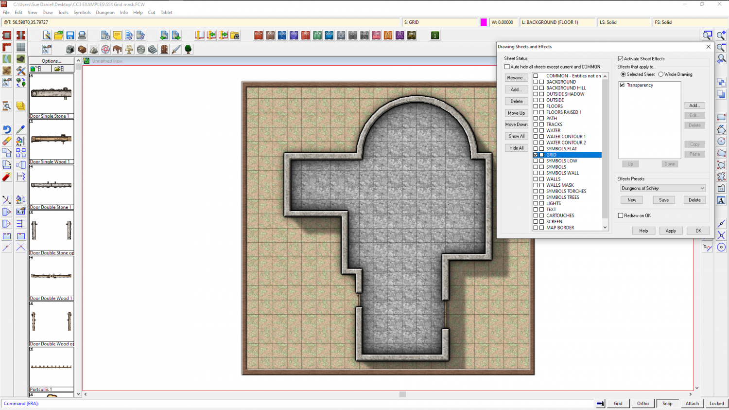
Then I add a Color key sheet effect to the GRID sheet and move it to the top of the list of sheet effects.
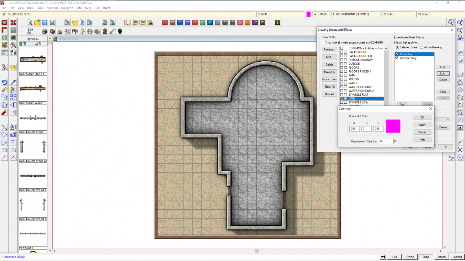
Ok all of that and make sure you have Solid fill and colour 6 selected as active. 6 is magenta - the same colour as was showing in the Color key effect.
Then draw a polygon on the GRID sheet that covers all the area where you don't want the grid to be visible. Here I have left a deliberate gap on the right hand side so that you can see how it was drawn.
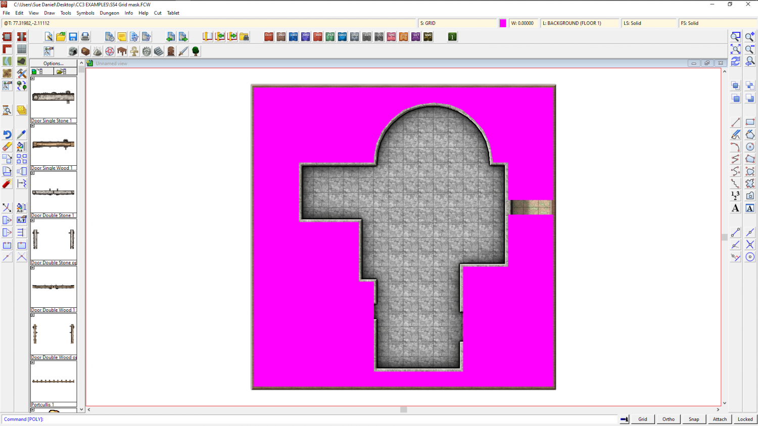
Refresh, and the magenta polygon vanishes, taking the grid with it.
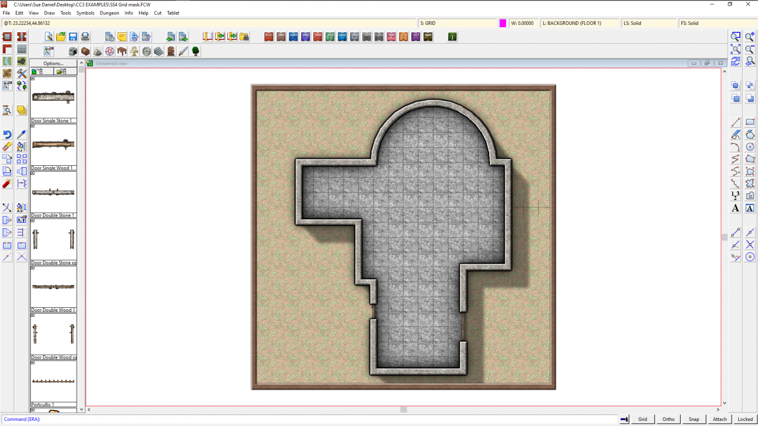
Once I move the nodes on that magenta polygon so that they cover that gap I left, I have a perfectly cropped grid.
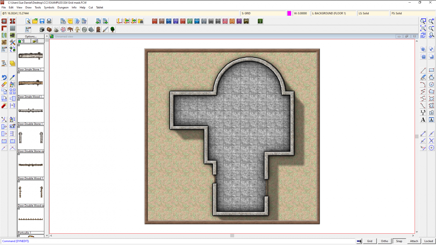
Here is the file for that example
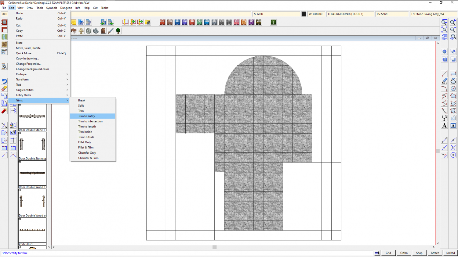
The other way I might do it, if I didn't want to be bothered with drawing a large and complicated magenta polygon, is by trimming the grid. Use the property picker tool to pick the grid so that you have all the right settings, and then hide everything but the floor and the grid. Then explode the grid and use Trim to entity from the Edit menu to trim the individual lines of the exploded grid to the inside of the floor extent. This usually takes longer to do than using a Color key, so I only rarely use it. There are also a few little glitches that can occur, such as lines that refuse to trim to the floor shape seen below. You can tidy them up by hand though using other types of trim.
This is the tidied up result. To make sure you don't keep accidentally selecting the separated lines of the grid, group them (as they were before you exploded them) and then make sure the grid is on the HEX/SQUARE GRID layer and freeze the layer.
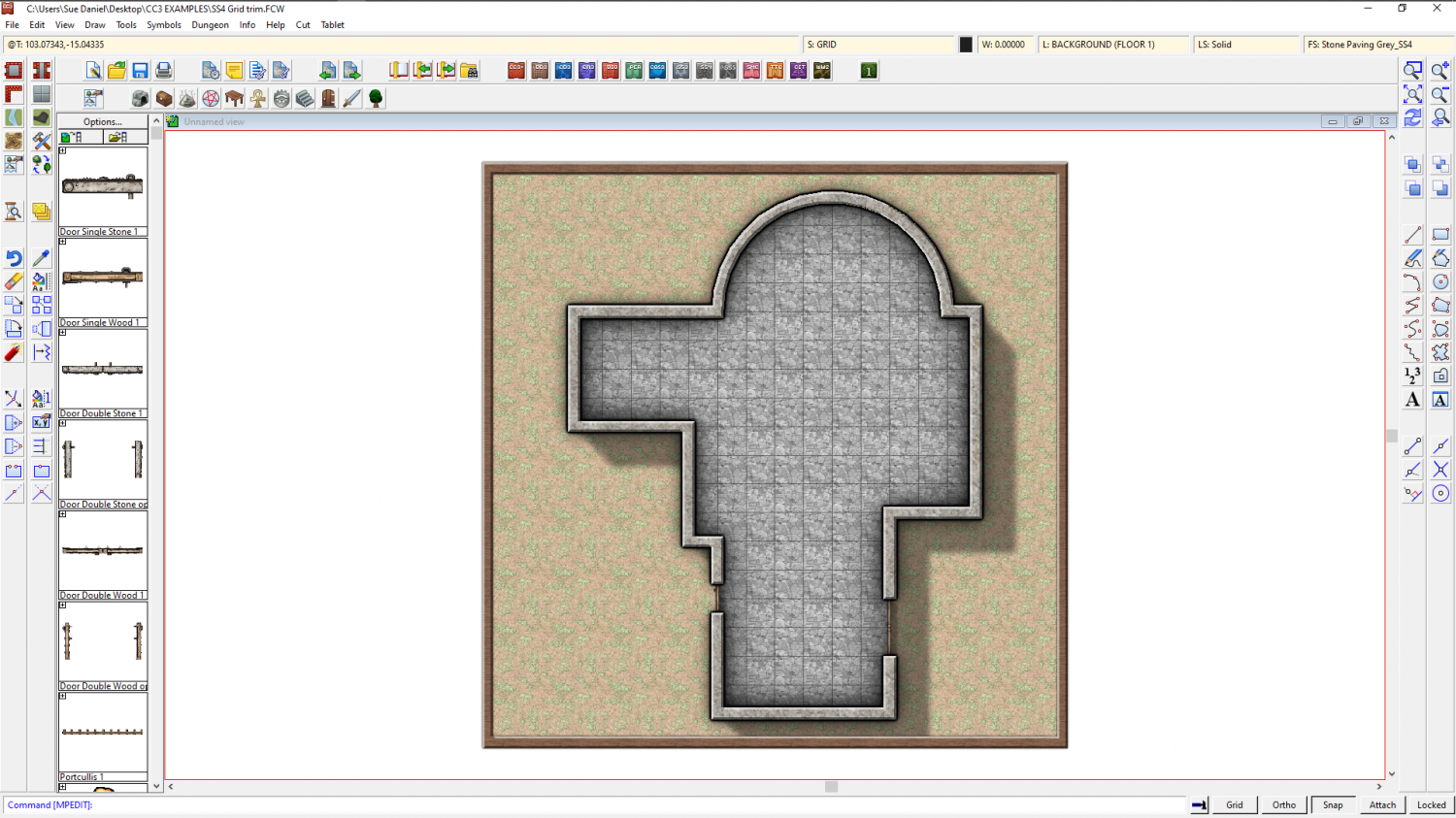
As you can see, the result is the same. Perhaps the main disadvantage of trimming the grid is that it's not so easy to edit the shape of the floor.
This is the trimmed grid example.
![[Deleted User]](https://secure.gravatar.com/avatar/c75d9a245b74d9c59be0999ea81ca541/?default=https%3A%2F%2Fvanillicon.com%2F92add7f8c954488718110edc4896ad39_200.png&rating=g&size=200)


