


Loopysue
Loopysue
About
- Username
- Loopysue
- Joined
- Visits
- 10,014
- Last Active
- Roles
- Member, ProFantasy
- Points
- 9,874
- Birthday
- June 29, 1966
- Location
- Dorset, England, UK
- Real Name
- Sue Daniel (aka 'Mouse')
- Rank
- Cartographer
- Badges
- 27
Latest Images


-
Arce Ursi
That old hatched stone fill seems to be stuck in the DD3 repertoire, but there are other alternatives around. If you are looking for something reddish you could use one of the Dirt fills instead, or maybe the "Stone Lava Cooled" and a sheet effect to change it's colour to something more reddish.
If you have other add ons there's no reason you can't use a fill from one of them if there's one you would prefer. How you do that is use Insert File in the Draw menu and pick a pre-prepared blank map of that style (or the actual template file .FSC) and press ESC just before clicking to place it in your map. That will import just the fills for that style which you can then use in your map.

-
how do you extend the white border
Remy wrote a blog about this and other things here:

-
Modern Resources
We don't have much in the way of specific tower block symbols at the moment, but quite a lot of city styles are pretty much time neutral in the sense that a tiled roof can be a medieval tiled roof or a modern one. You can also use the House tool to create simple flat rooftops and add details to them to indicate more modern skyscrapers. Sometimes a simple rectangular polygon will do, with added details and appropriate shadow casting sheet effects to make it look like the top of something tall.
Another option is to find and import third party symbols available on sites that sell those kinds of assets. This is easy enough to do. We can guide you if you aren't sure how to do it, or the Tome has full instructions.

-
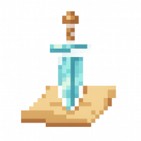
Live Mapping: New Isometric Cities
Hi Everyone! :D
In this week's Live Mapping session Ralf will be demonstrating all the beautiful new symbols Mike Schley has made to expand the Isometric Cities style. All such free monthly sets can be downloaded from your account page listed under your "Campaign Cartographer 3 Plus" registration list as a single combined installer.
Come and join in the discussion live here on YouTube:
https://www.youtube.com/watch?v=MvJC8OMXCDo
Or if you prefer you can watch it later right here:
We look forward to hearing from you in the chat :)
If you miss the live session a recording will be available on the Profantasy channel, and if you want to chat about it after the event feel free to use this thread.

-
Upside down text on a curve
The default settings should work pretty straightforwardly as long as you have drawn the curve from left to right. These are the default settings in the dialog in case you have changed yours. I've run it twice here, the first time with the line left behind so you can see it as well as the text.
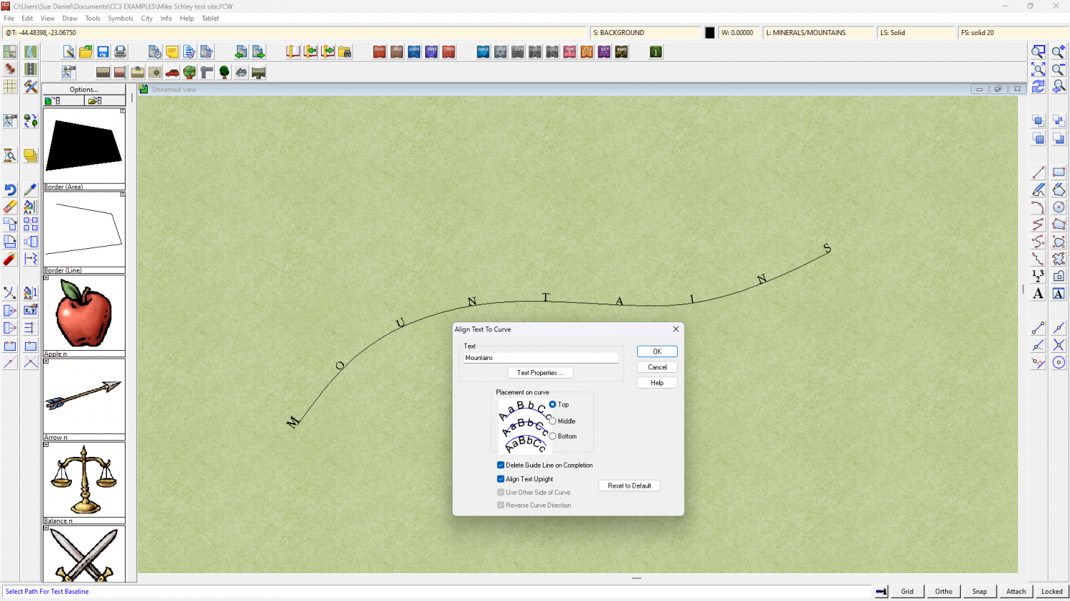
If your text is all squashed up the font size is too big for the words to fit on the curve. Unfortunately there are no settings to adjust the size of the font as it is placed on the curve, so if it is too big or too small when placed you will need to undo and adjust the font size using the Text Specs button on the right.


