


Loopysue
Loopysue
About
- Username
- Loopysue
- Joined
- Visits
- 9,978
- Last Active
- Roles
- Member, ProFantasy
- Points
- 9,861
- Birthday
- June 29, 1966
- Location
- Dorset, England, UK
- Real Name
- Sue Daniel (aka 'Mouse')
- Rank
- Cartographer
- Badges
- 27
Latest Images


-
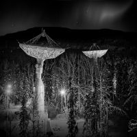
Forest Trail project - part 2
This is the only effect that affects the colour of the water on that sheet. The water itself is laid over a stone texture for the river bed (which may be part of part 2). In the waterfall pool it's laid over a new Riverbed fill. I can't remember how I did the water in the example map for part 1, but you can find out by examining the map.
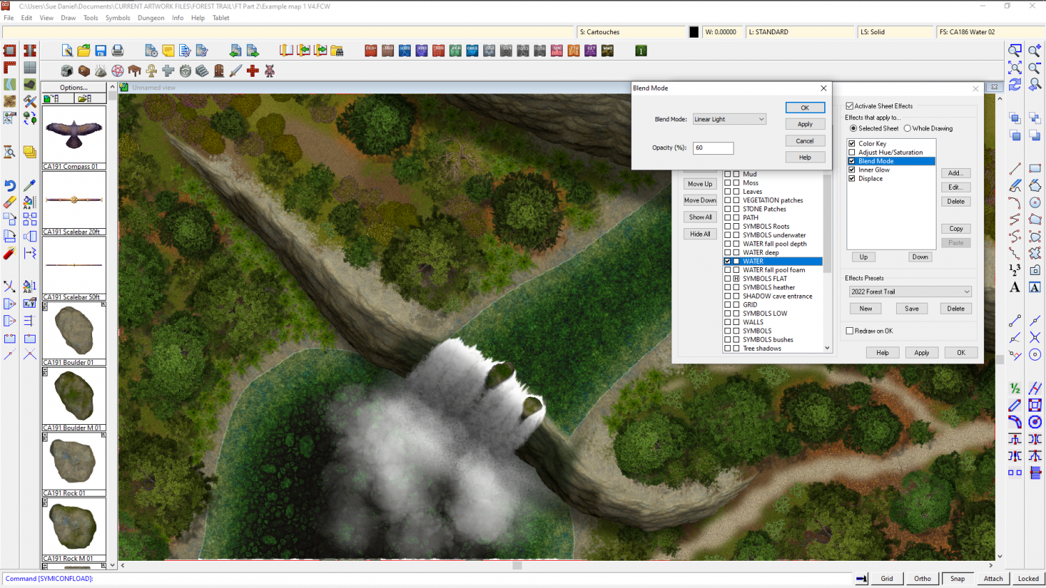
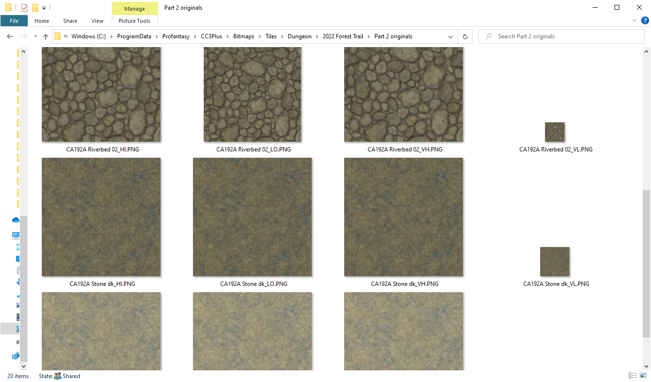
No symbols were used in the river. This is a shot of the new riverbed texture. I was right - the stone textures are both in part 2, but there is a riverbed texture in part 1 that is fairly close in colour to these 3 new ones.
About the grass sheets - the thinking behind making all the grass drawing tools go to GRASS* (anything beginning with GRASS) is that you can pick which one you want to use, though this must be done before you pick the drawing tool to work. For there to be a specific grass sheet for each shade of grass there would need to be 5 grass sheets, and even then you would be a bit stuck if you wanted them in a different order in one place on your map than in another place on the same map. But if you want you can edit the drawing tools and add the other 2 grass sheets.


-
Looking for Symbols of D&D style Dice
You can't connect more than two lines at each node, or point of the dice. Instead, try drawing the outline as a hexagon and add the triangle in the middle, then draw the other details as single lines, but move them behind the hexagon and triangle. That should hide the untidy bits.

-
Forest Trail project - part 2
Oh dear, Julian. The work on part 2 focussed primarily on waterfalls and cliffs. I've lost 3 weeks work because of PC troubles (blue screen of death) and now there are only 13 days left to the handover deadline.
I think you will find there are some pine trees, and there are already 2 different colours of water. Caves are easy to do (see below)
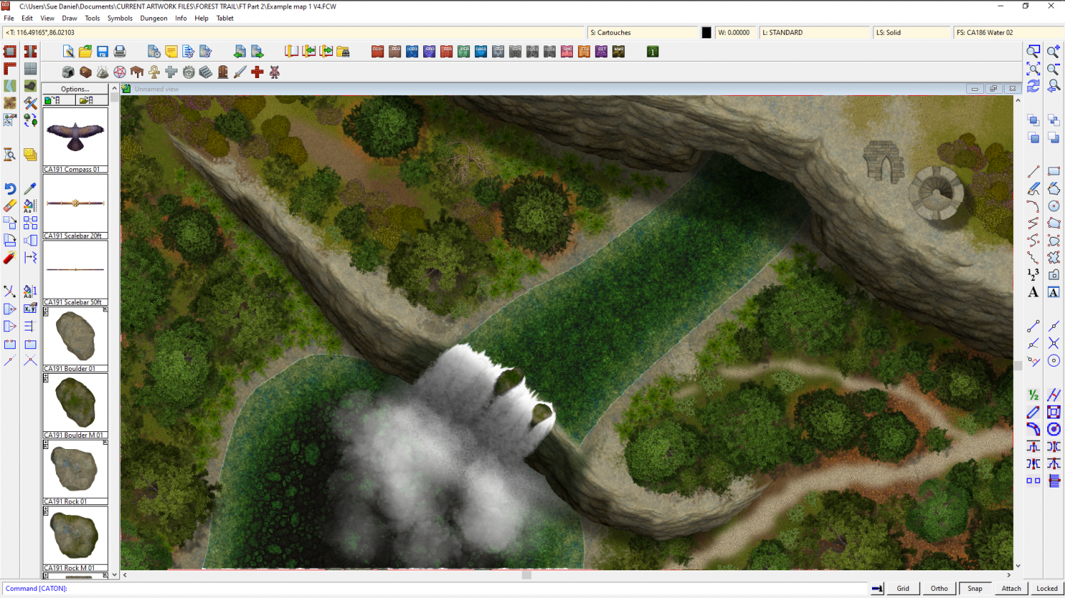
My main focus in the last fortnight before handover (some of which is dotted with unavoidable appointments and other interruptions), is to sort out the rapids and flow marks for the water, but I will see if I have time to do a square tower.


-
Forest Trail project - part 2
Ok, so there's already been a bit of work for this part of Forest Trail, but it was tacked onto the end of the part 1 thread. I've had serious PC problems which are mostly resolved now, but work has been a bit slow.
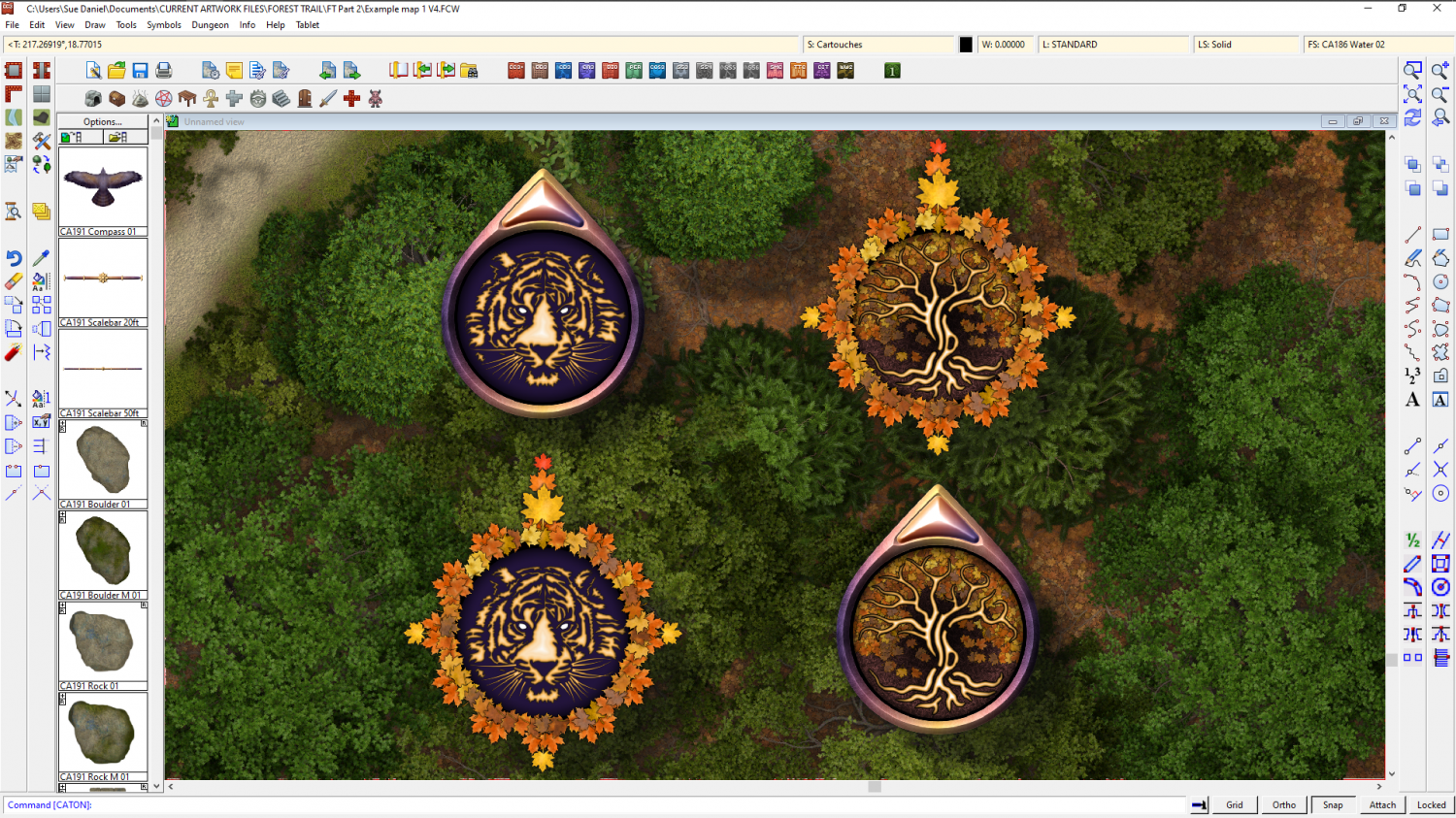
Still working on the waterfalls, but while everything was in upheaval I decided to add a couple more compasses to the style. I couldn't decide on the design so you've ended up with interchangeable parts.
![[Deleted User]](https://secure.gravatar.com/avatar/c75d9a245b74d9c59be0999ea81ca541/?default=https%3A%2F%2Fvanillicon.com%2F92add7f8c954488718110edc4896ad39_200.png&rating=g&size=200)


 and 7 others.
 -
Critique
While Julian and Monsen are both right, and you are discussing function and scale, there is also an artistic aspect of getting the right Level of Detail (LOD) in a map.
Even in this day of technology some things are still better if they are judged by eye. Create your map to the correct CC3 scale for the area you are mapping (map units are miles or kilometers in an overland map, and feet or metres in city and dungeon maps), and paste a handful of the symbols you intend to use in that space at the default scale set by CC3 at the creation of the map (not too many - don't go overboard and start the map just yet), then render the mostly empty test map to the final size and examine it at 100% zoom, or print it the size it will be published at if you can at home - no need to get professional prints just yet.
Judge how much larger or smaller you want everything to be so that you have enough room to show the information you want in the map, and to be able to enjoy the symbols themselves - even though each mountain or tree may end up representing several mountains or trees due to their size relative to the scale of the map.
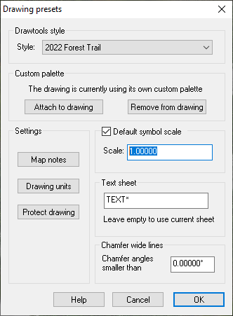
I don't recommend using different scales for different types of symbols in the same style unless, as Monsen points out, the settlements are a bit on the small side and not easy to identify. Pick a scale for the whole set and stick to it unless you have a rare exception (such as a world tree). Once you know what the symbol scale should be, set the default symbol scale in the Drawing Presets dialog |CC2PRESETS| and save the map.
Do two more tests like this to see:
- How thick your lines for coast and river should be, and how much detail you really need to draw in those two things. You would be surprised how messy a really accurate coastline with tens of thousands of nodes can look when printed on a piece of A4. Most maps have grossly simplified coastlines to avoid that mess and look so much better for it.
- Set the right font and size for your labels. Labels don't need to be huge (unless you are naming a continent, in which case they would probably be quite transparent as well to allow more regular town names to show through those enormous continent labels). But they must be readable without squinting.
It's worth the time and trouble to run a few quick tests first than to spend hours, days or possibly weeks making a fantastically beautiful map only to realise that it is a meaningless unreadable jumble when rendered to production size.

