


Loopysue
Loopysue
About
- Username
- Loopysue
- Joined
- Visits
- 9,985
- Last Active
- Roles
- Member, ProFantasy
- Points
- 9,863
- Birthday
- June 29, 1966
- Location
- Dorset, England, UK
- Real Name
- Sue Daniel (aka 'Mouse')
- Rank
- Cartographer
- Badges
- 27
Latest Images


-
Crypt
The easiest way to do this quickly, even if your building is quite complex in shape, is to use a Color key.
The first thing I do is move the GRID sheet to just below the SYMBOLS FLAT sheet in the sheet list. This places the grid underneath the wall.
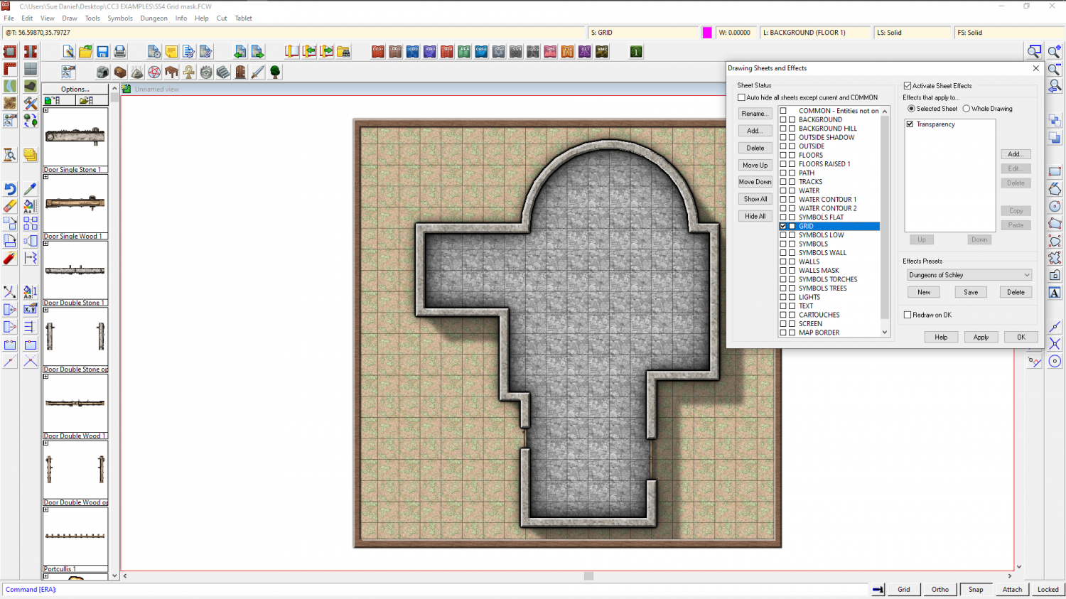
Then I add a Color key sheet effect to the GRID sheet and move it to the top of the list of sheet effects.
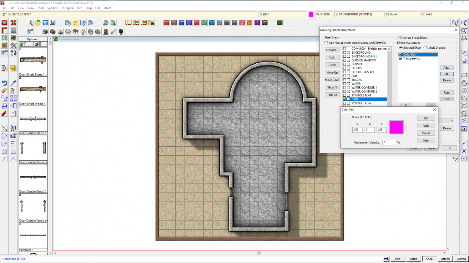
Ok all of that and make sure you have Solid fill and colour 6 selected as active. 6 is magenta - the same colour as was showing in the Color key effect.
Then draw a polygon on the GRID sheet that covers all the area where you don't want the grid to be visible. Here I have left a deliberate gap on the right hand side so that you can see how it was drawn.
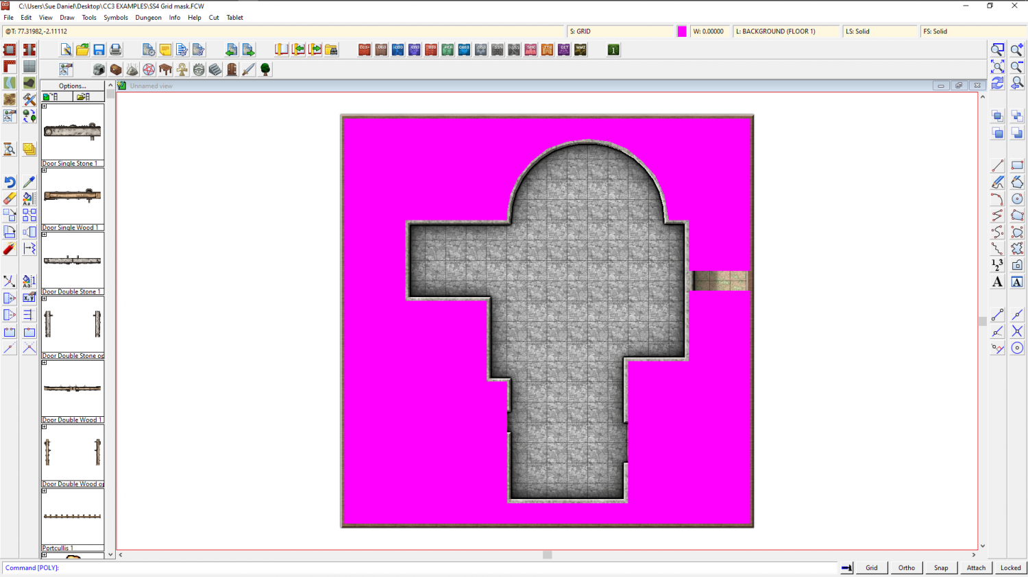
Refresh, and the magenta polygon vanishes, taking the grid with it.
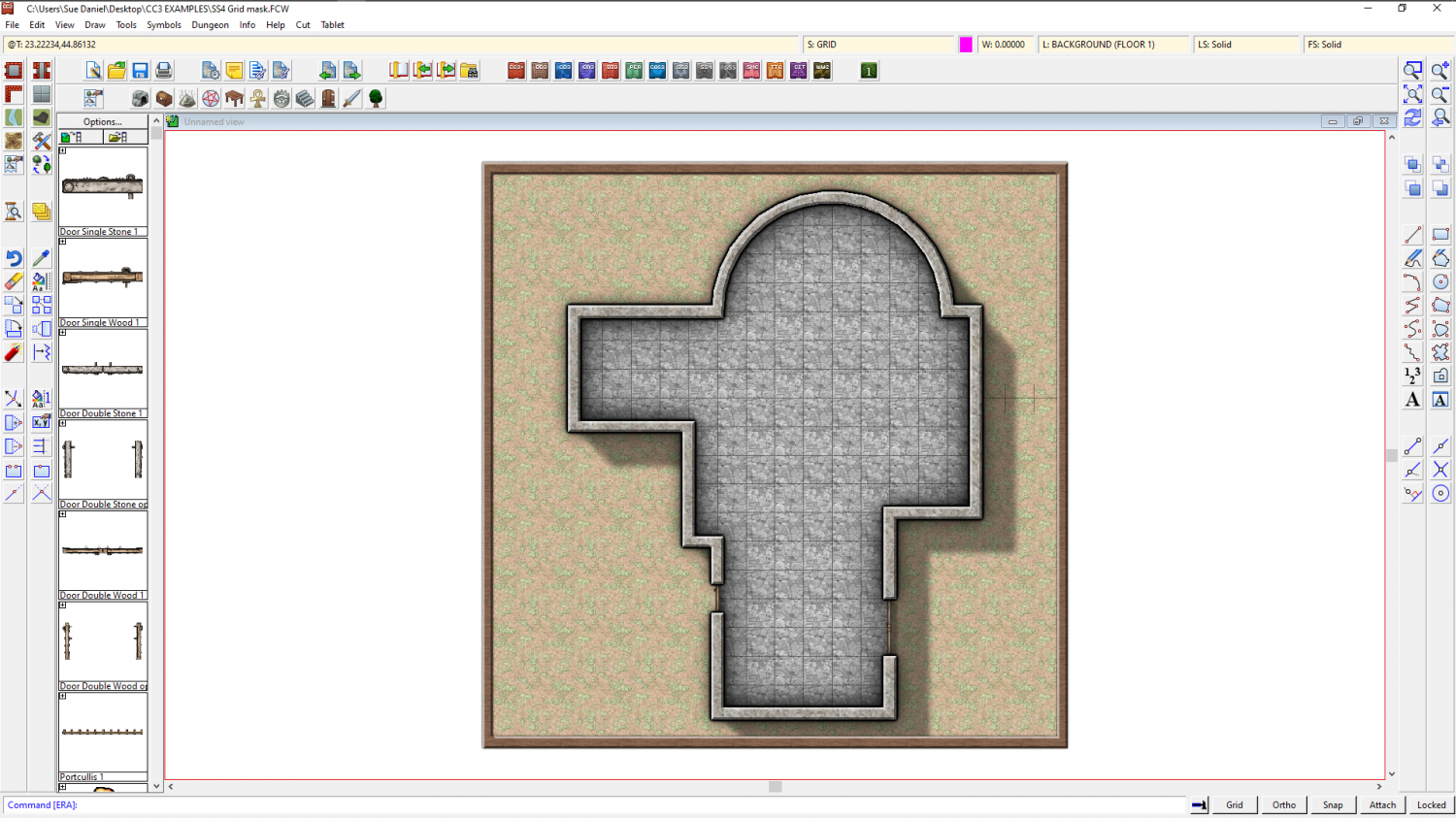
Once I move the nodes on that magenta polygon so that they cover that gap I left, I have a perfectly cropped grid.
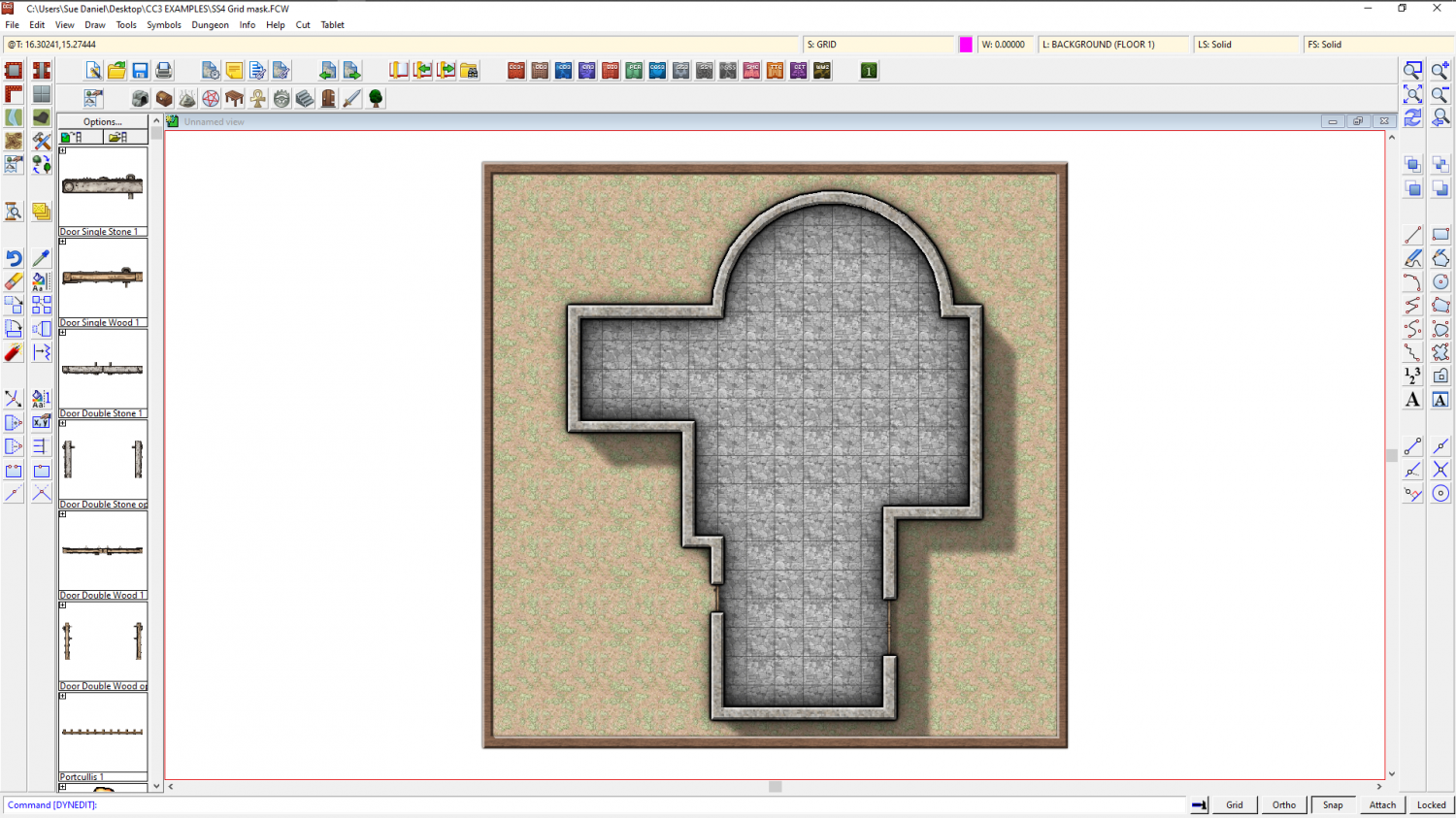
Here is the file for that example
The other way I might do it, if I didn't want to be bothered with drawing a large and complicated magenta polygon, is by trimming the grid. Use the property picker tool to pick the grid so that you have all the right settings, and then hide everything but the floor and the grid. Then explode the grid and use Trim to entity from the Edit menu to trim the individual lines of the exploded grid to the inside of the floor extent. This usually takes longer to do than using a Color key, so I only rarely use it. There are also a few little glitches that can occur, such as lines that refuse to trim to the floor shape seen below. You can tidy them up by hand though using other types of trim.
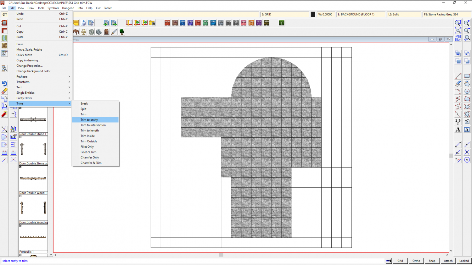
This is the tidied up result. To make sure you don't keep accidentally selecting the separated lines of the grid, group them (as they were before you exploded them) and then make sure the grid is on the HEX/SQUARE GRID layer and freeze the layer.
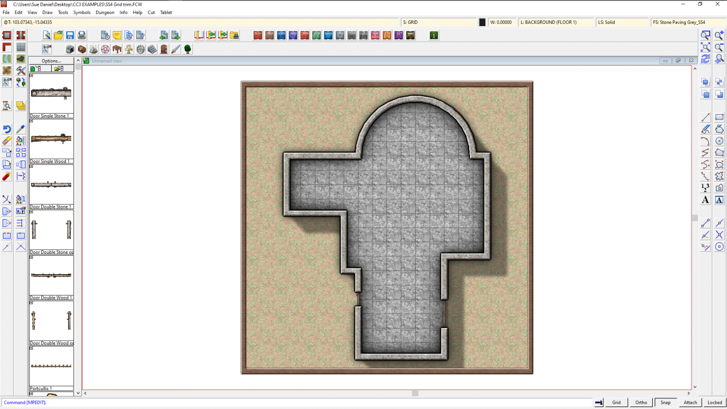
As you can see, the result is the same. Perhaps the main disadvantage of trimming the grid is that it's not so easy to edit the shape of the floor.
This is the trimmed grid example.
![[Deleted User]](https://secure.gravatar.com/avatar/c75d9a245b74d9c59be0999ea81ca541/?default=https%3A%2F%2Fvanillicon.com%2F92add7f8c954488718110edc4896ad39_200.png&rating=g&size=200)


-
A Quick B&W Village
It's probably more than a basic map. You've considered quite a lot of things a lot more carefully than you would for a sketch map. The plan of the village is realistic, and you've thought about where there might be single trees or avenues of trees instead of just blocking them down and leaving it. You've even considered that the main road might be older than the smaller roads and be more jiggly as a result of time and various deviations to the original course.
If I have any suggestions it would only be that the river banks would probably be less jiggly where it's narrower, since the water will flow faster there and tend to erode in a straighter line - unless there are huge boulders causing those jiggled edges to it's channel.

-
Asian Town Housing Keeps Crashing
Asian Town
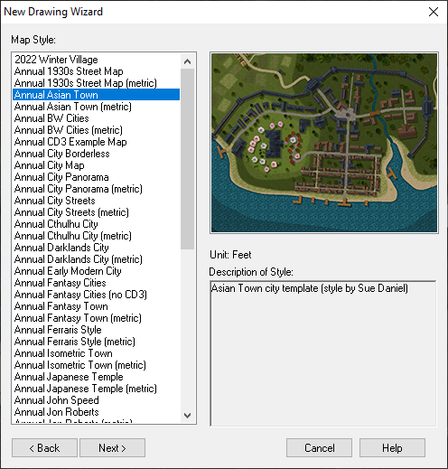
If you try to use the House tool to draw a long thin building it crashes every time.
Here is an FCW showing at what point the crash happens. (I saved after each successively longer building and attached the file once it crashed).
The limit seems to be somewhere around 120 feet long.
The reason such very long buildings are quite likely to be drawn is that the Mapping Guide indicates using them to draw the city walls. I noticed that the example map for that style has a building that is 175 feet long. I was trying to separate it out from the rest of the wall to take a screen shot of it with a result of the Distance tool to show you, when moving it caused a crash. Maybe it is something that has happened since the publication of Asian Town in November 2018?

-
First Ferraris Style Map
It looks good to me :)
The Ferraris Style is based on the actual Ferraris map. You might find it useful to examine the original here:https://maps.arcanum.com/en/map/belgium-1777/?layers=37&bbox=624622.0609151967%2C6665485.106049%2C634191.0213936471%2C6669048.982492796
This is just one section of marsh. Because the map was a team effort you will find other sections of marsh that will appear to be quite different because they were drawn by different cartographers.
The Ferraris style isn't so much an artistic style, but a historical style, so there is less emphasis on things looking beautiful, and more emphasis on the resulting map looking like it might be part of the real Ferraris map.


-
[WIP] The Dancing Princess (Community Atlas, Artemisia, Spiros Isle, Helinesa)
You might need to do all those split level differences on the deck with a separate set of sheets for each one, so that you can cause the upper ones to cast a shadow or a dark glow over the lower ones. You've got 3 levels, as far as I can see. The highest one is the stern, or aft deck (and now we are going to see if I can remember all the terminology!). The next level down is the mid and fore deck, and the lowest level between them is... ummm. I've run out of terms, but that's kind of a mid deck also! LOL! And its about the same level as the bow, so you could put them on the same set of deck sheets as well.
I'm not sure how that would translate as far as the general outline goes, but if there's a step up or down in the deck level, then there will also be a step up or down in the freeboard. The bit that sticks up above the water line. So you could draw it as 4 separate decks (on different sets of sheets) that just happen to make the shape of a ship.
I think you might find that the part of the plan view not shown as planked down the sides is the bulge of the lower decks, which if you look at the stern elevation plan stick out beyond the extent of the deck. If you look at where the gun ports are located in all the plans you will suddenly see what I mean. The true extent of the deck is where you have drawn the paler planking. The extra extent should be very steep flanks with the guns poking out of them.

