


Loopysue
Loopysue
About
- Username
- Loopysue
- Joined
- Visits
- 9,967
- Last Active
- Roles
- Member, ProFantasy
- Points
- 9,852
- Birthday
- June 29, 1966
- Location
- Dorset, England, UK
- Real Name
- Sue Daniel (aka 'Mouse')
- Rank
- Cartographer
- Badges
- 27
Latest Images


-
1000th Map Competition: Ober, Southern Scar
Here is a general view of some English fields for comparison.

-
[WIP] Community Atlas - Eknapata Desert
It's looking good so far.
The glows don't have to be really loud to work. As long as they make the text clear enough to read that is fine. With the labels 2 different colours this can be a bit tricky, but I assume that the brown labels are not as important as the black ones, so they don't have to be as eyecatching.
So, how about this?
I switched off the effects on the Text Outlined Light sheet because the text itself is so large and so pale it doesn't really need a glow.
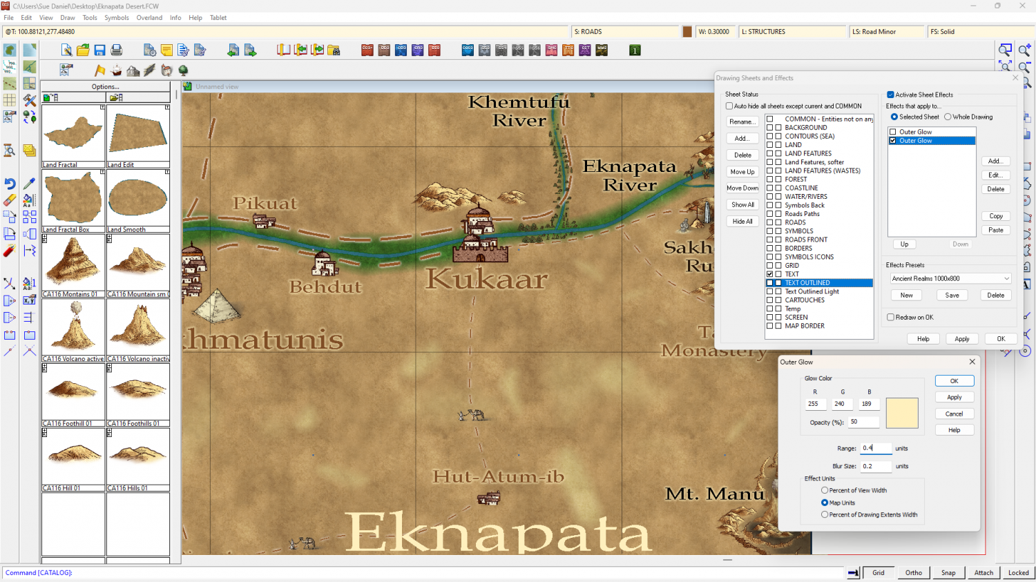
You might want to make them a little more opaque, but that's part of personal taste.
A little tip: Using a ranking system of different sizes is ok, but try not to use too many different sizes if you can avoid it.

-
Annual Darklands fill question
Thanks :)
I did a quick sampler of all the forest and woodland drawing tools with the tool names shown for identification.
The trees from Darklands are quite dark compared to other styles, so you won't get any lighter trees than the jungle ones.
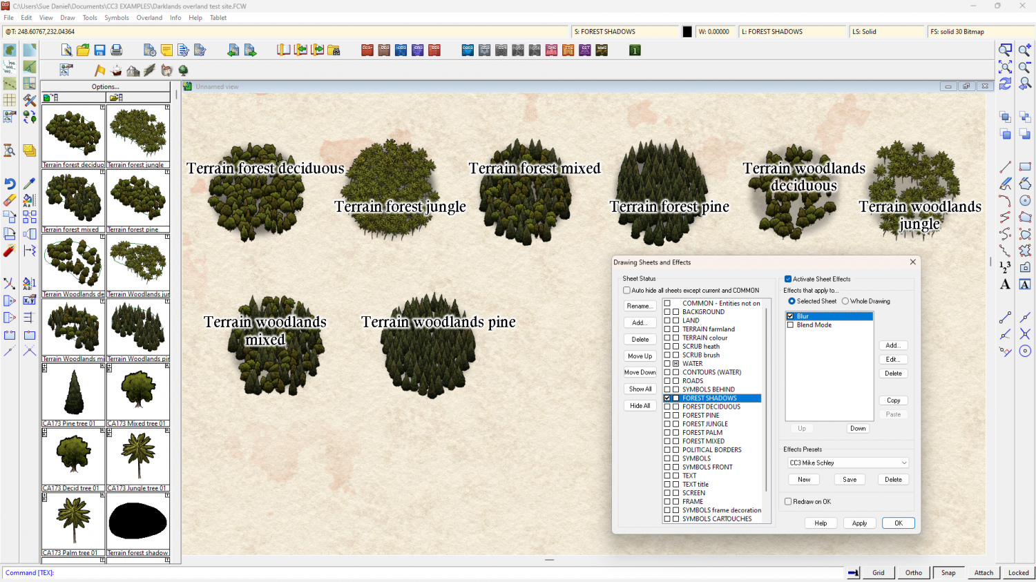
I think you might have the blurred FOREST SHADOWS sheet above the FOREST* sheets (above in the map - below in the list). That would cause the blurring seen in your shot. Check to make sure the sheets are in the right order.
As for the drawing tools themselves, the forest ones all seem to be in order, but the last two woodlands drawing tools seem to have a higher than expected density. I don't know if this is intended or not.


-
Suggestions for Tweaking this Map
Try adding a new Glow to the WATER sheet, move it up to just below the Color Key and set it up like this.
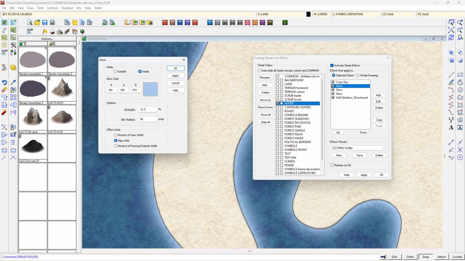
You might have to adjust the extent of the water to take the edges outside the ribbon border so you don't get pale colours seeping in from the edge all around, but it should work. The drawback is that all the rivers will be that lighter blue.
I also really recommend moving that title back to the top corner where it was. There's a natural space for it there.

-
an inverted bevel ???
On the Bevel, Lighted it is possible to make the bevel concave by increasing the value of the Slope Curve.
With a bit of fiddling you can reverse the shading to show the effect of a hollow by unchecking the Global Sun Direction and setting the Azimuth to 180 degrees from the global sun settings.
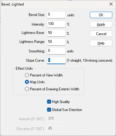
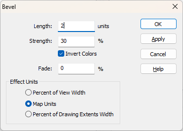
With the ordinary Bevel, you can't make the curve concave, but you can reverse the shading by checking the Invert Colors box. That would make the polygon appear to be sunken instead of raised.

