


Loopysue
Loopysue
About
- Username
- Loopysue
- Joined
- Visits
- 9,967
- Last Active
- Roles
- Member, ProFantasy
- Points
- 9,852
- Birthday
- June 29, 1966
- Location
- Dorset, England, UK
- Real Name
- Sue Daniel (aka 'Mouse')
- Rank
- Cartographer
- Badges
- 27
Latest Images


-
WIP: Manor house (problem with walls)
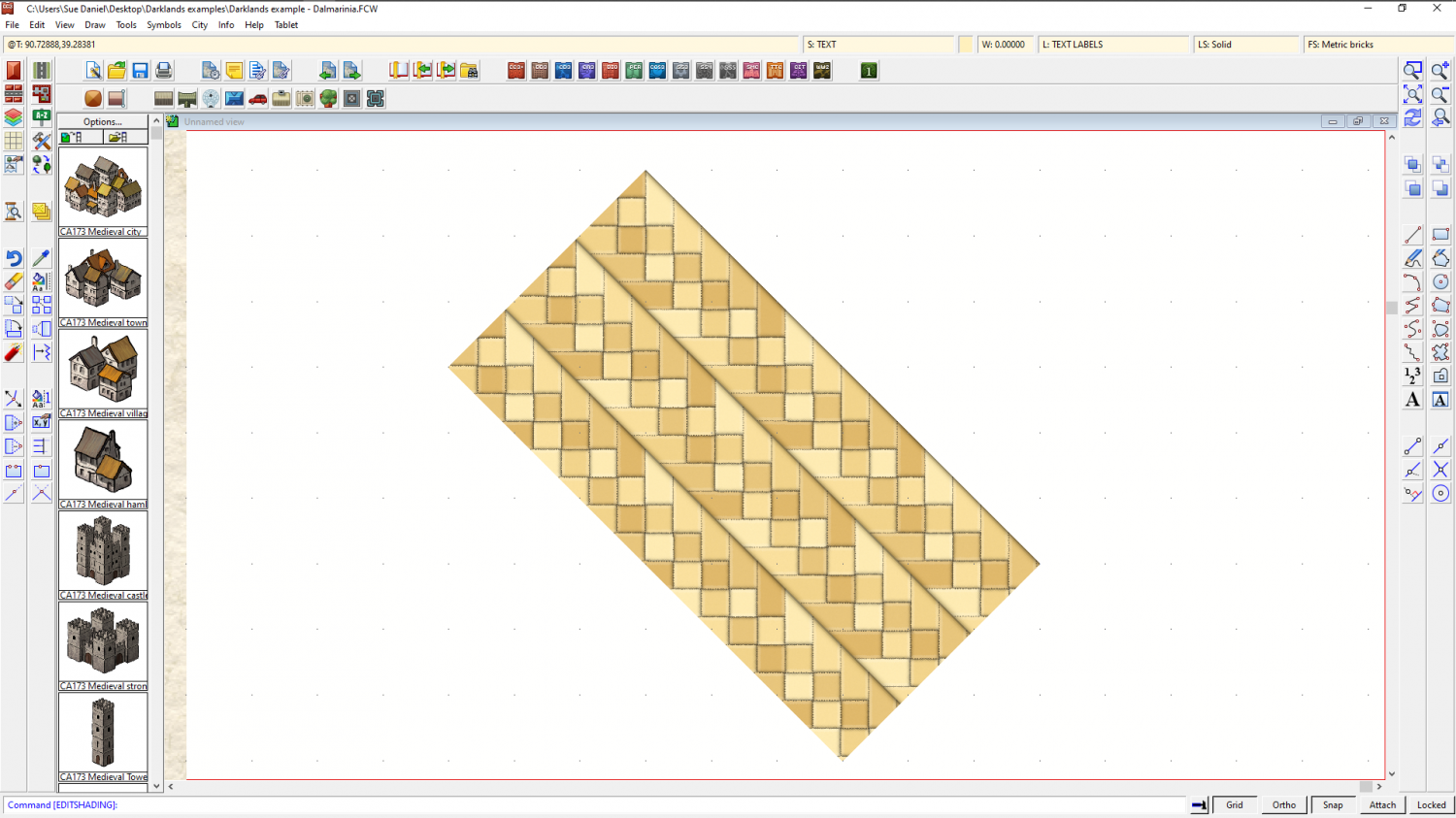
Once a polygon is shaded you can rotate it intact. the shading will stay aligned to that side of the polygon. Try it and see.
-
WIP: Manor house (problem with walls)
Looking good :)
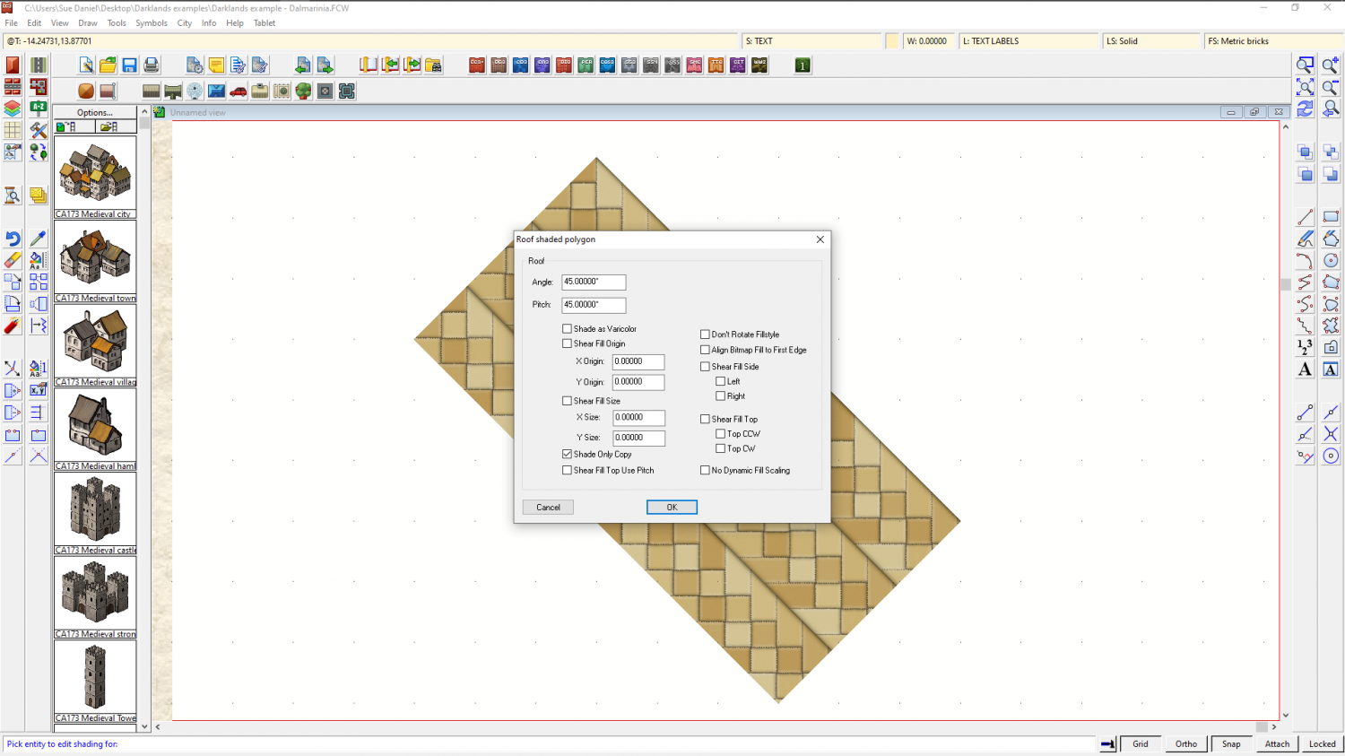
Do you know that you can align the floorboard fills in those rooms that aren't perfectly aligned with the usual compass directions using Shaded Polygon (Angle by Edge) from the right click menu on the Polygon drawing tool on the right? (providing that floor isn't all one polygon). You get the tool and click the long side of the floor with it and the fill is instantly aligned to that edge.

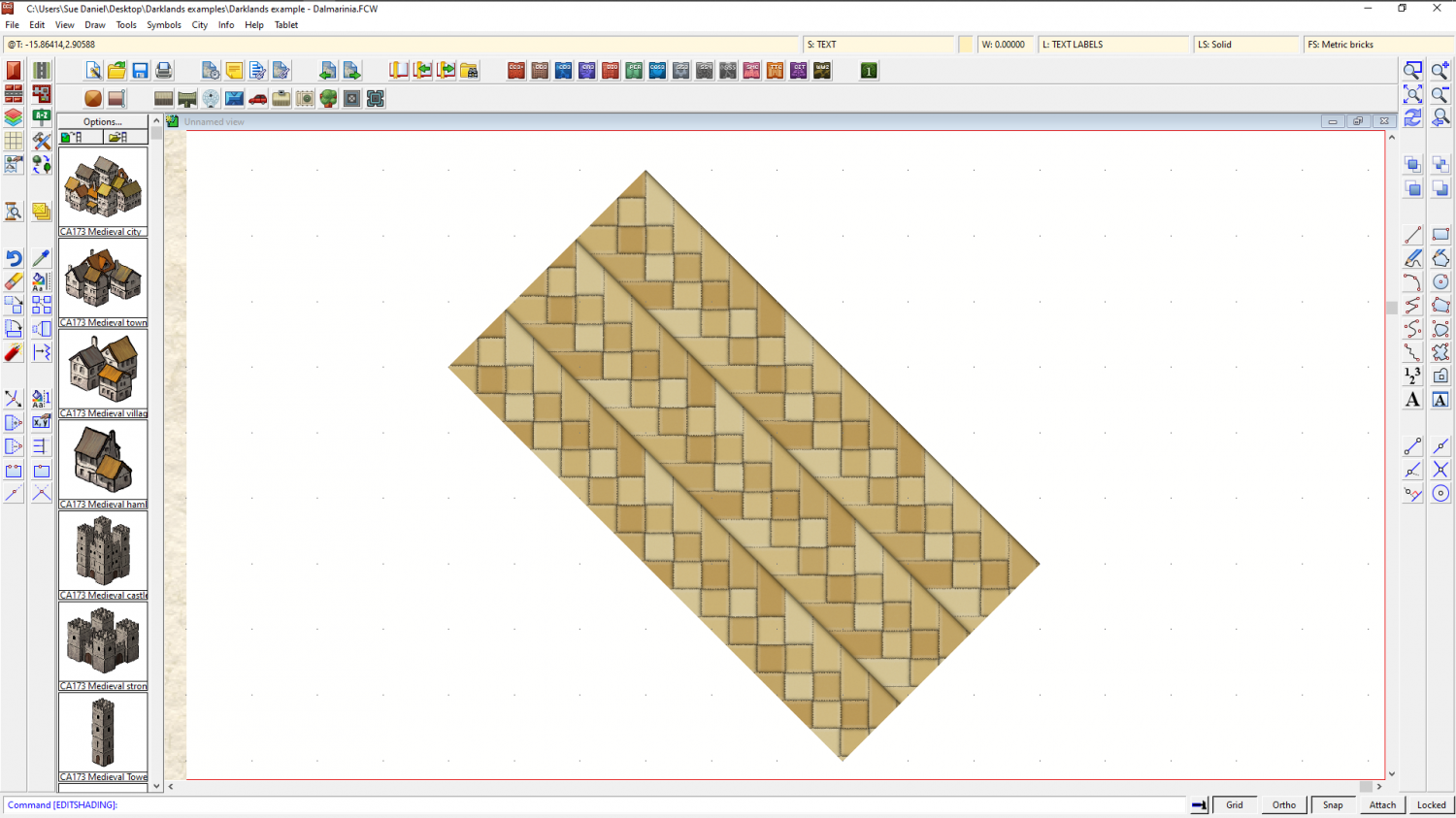
The tool was originally intended as a roof shading tool, so each one of the floors now has a pitch like a roof. That is why they will have gone darker or lighter than they should be. Then when they are all aligned you type EDITSHADING, and pick them one by one and check the little box where it says "Shade only copy" and they will lie flat again.

-
New Mouse
Wouldn't it be interesting to have a 'click counter' app for the mouse so we could see how many were actually involved in making a map.
-
[WIP] Cliff City B&W
Thanks :)
I had a look at all the sheets you made to get the effect right, and where I've jumped in at the end of it all I decided it was probably easier if I did a fresh setup for myself, but making use of the symbols you pasted. So this is your map as you drew it, but with adjusted sheets and effects settings.
I'm hoping this was the effect you were after?
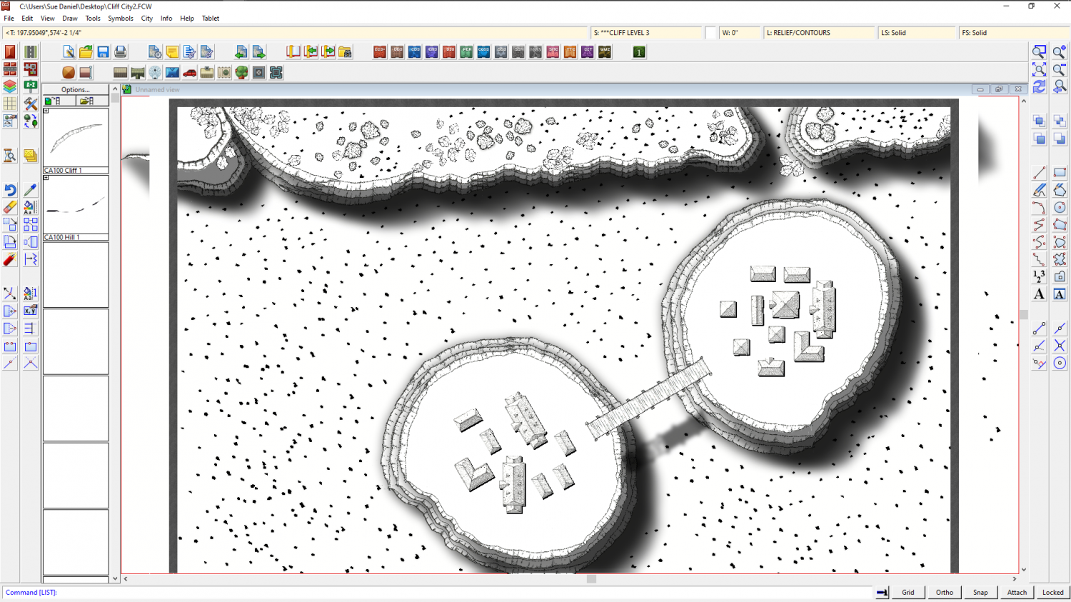
What I did to it is summed up by saying that I moved all the cliff symbols for the base of all the cliffs onto one sheet called CLIFF LEVEL 1, and drew a white polygon to cap the top of that level and stop the shadows showing on the inside of the cliffs on the same sheet. I then moved all the cliff symbols from all the map that represented the second level of the cliffs to a new sheet called CLIFF LEVEL 2, and drew a white polygon cap for that level too. Same for all the level 3 cliff symbols.
I moved the 3 new sheets down to the bottom of the map so that everything else appears on top of them and adjusted the shadow effects so that they blended better with each other (more blur). There are a couple of tree symbols I guess you wanted to put on the cliff itself, but which now appear to be floating because they are no longer under the shadow of the cliff 'above' them, but you can make a new SYMBOLS LEVEL X sheet (where X is the level number of the cliff they are supposed to be sat on), and move them there if you prefer.
I hope this has helped. You were nearly there. Things will get easier with sheets and effects as you go on.


-
Grimdark Fantasy (renamed "Darklands") - development thread
Hello Linn :)
That sounds quite fascinating. I would love to read an introduction thread by you!
The last time I ever had the critique of an art tutor (about 35 years ago) I was told that my style wasn't fashionable, and that I wouldn't get onto a degree course. He was quite right as it turned out, so all I have to show for that time in my life is a Foundation Diploma in Fine Art. I do landscape paintings - or at least I used to in the old days. They just weren't abstract enough for contemporary taste and didn't sell as well as all those pink, orange, blue and viridian expressions I saw in the window.
So I took an office job and laid all those things to one side until very recently, when I became involved with fantasy mapping art. I've done the digital version of drawing my own maps from scratch, but only ever one map on real paper using real pencils. It turned into more of a landscape than a map. Well, that was no surprise given my background.
Things happened in my life at that point and I drew my horns in quite a bit. I also discovered at that time the great pleasure of producing assets for other people to use in their maps, and eventually became far more interested in doing that than in drawing maps for myself.
I wouldn't claim to know very much about fantasy mapping styles because there is just so much to consider beyond the drawing itself, but I have worked out that maps differ from paintings in that the elements are more symbolic than real at this scale. The example map represents 1000 x 800 miles, which means that the volcanoes are gigantic, and the mountains themselves are super massive beyond that. In a non-photorealistic style it is not the scale of the elements that is important as much as the clarity - the ease of identification of each thing. Hence everything is several hundred times bigger than it would be if it was drawn actual size, and each tree might represent a whole woodland.
However, and having explained my personal take on scale and symbolisation, I can see that the ash clouds may be too large relative to the rest of the volcano, and also that this slightly discomforting distortion isn't helped by them being less cartoony than the rest of the elements. I look at them again, now, and I can see something that is neither cartoon nor photorealistic but a rather distracting hybrid of the two things.
Thank you for helping me to work this out and get it straight in my head. I think I will probably reduce the size of the ash clouds a bit and make them more cartoony, but I will leave that until I have done a draft version of the full set so I can smooth out the bumps all in one go.
And also, thank you very much for the reference material. I have bookmarked those pages for personal interest, since I currently have something of a fascination with volcanoes :)


![[Deleted User]](https://secure.gravatar.com/avatar/c75d9a245b74d9c59be0999ea81ca541/?default=https%3A%2F%2Fvanillicon.com%2F92add7f8c954488718110edc4896ad39_200.png&rating=g&size=200)

