


Loopysue
Loopysue
About
- Username
- Loopysue
- Joined
- Visits
- 9,968
- Last Active
- Roles
- Member, ProFantasy
- Points
- 9,853
- Birthday
- June 29, 1966
- Location
- Dorset, England, UK
- Real Name
- Sue Daniel (aka 'Mouse')
- Rank
- Cartographer
- Badges
- 27
Latest Images


-
WIP: Cartographer Guild May Challenge
Looking good :)
I think you may have used a bit too much compression on this JPG. I'm getting those nasty little squiggles. 90% is enough. Never ever sacrifice quality for having a file size that is unnecessarily tiny.

-
A couple maps
Well... maybe, on the font size.
It's bit hard to tell when the map is so small in all that white.
If you want to get rid of it and get the maximum map for the minimum MB, try using the "JPEG Bitmap file" save as type, and making your settings a bit like this:
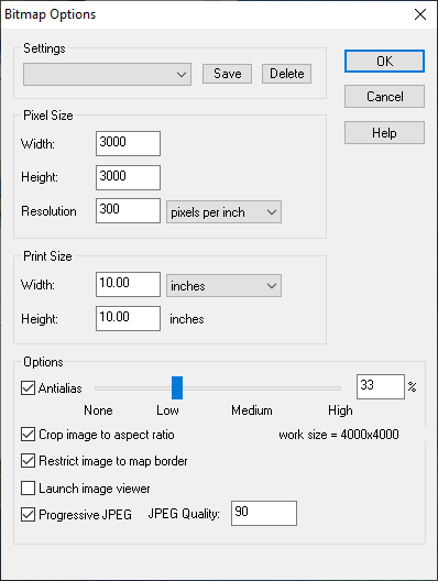
The area of the map is then automatically rendered within the map border, and trimmed on the short side so that the long side is 3000 px.

-
Seeking advice re world map and civilization placement
I think it might be a bit too massive in nature.
You have two huge mountainous regions, the smallest of which is probably the size of Africa. You might want to have a look at just how many mountain ranges there are in the combined area of Earth's landmasses, and maybe rethink those bulky summits.
There's a map on this link that shows the mountainous areas of Earth in red. It's a bit psychedelic, but the colours are as close as I could find to the colour scheme you are using for your map. Remember that the ice caps on Greenland and Antarctica account for the red in those areas, and you will see that very little of the real world is actually mountain, and that those mountain ranges are much more linear in nature and relatively short (with the obvious exception of the Andes and Rockies).
I think its possible that the way to go from here is to worry first about breaking up those masses by levelling wide troughs through them so that they really do end up on one side of the continent or the other. That will automatically make your world look like it is much larger.
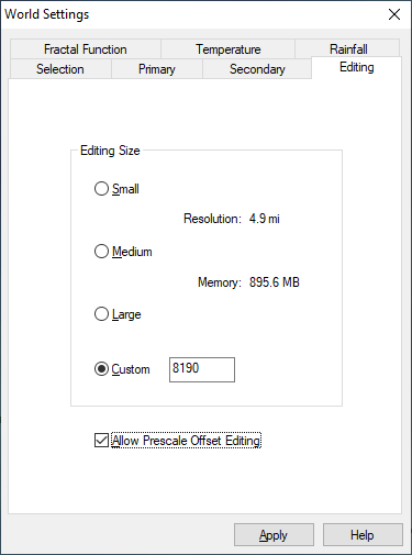
The easiest way to do that with least fuss is to activate the prescale offset editing, and use only the prescale raise and lower brushes (the green ones) set large and very low powered. These brushes cause less damage to the underlying fractal. I assume you have The One Day Worldbuilder, since I think that is one of the colour schemes that comes with CA155, so this is probably a repeat of information you already have ;)


-
WIP: Cartographer Guild May Challenge
Nice work on the rivers so far :)
The way the terrain textures are designed, it may be easier to add the rest of the various greens and browns before the mountain background, though it depends on your personal taste. All of them (the colours - including the mountain background) are just polygons drawn on the same sheet and massively blurred, then blended with the paper, so whatever you add first tends to diminish beneath later colours that overlap. If this happens to your map just use the bring to front tool and grab the mountain background colours (there are 3 of them in fact in various shades of increasingly dark grey) to bring them forward.
You may find that doubling or trebling the size of the blur on the TERRAIN Colour sheet will improve the overall appearance of the map, since it is quite a large map. The colours are meant to work like a smooth gradient across the map without any noticeable edges. Edges are for the scrub and farmland textures, which are on different sheets to the terrain colour.
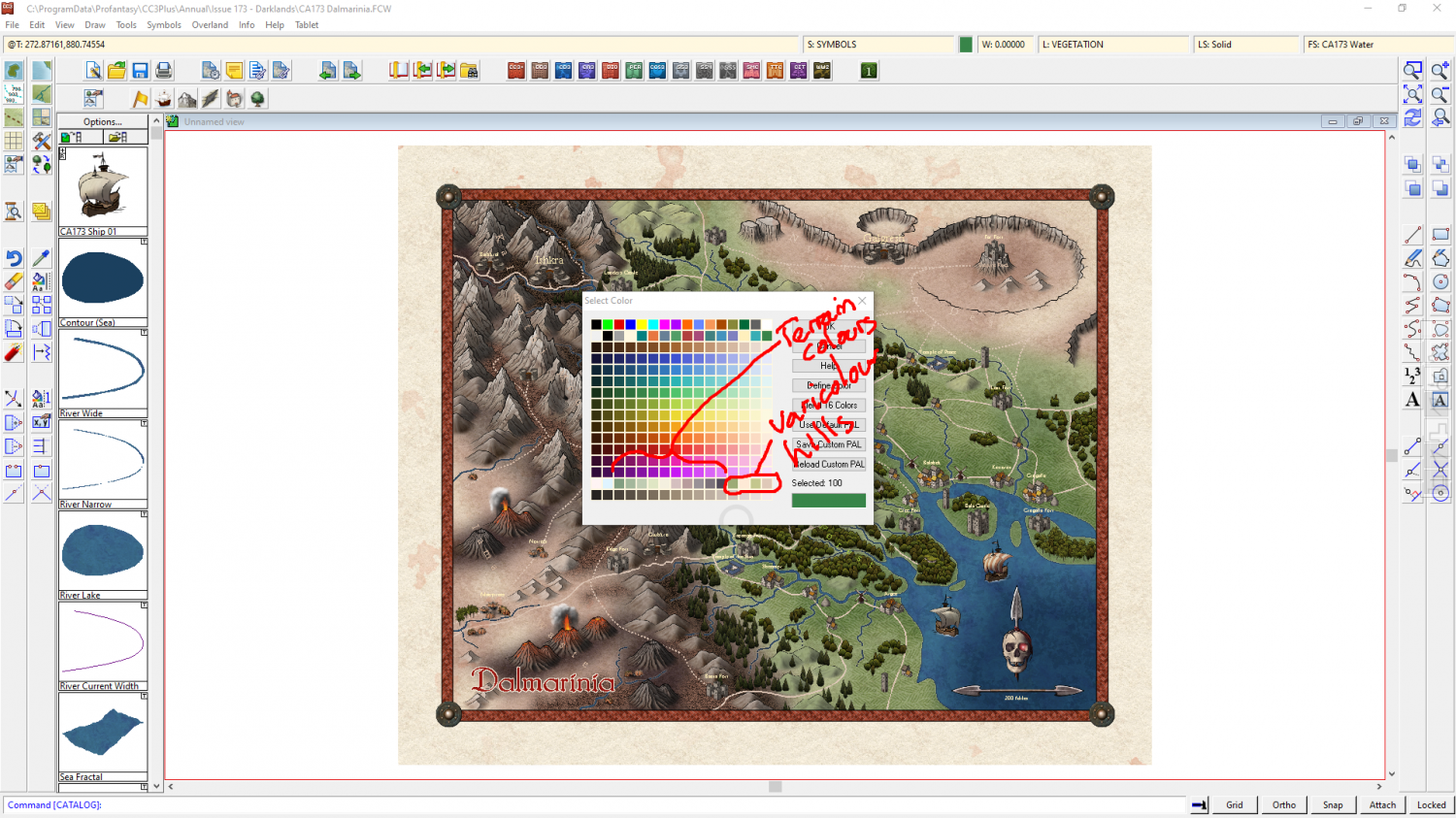
The colour palette with this style contains all the terrain colours in a single row. Towards the right hand end of that row of colours there are a range of colours for the varicolour hills so that you can match them with the terrain colours a little better when you have finished colouring the terrain. You can change the colour of a varicolour hill using the change properties tool if you end up with any mismatches by the end.


-
Hi, great to be here from Skillet!
Pst! It's ok Skillet - Remy is Norwegian ;)

